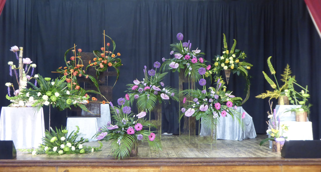
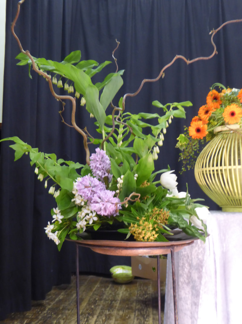
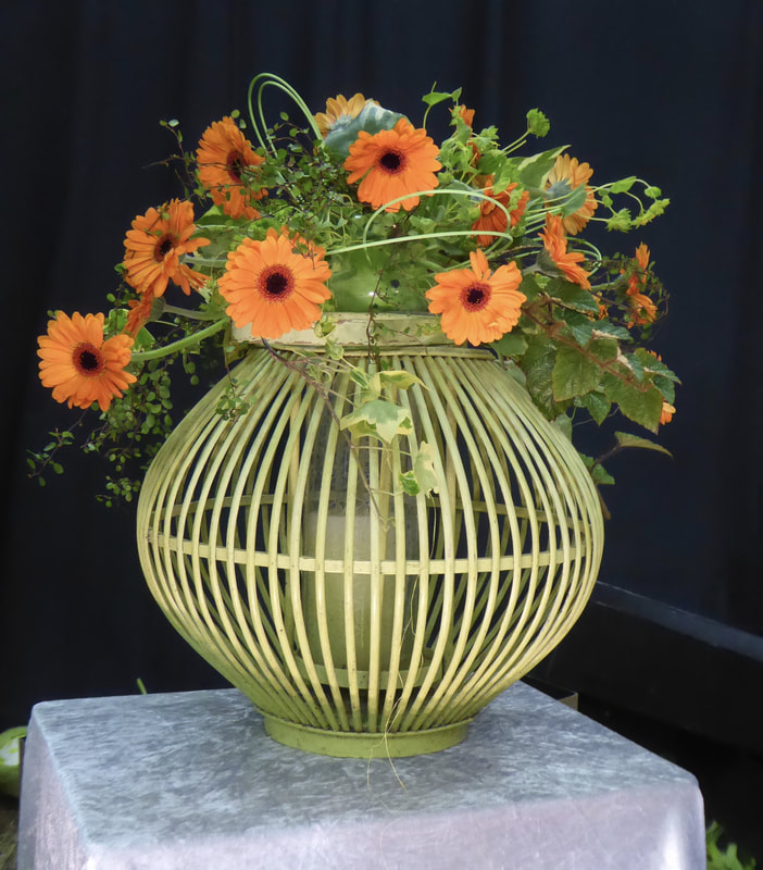
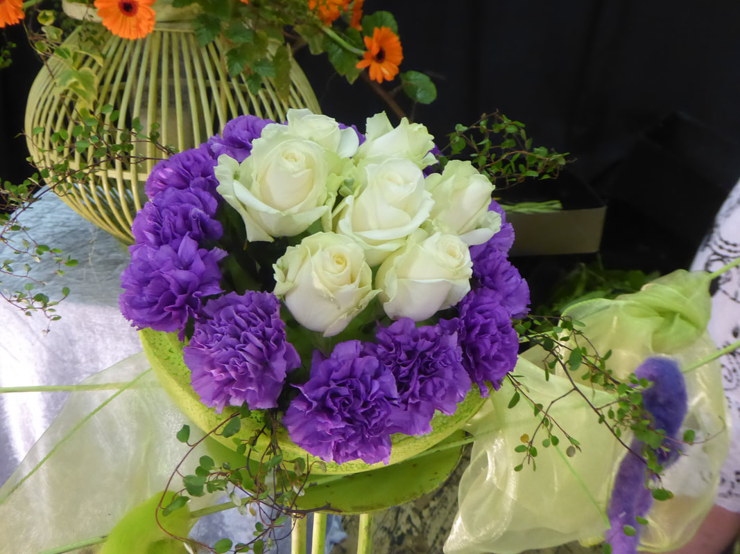
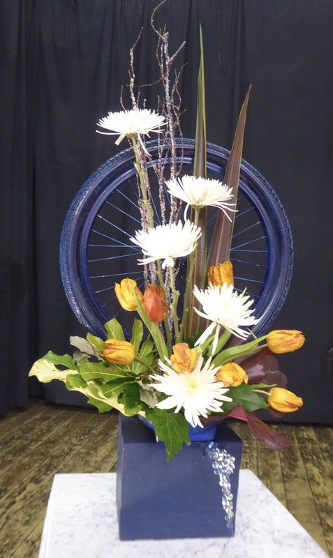
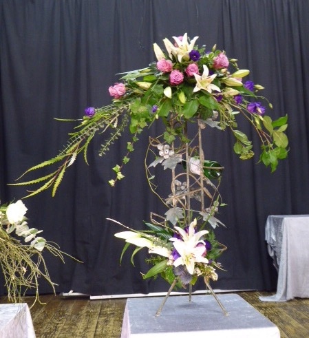
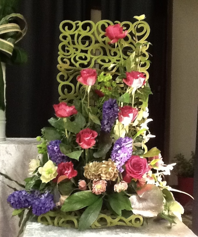
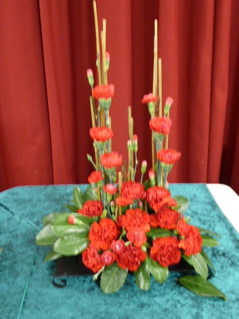
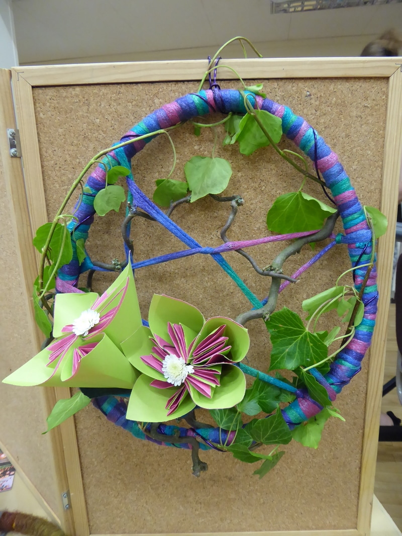
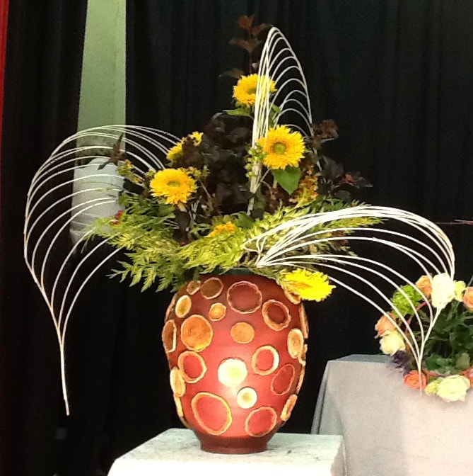
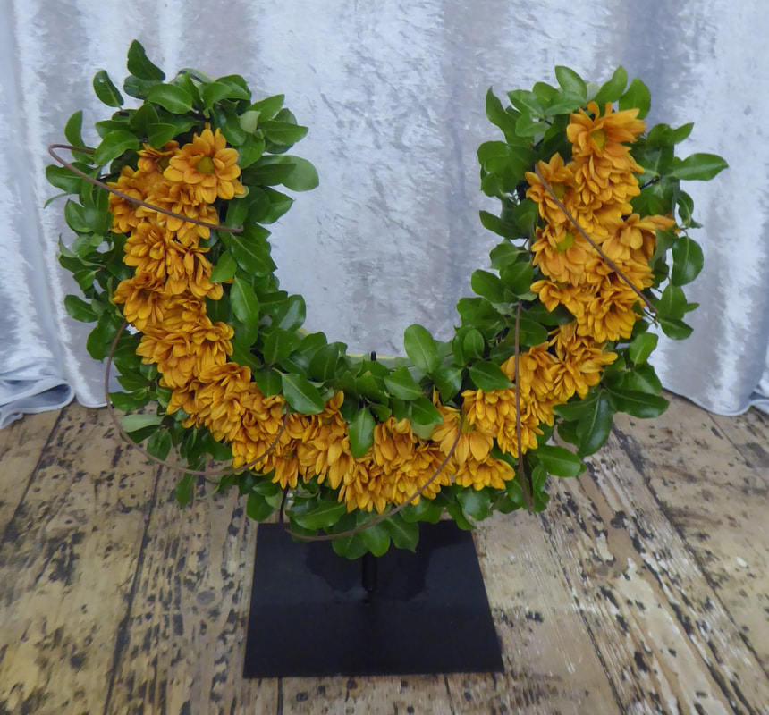
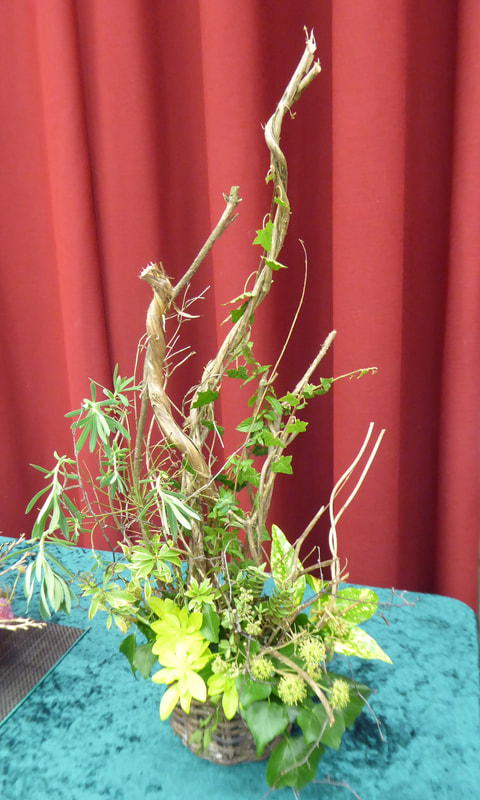
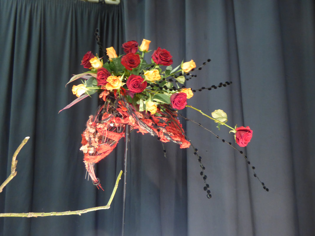
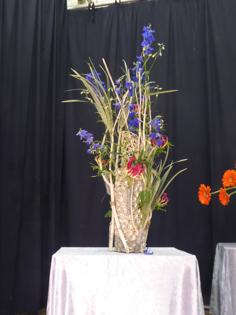
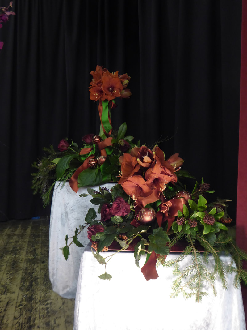
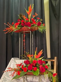
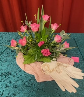
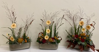
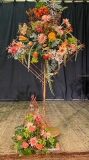
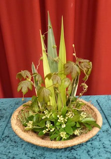
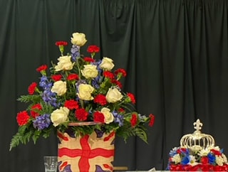
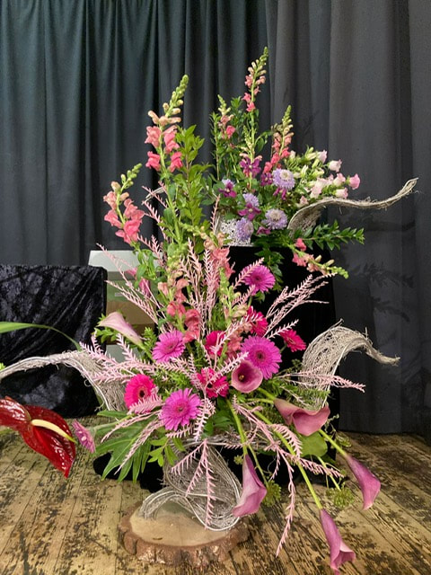
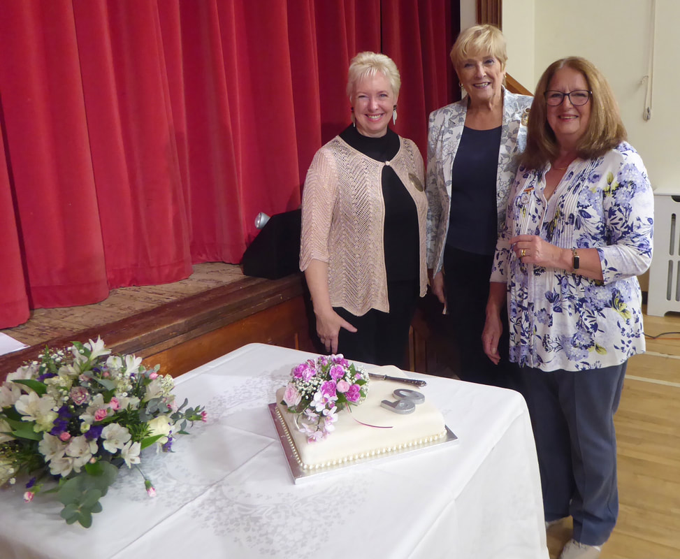
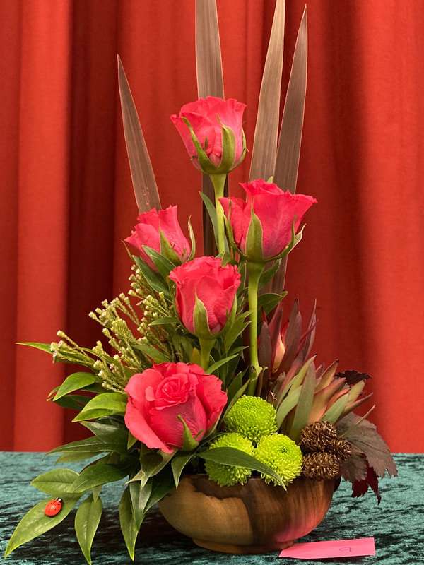
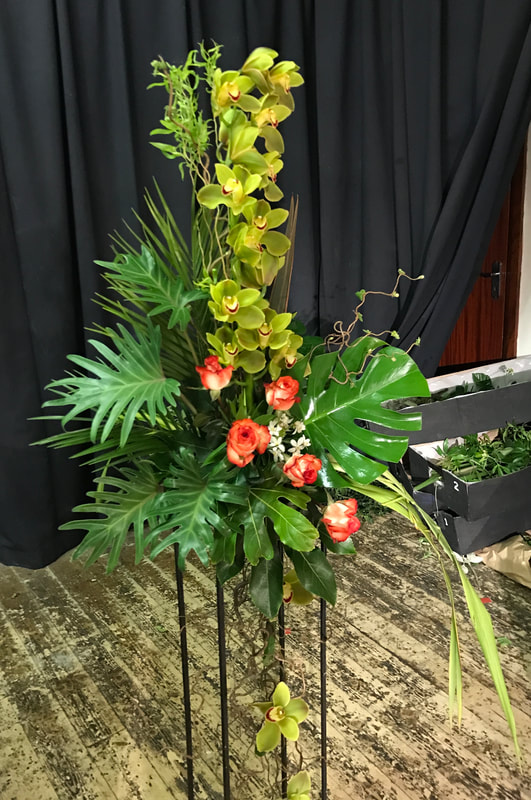
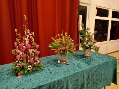
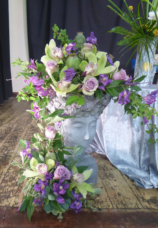
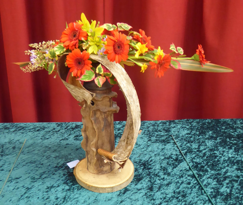
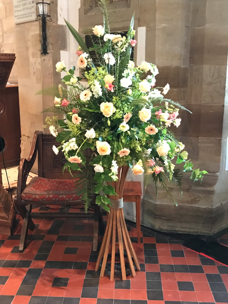
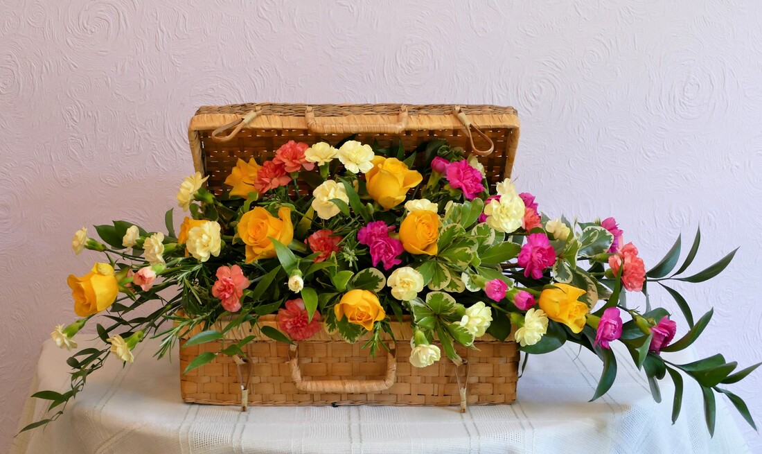
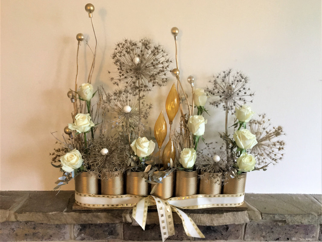
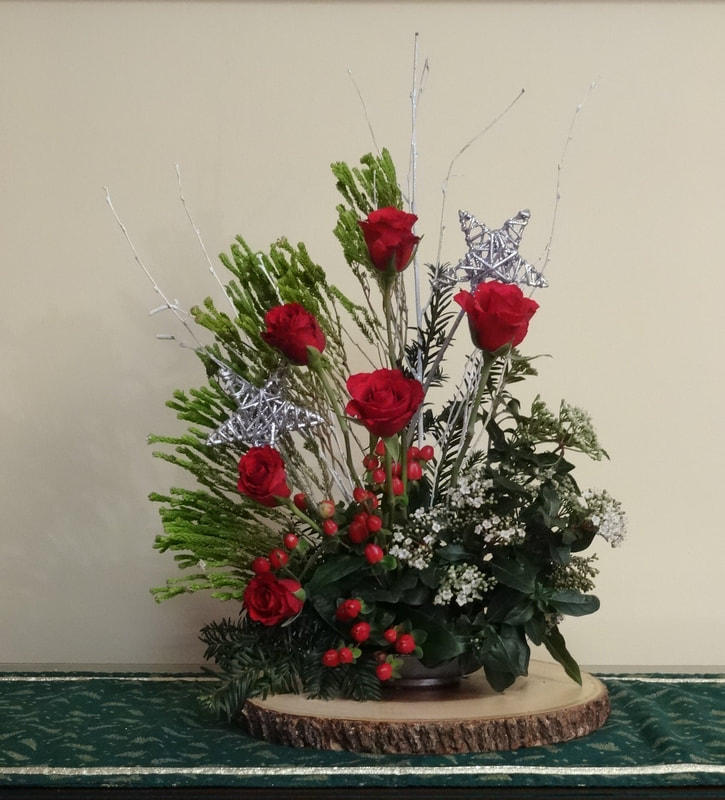
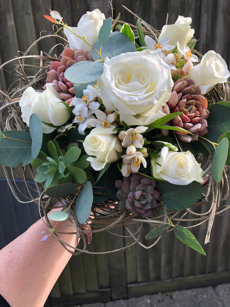
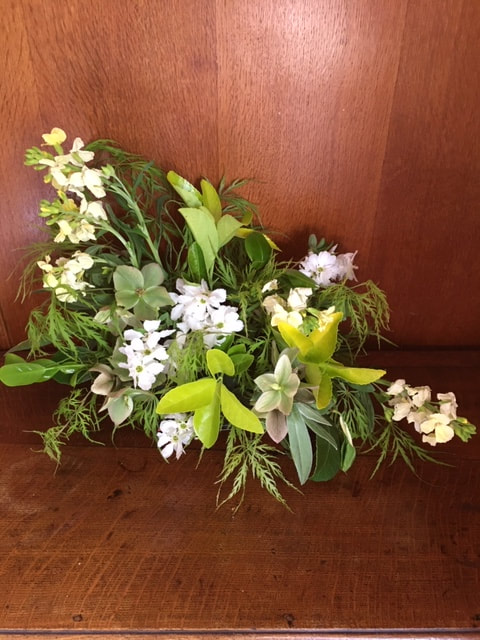
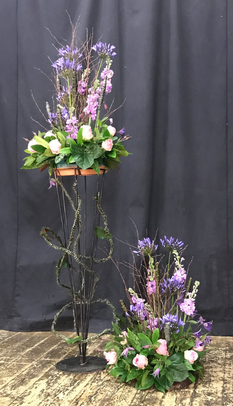
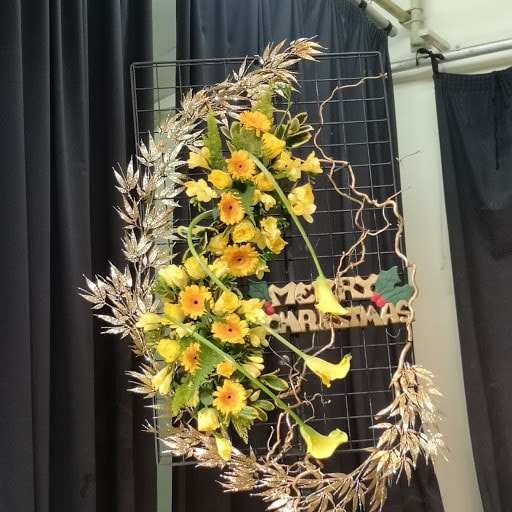
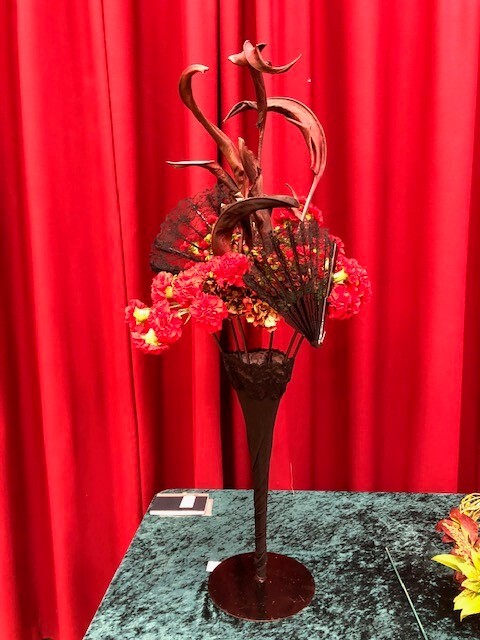
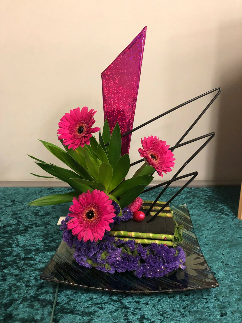
16th July 2024
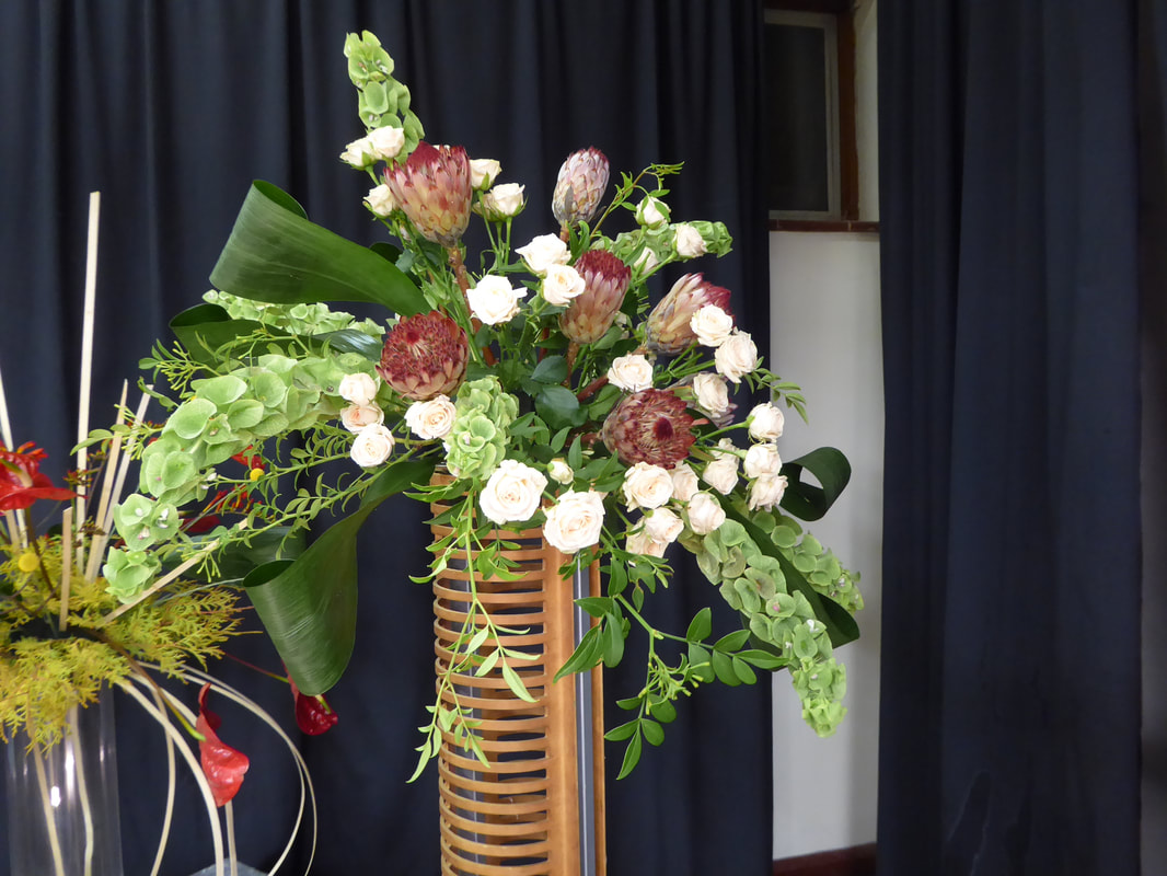
Demonstrator - Graham King
Title - "How Bizarre"


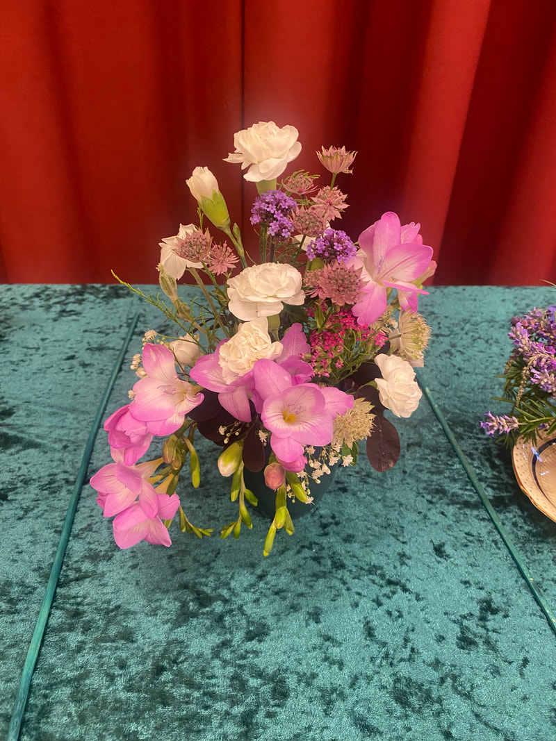
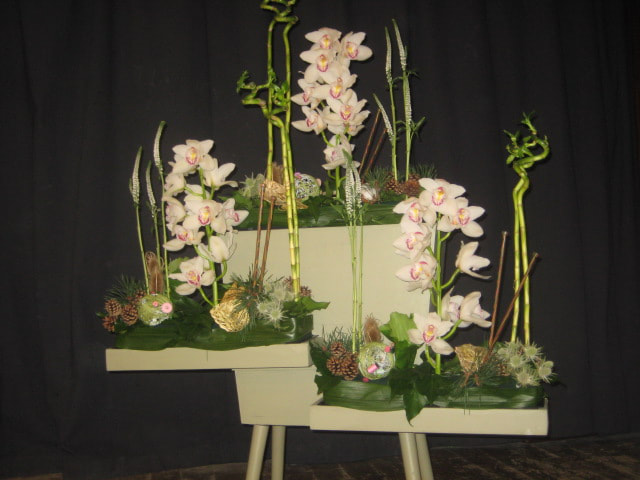
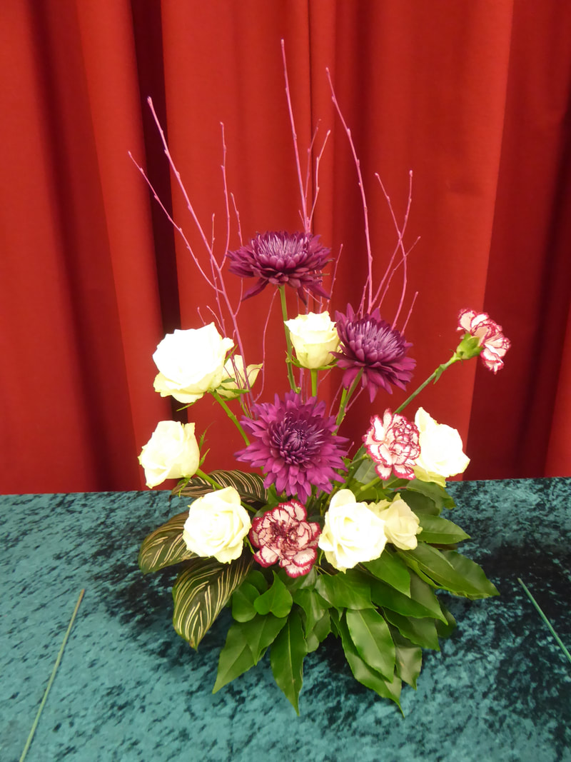
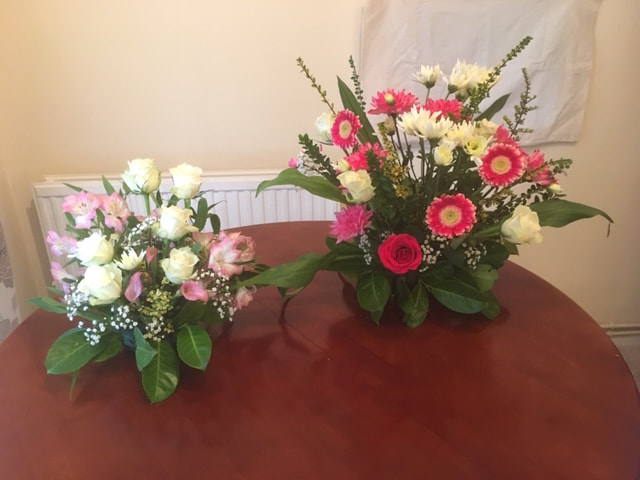
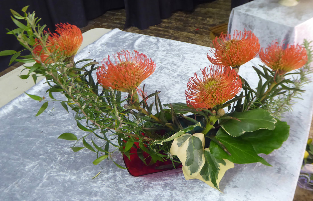
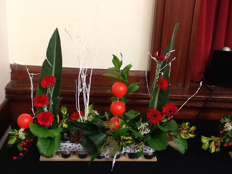
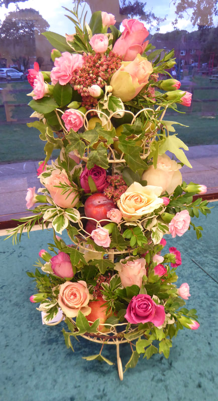
Club Competition
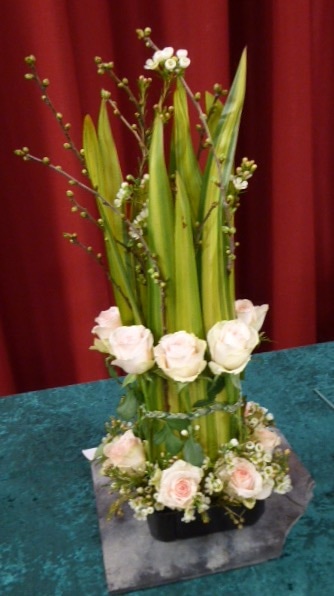
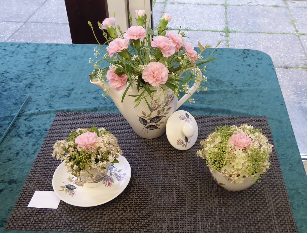
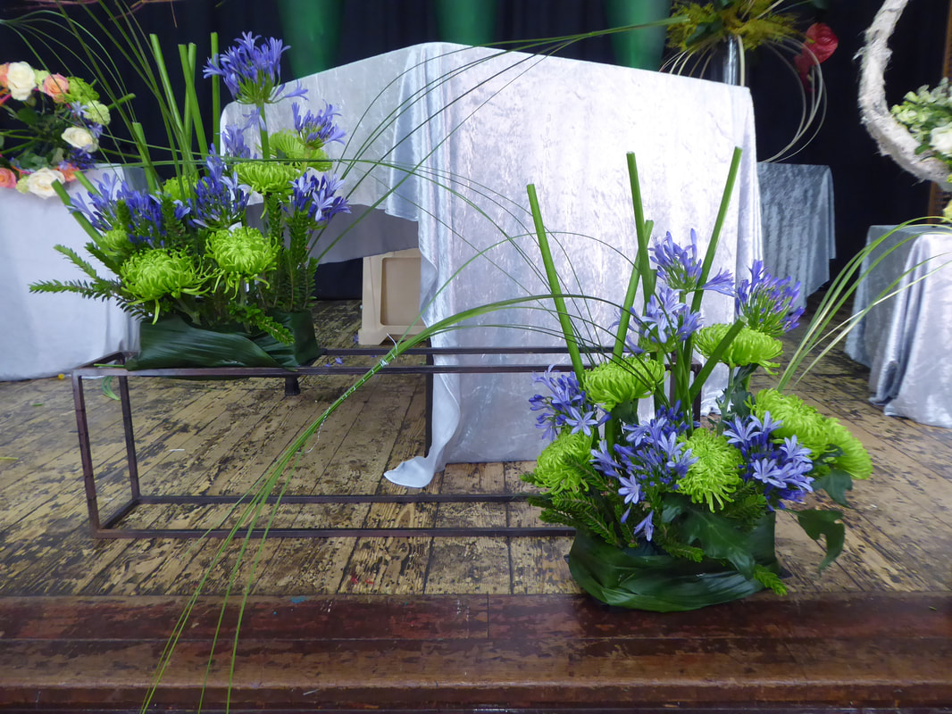
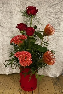
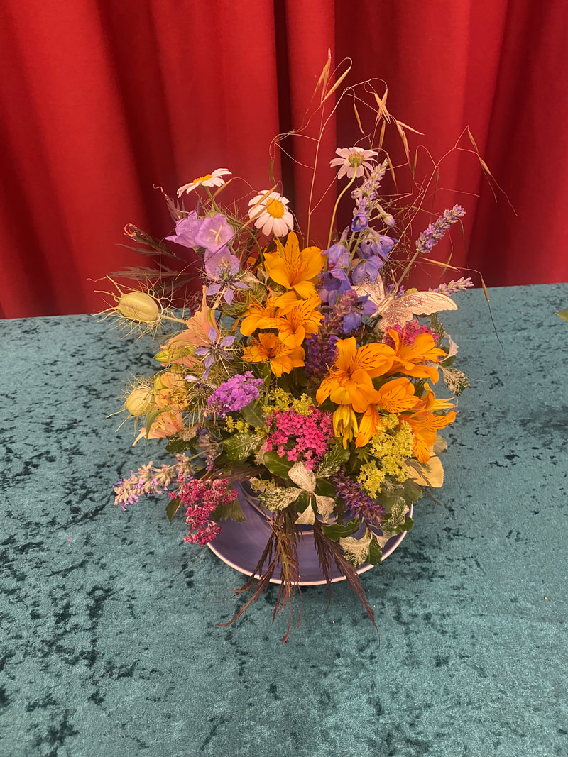
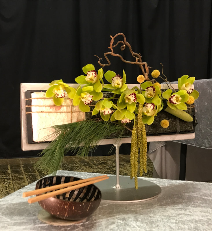
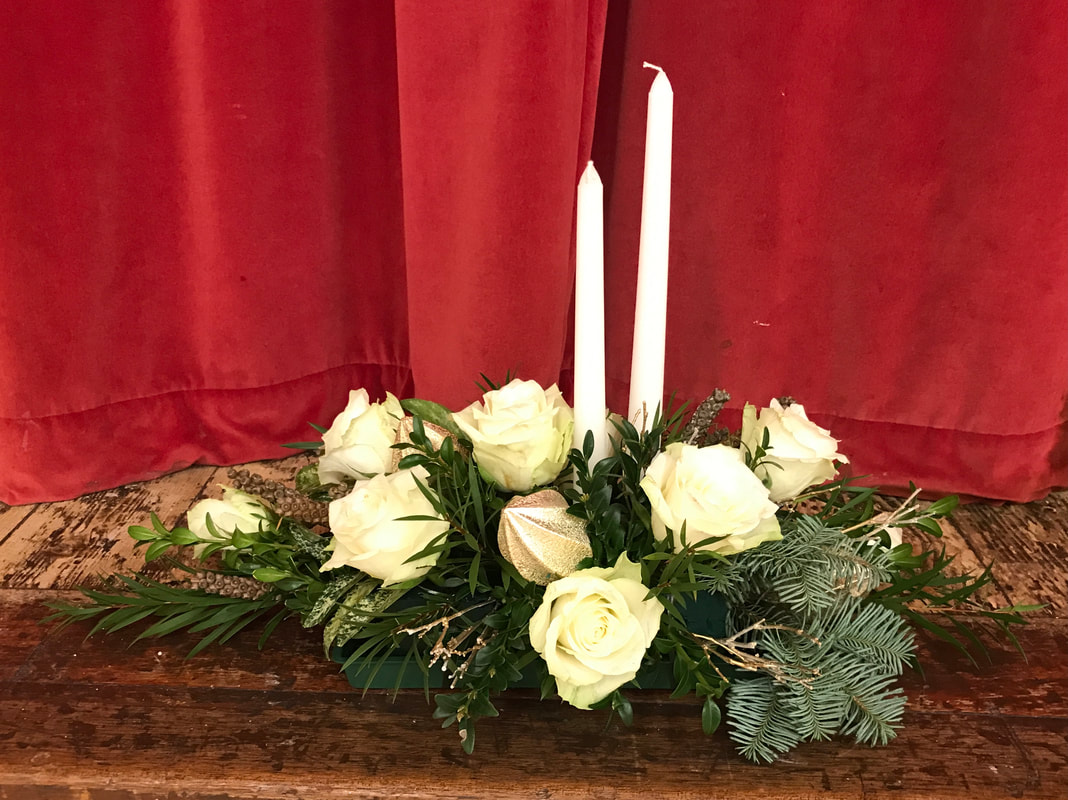
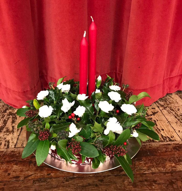
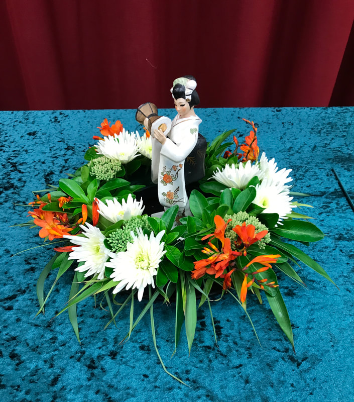
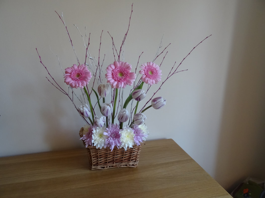
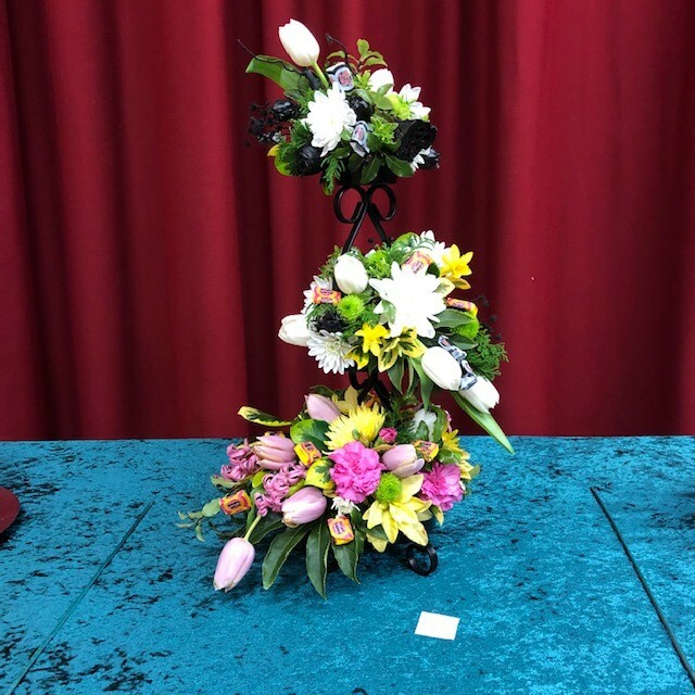
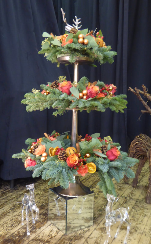
Title - "Three's Company"
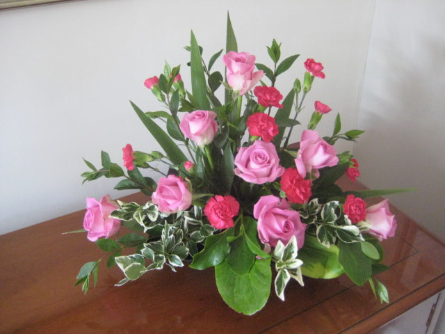
Judges Cup won by Barbara Tucker (Photo 1)


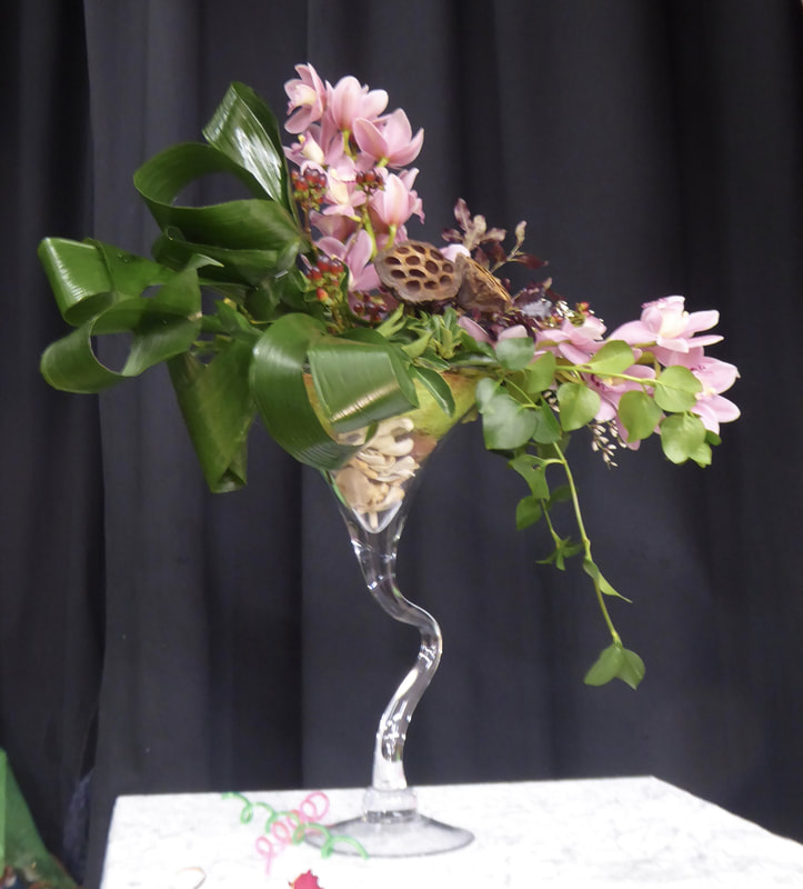
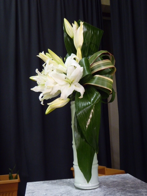
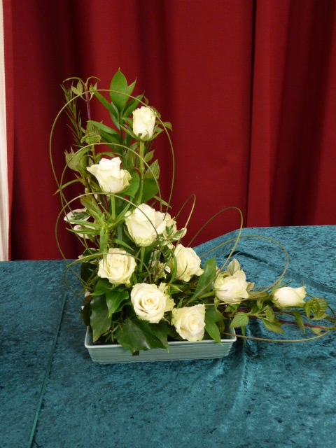
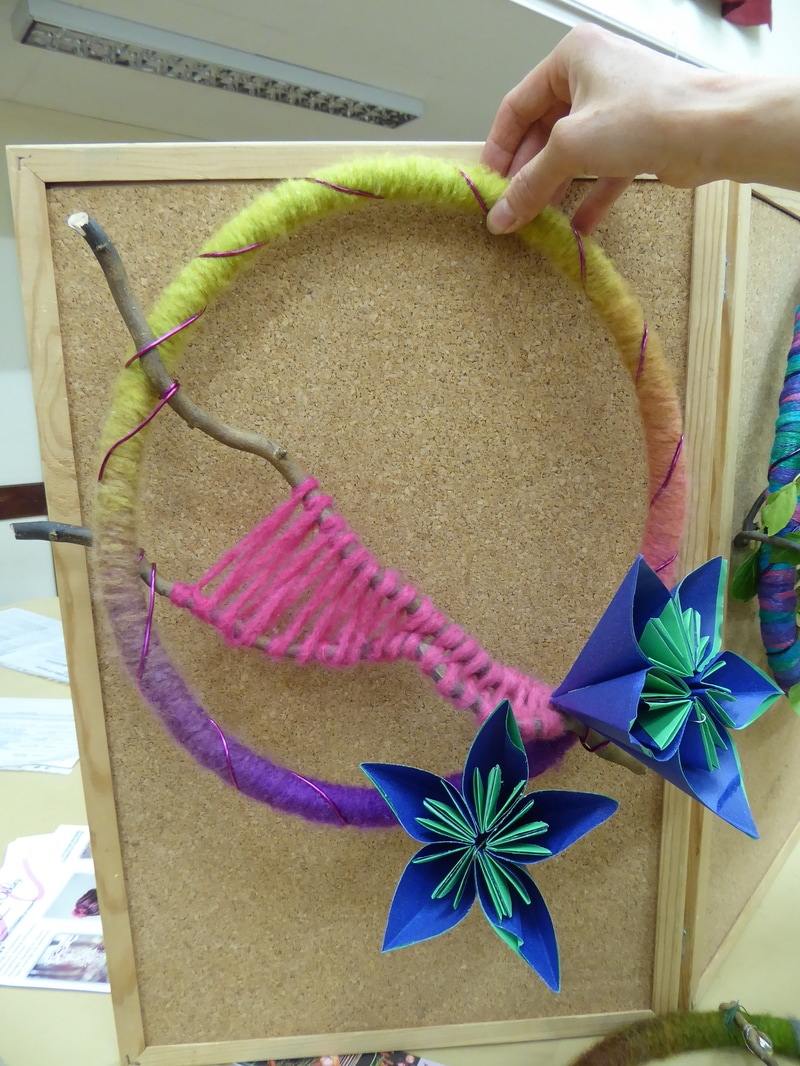
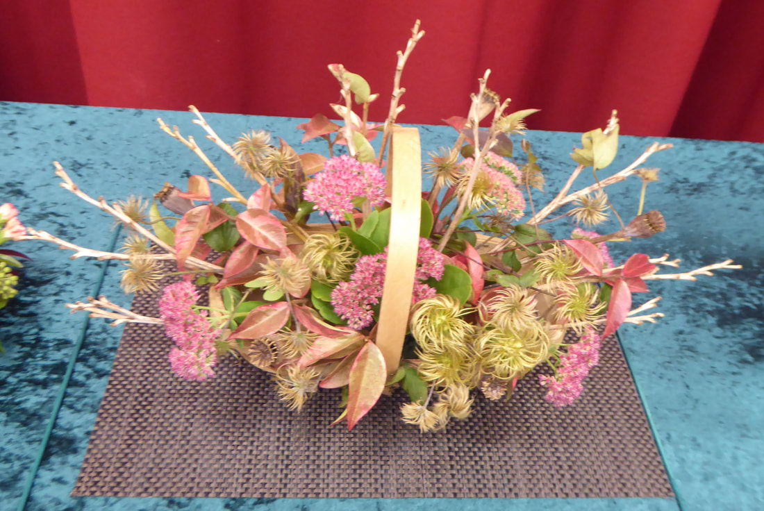
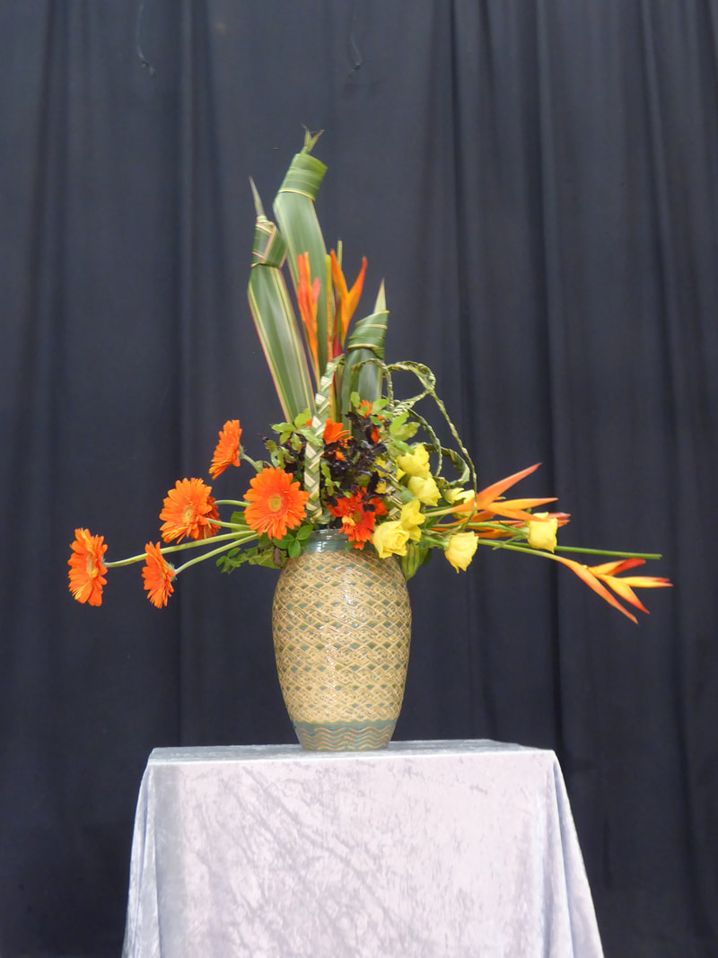
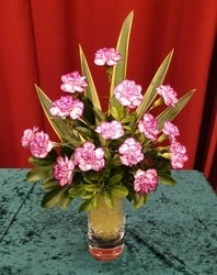
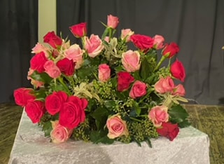
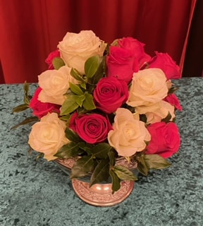
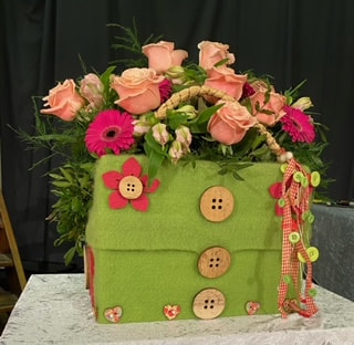
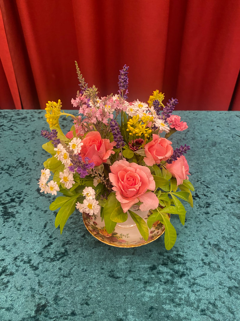
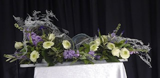
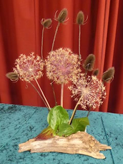
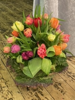
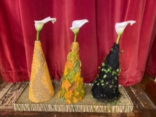
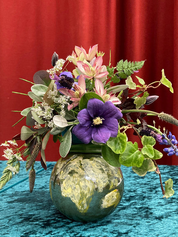
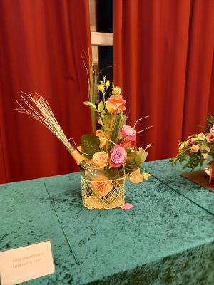
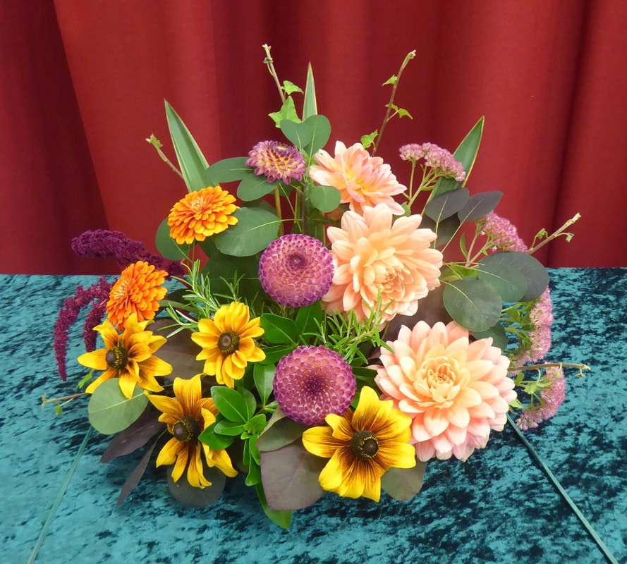
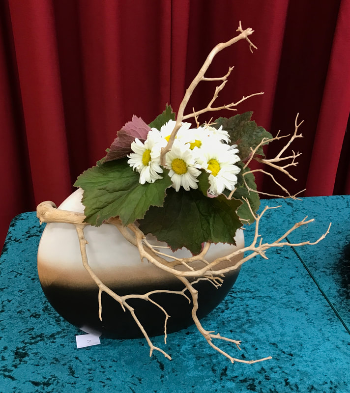
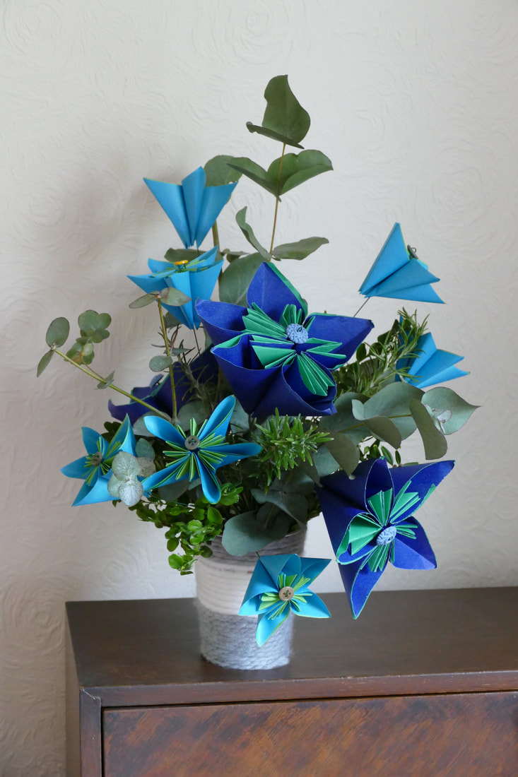
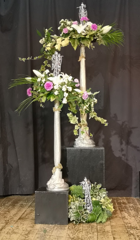
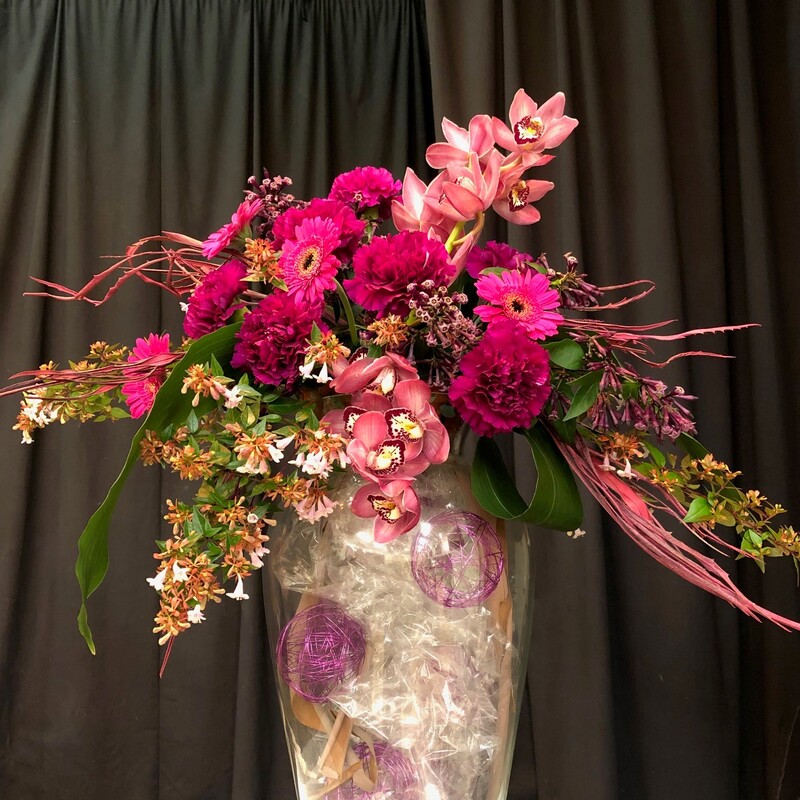
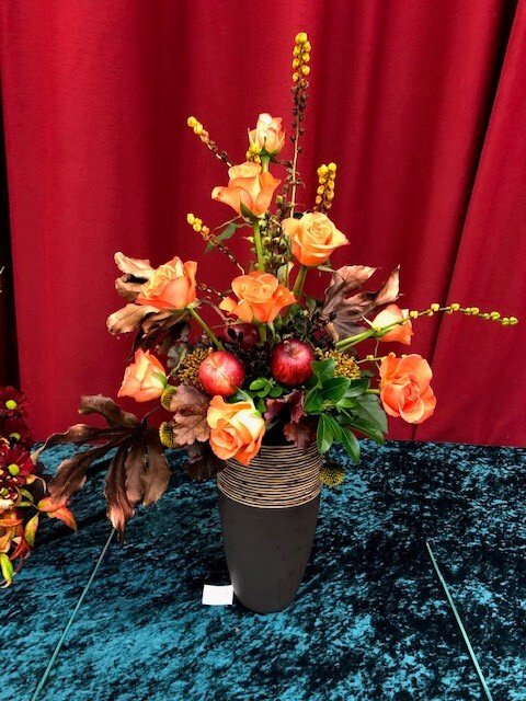
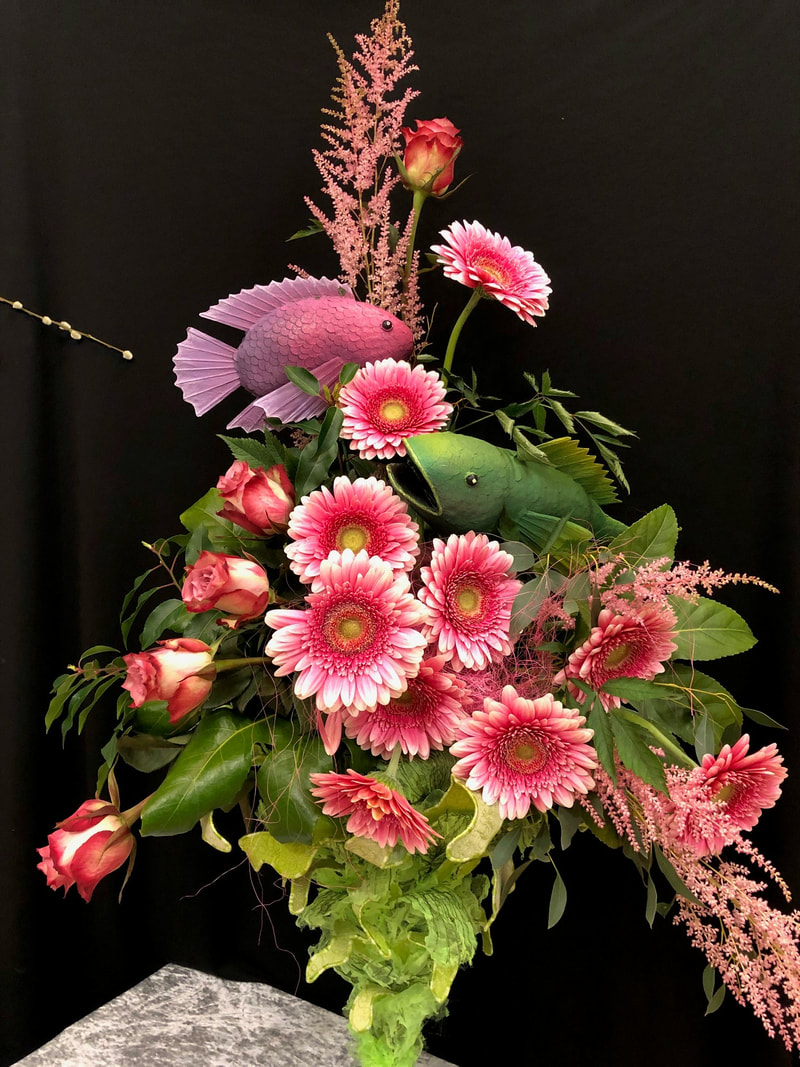
18th June 2024
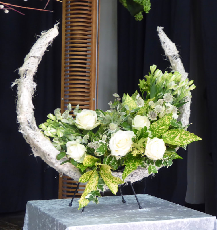
Demonstrator - Kim Zimmerman
Title - "A Summer Sensation"


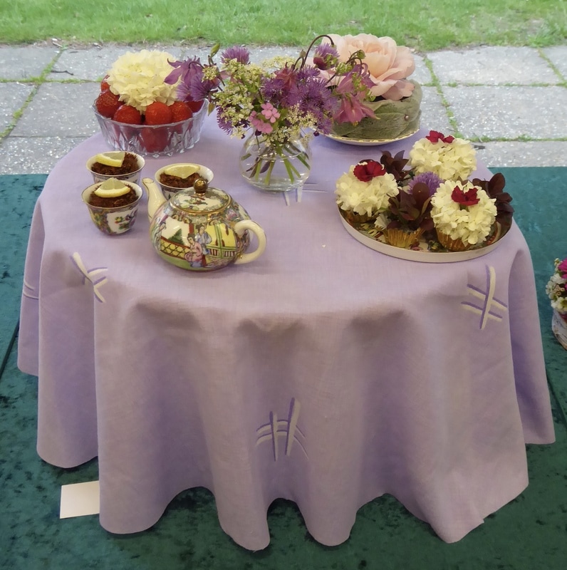
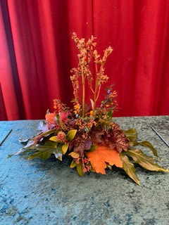
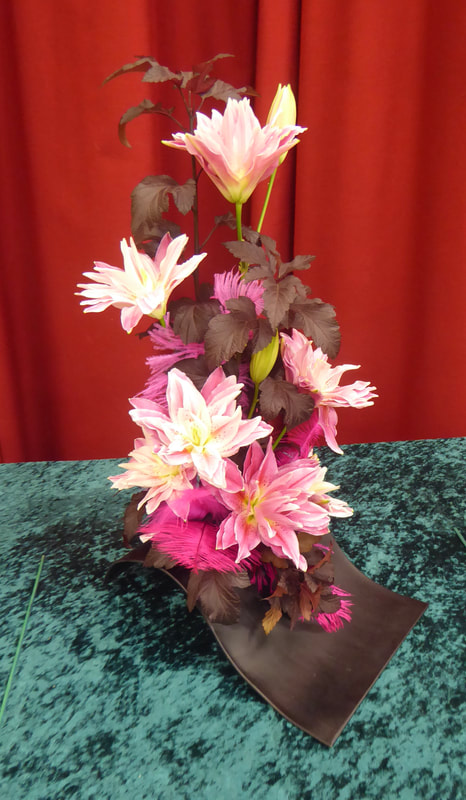
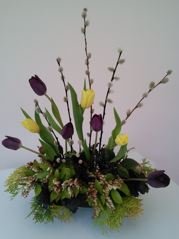
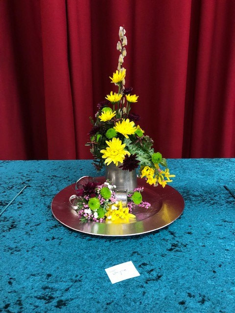
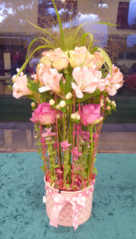
Club Competition
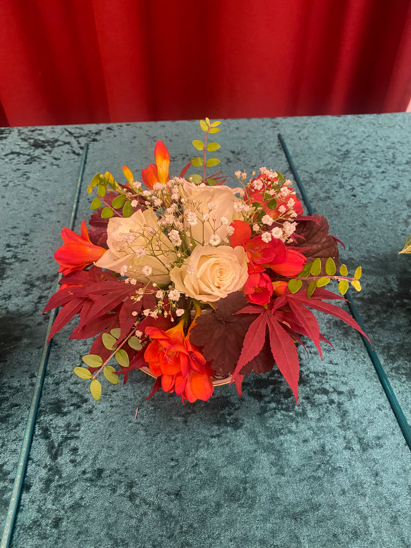
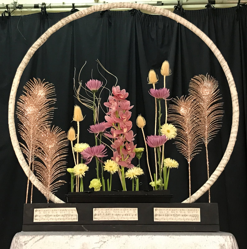
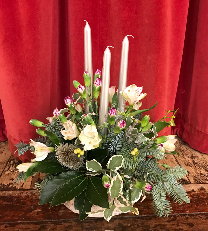
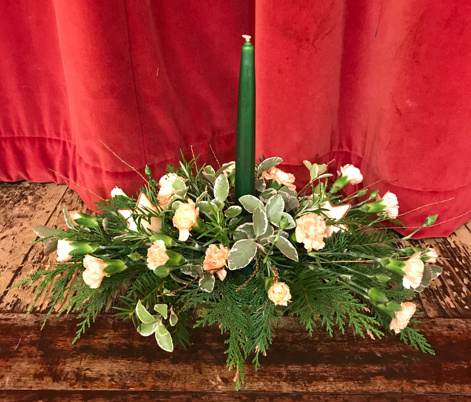
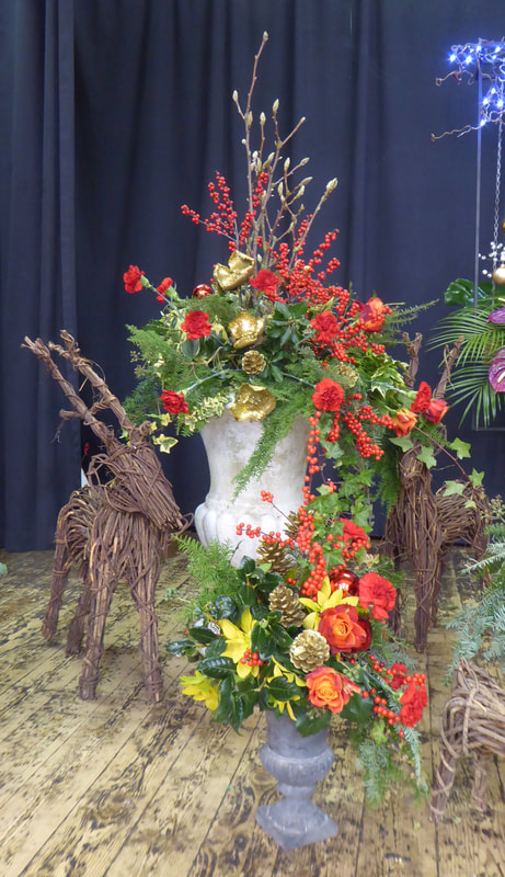
Title - "Double Up"
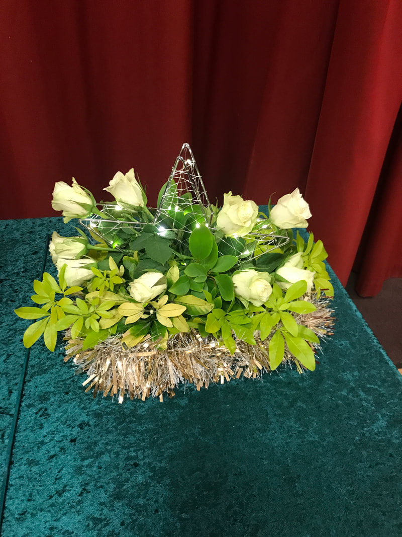
Judges Cup won by Lesley Etherton (Photo 1)


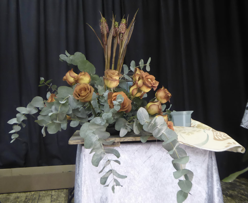
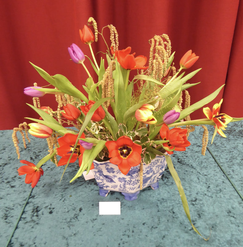
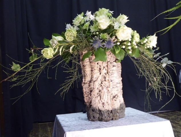
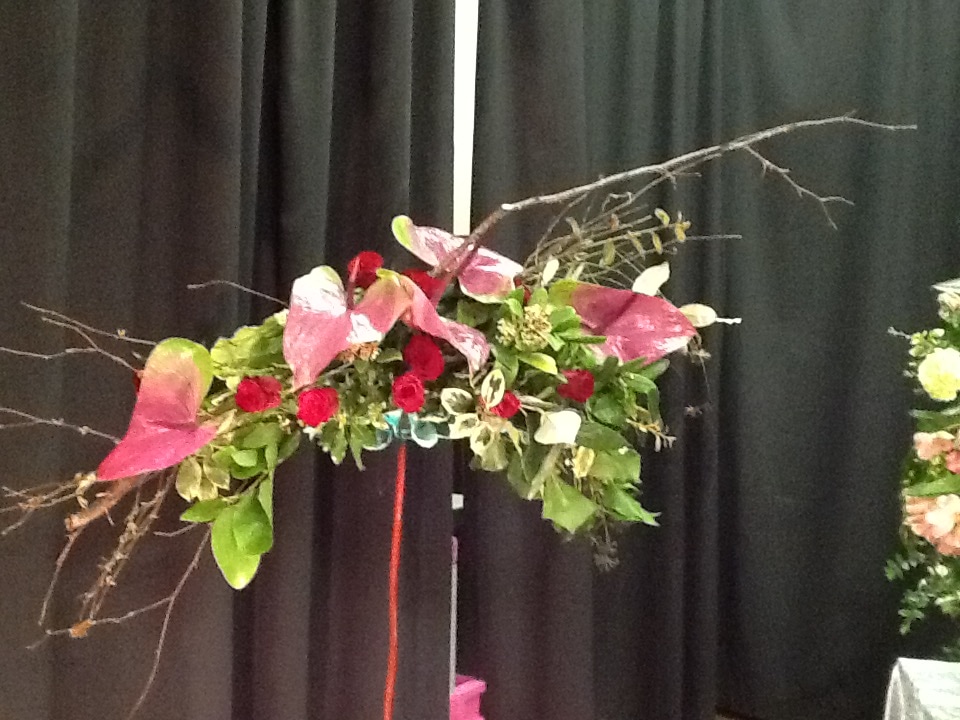
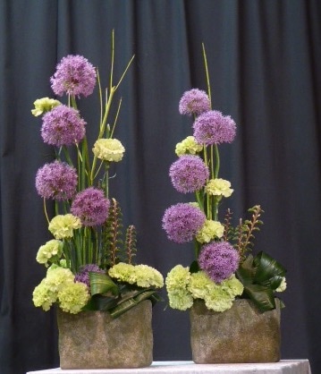
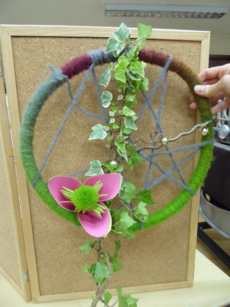
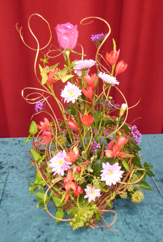
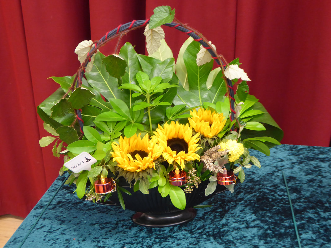
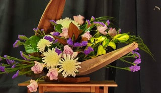
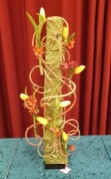
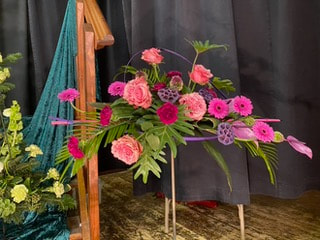
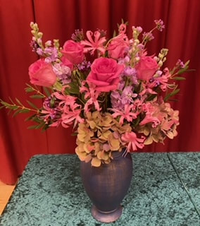
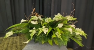
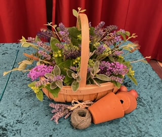
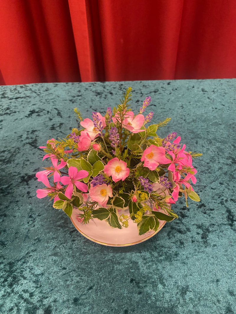
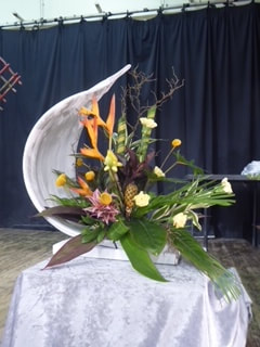
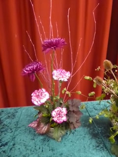
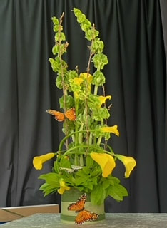
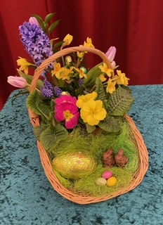
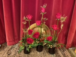
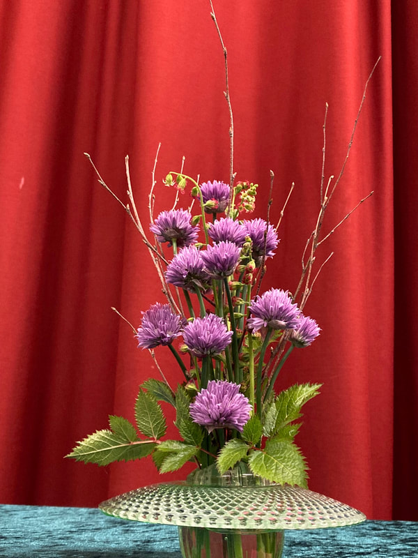
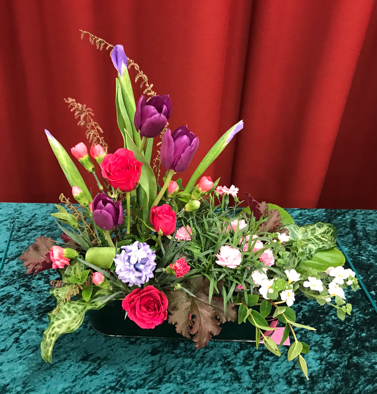
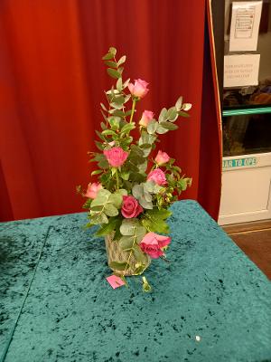
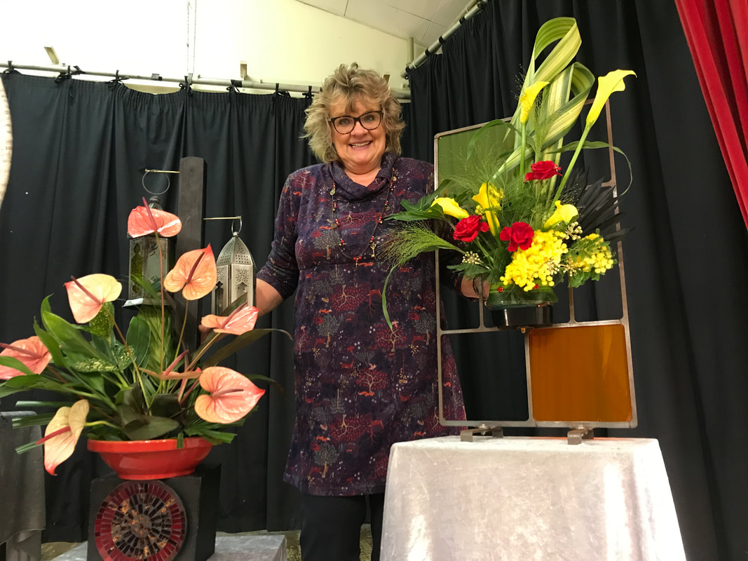
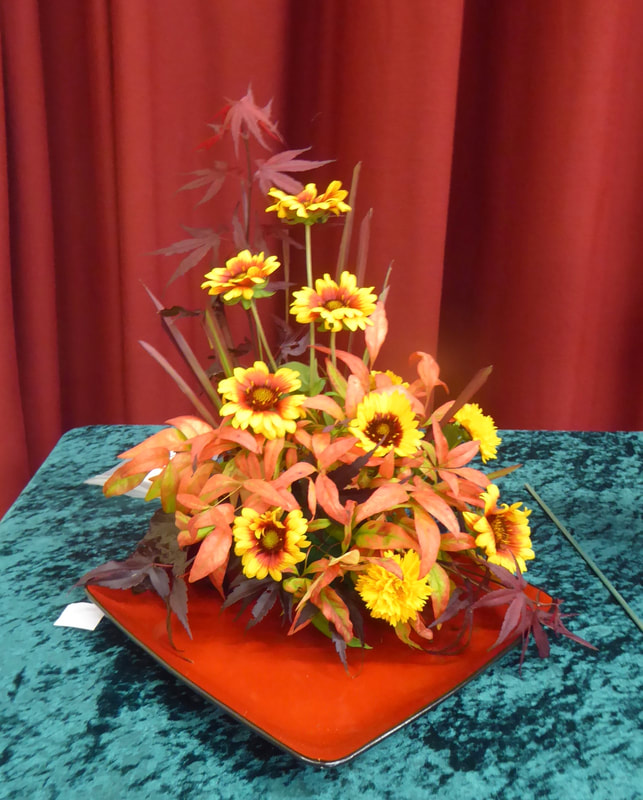
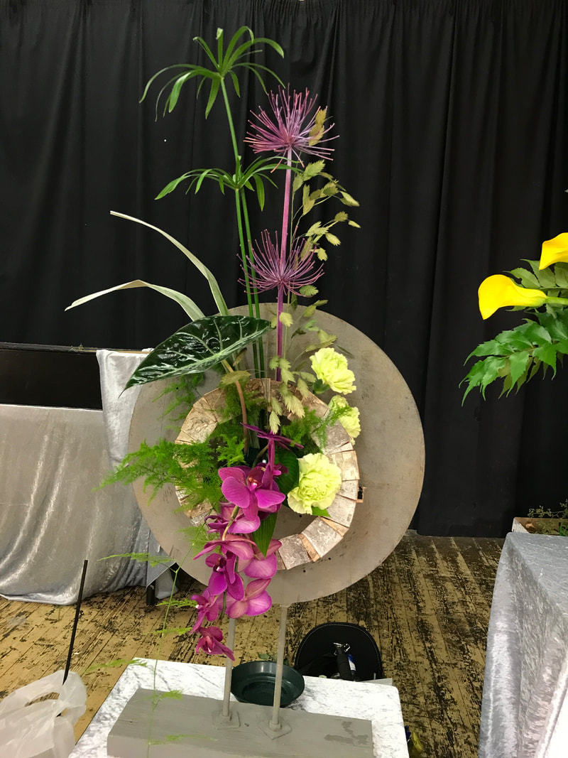
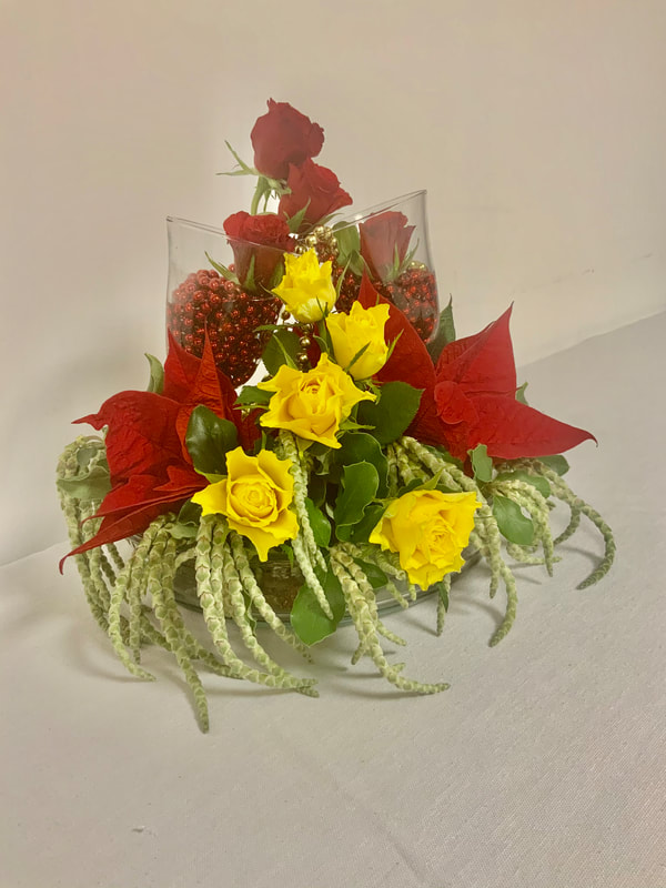
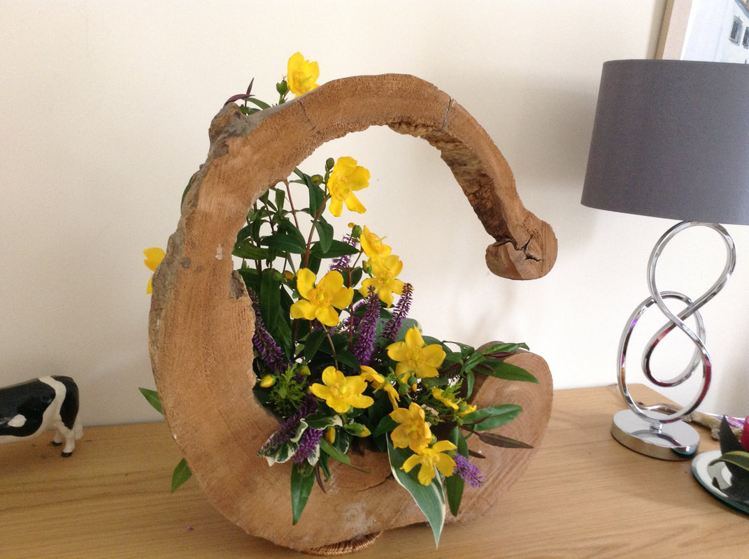
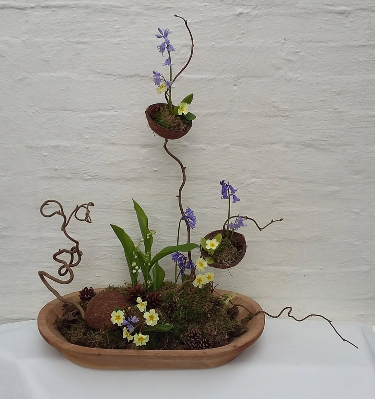
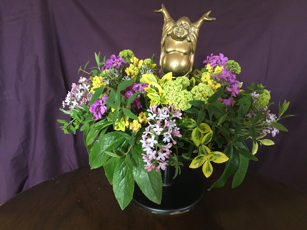
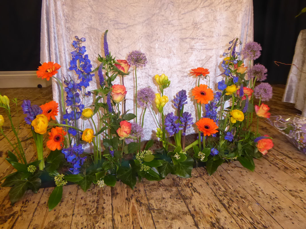
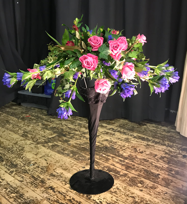
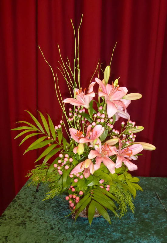
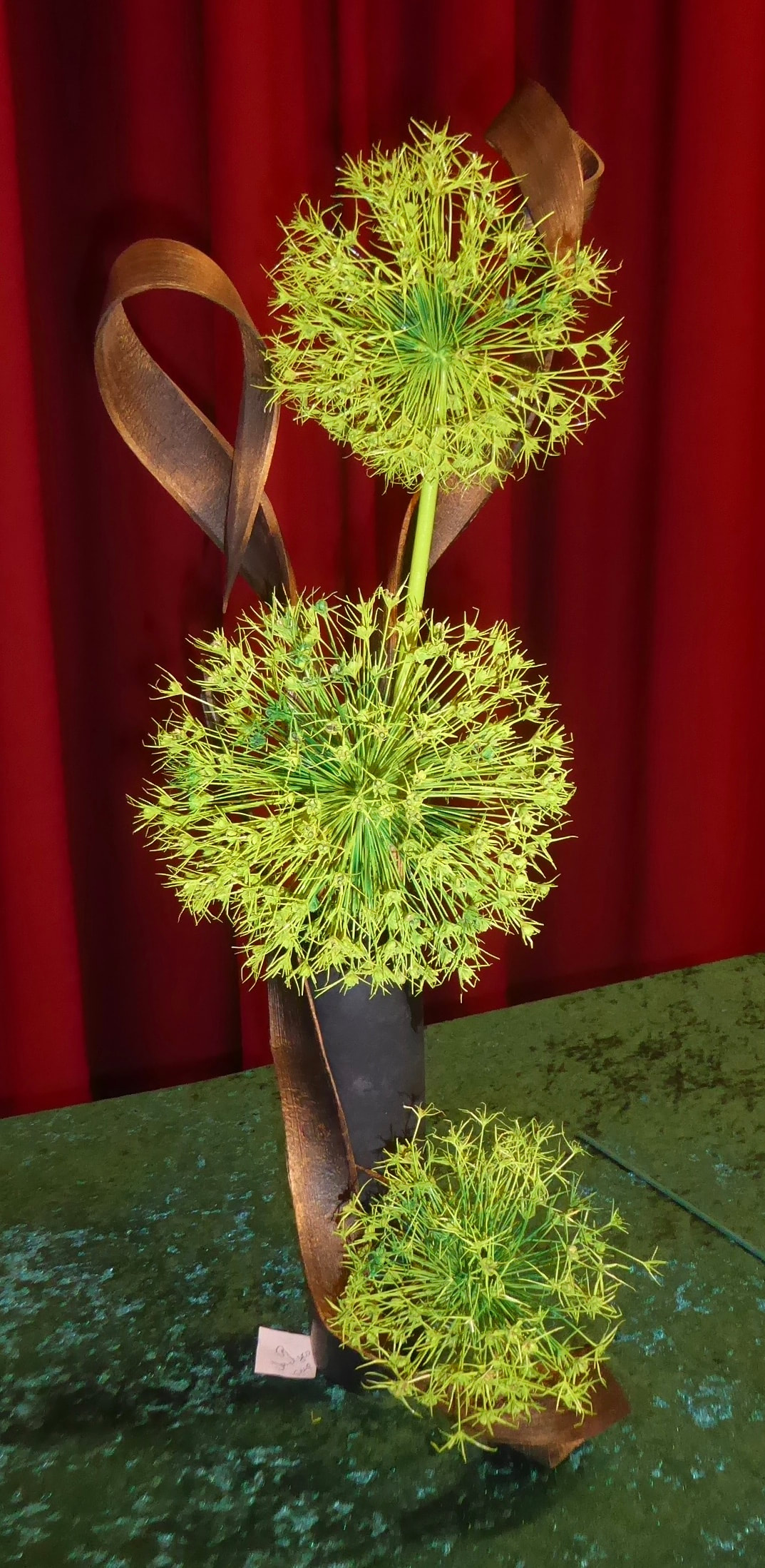
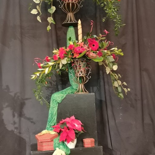
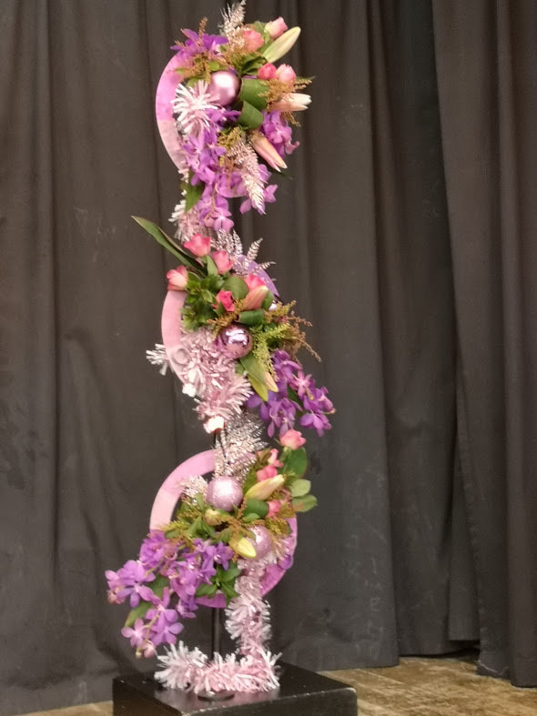
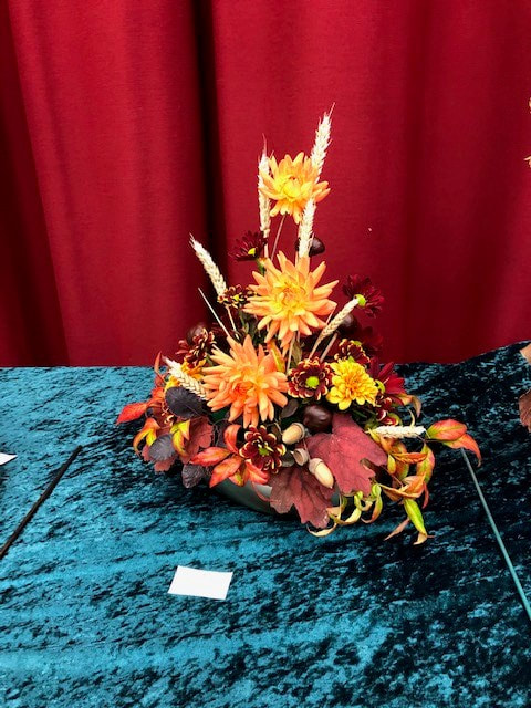
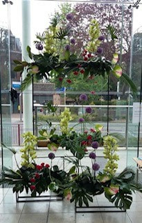
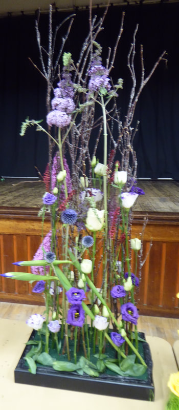
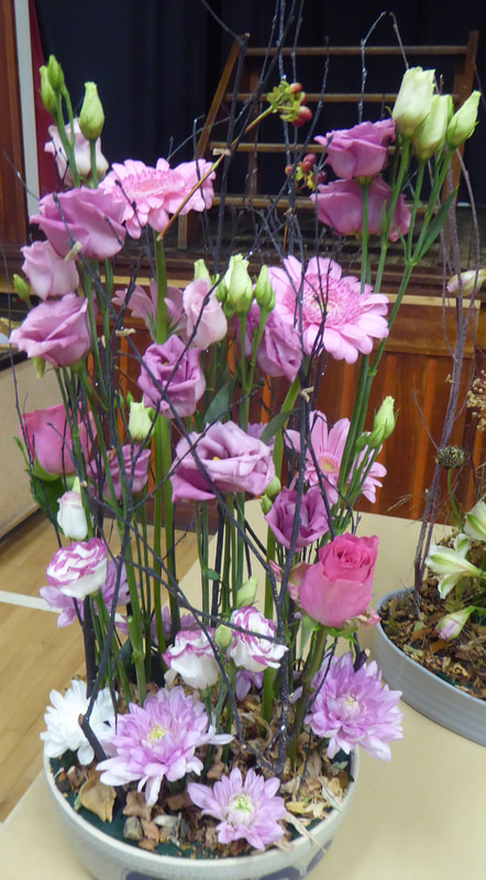
21st May 2024
Demonstrator - Eleanor Bracken
Title - "The Magic of Spring"


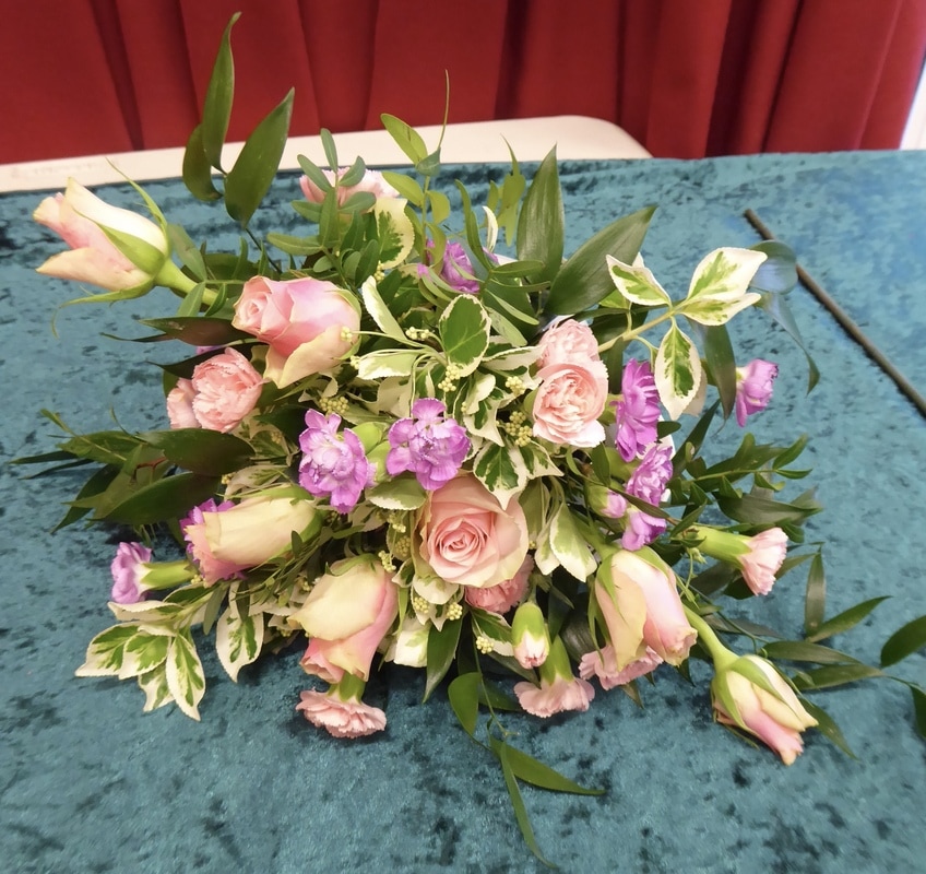
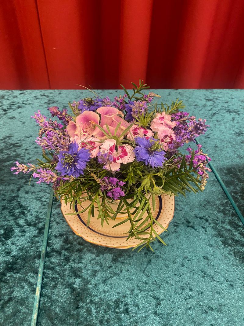
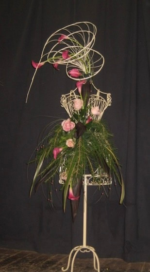
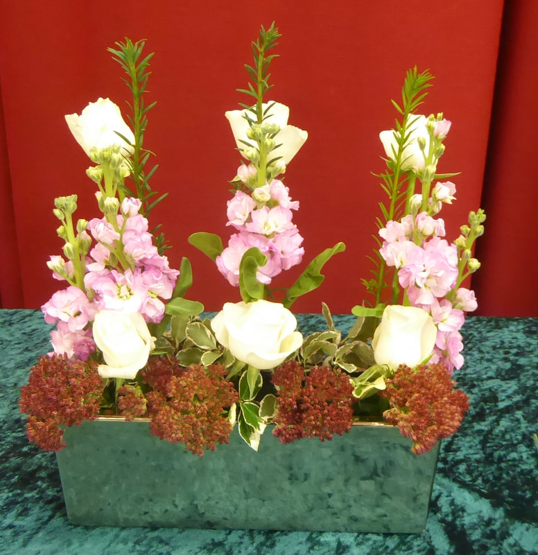
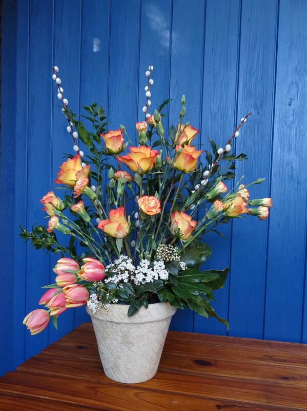
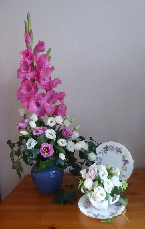
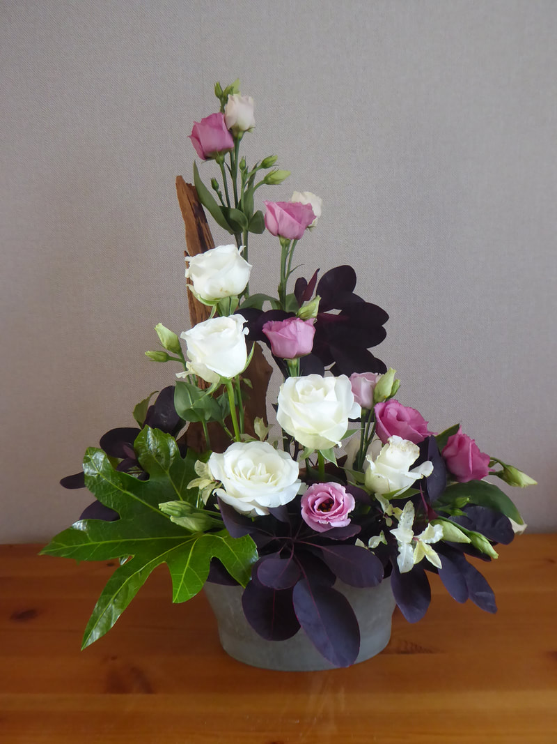
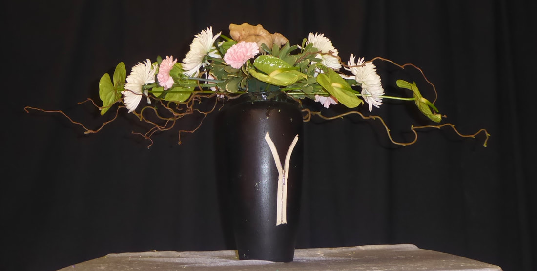
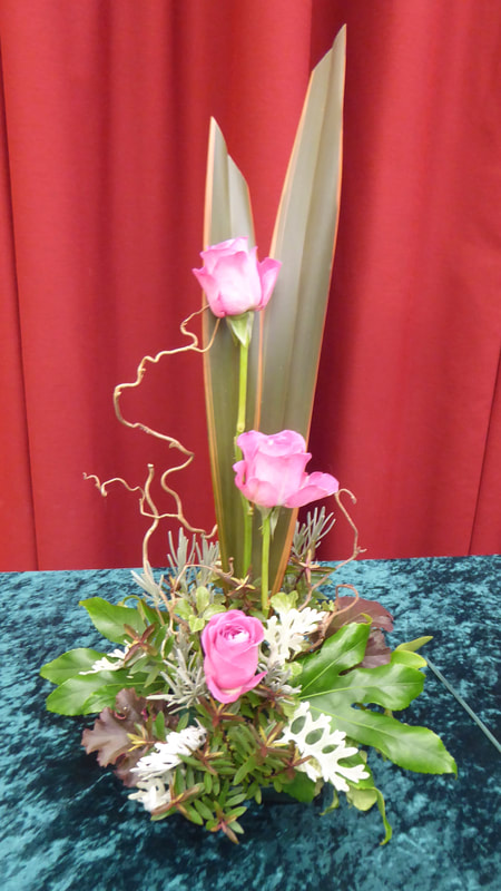
Club Competition
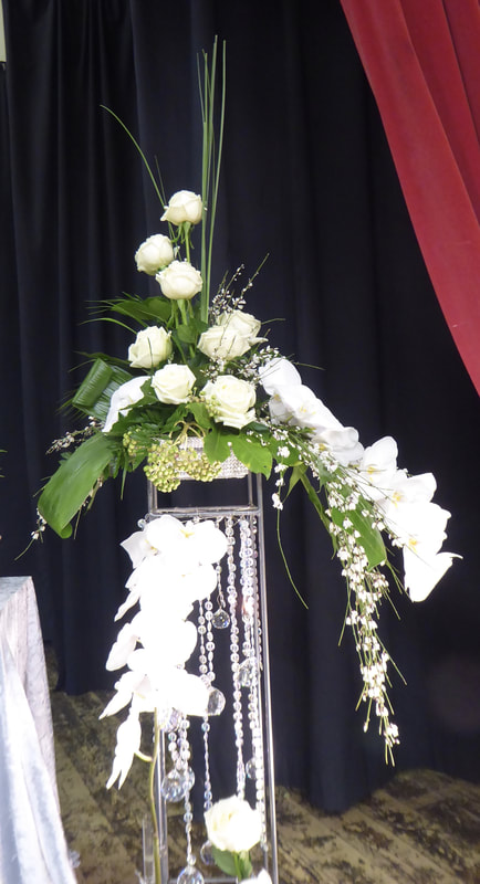
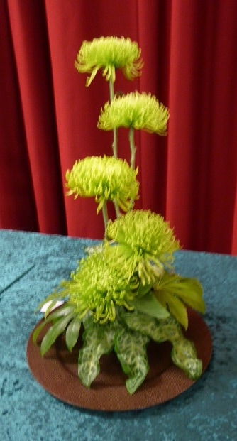
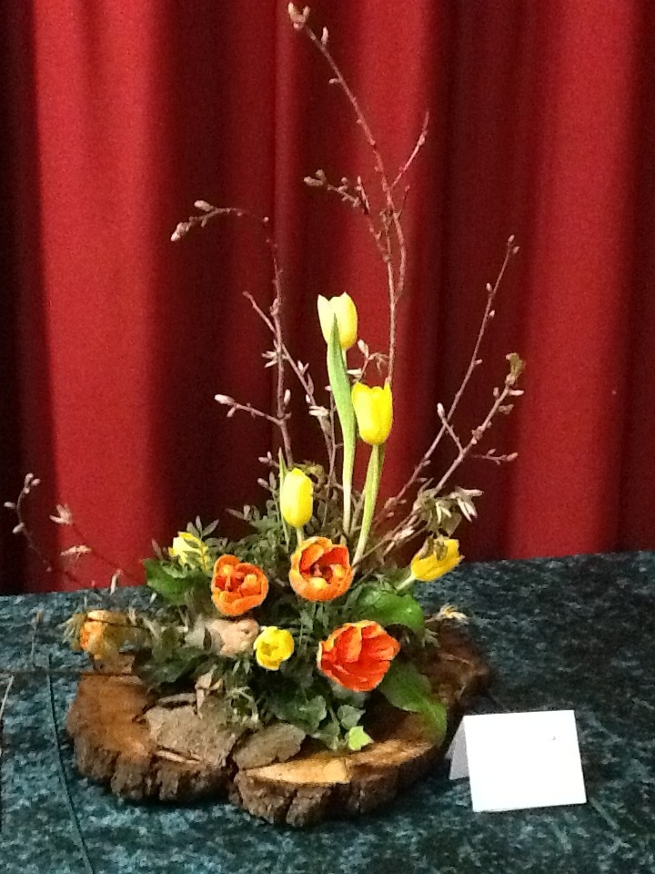
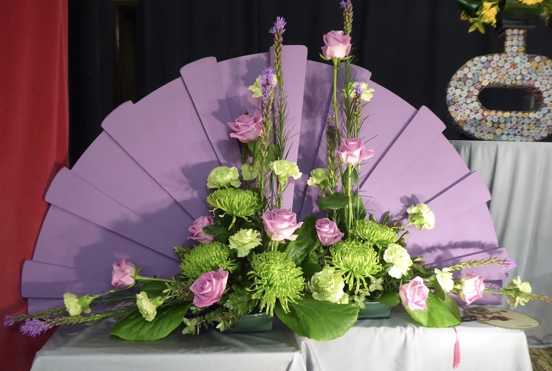
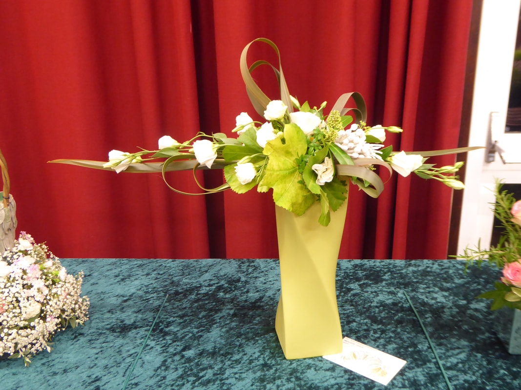
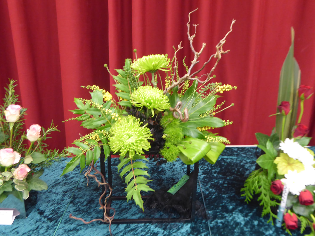
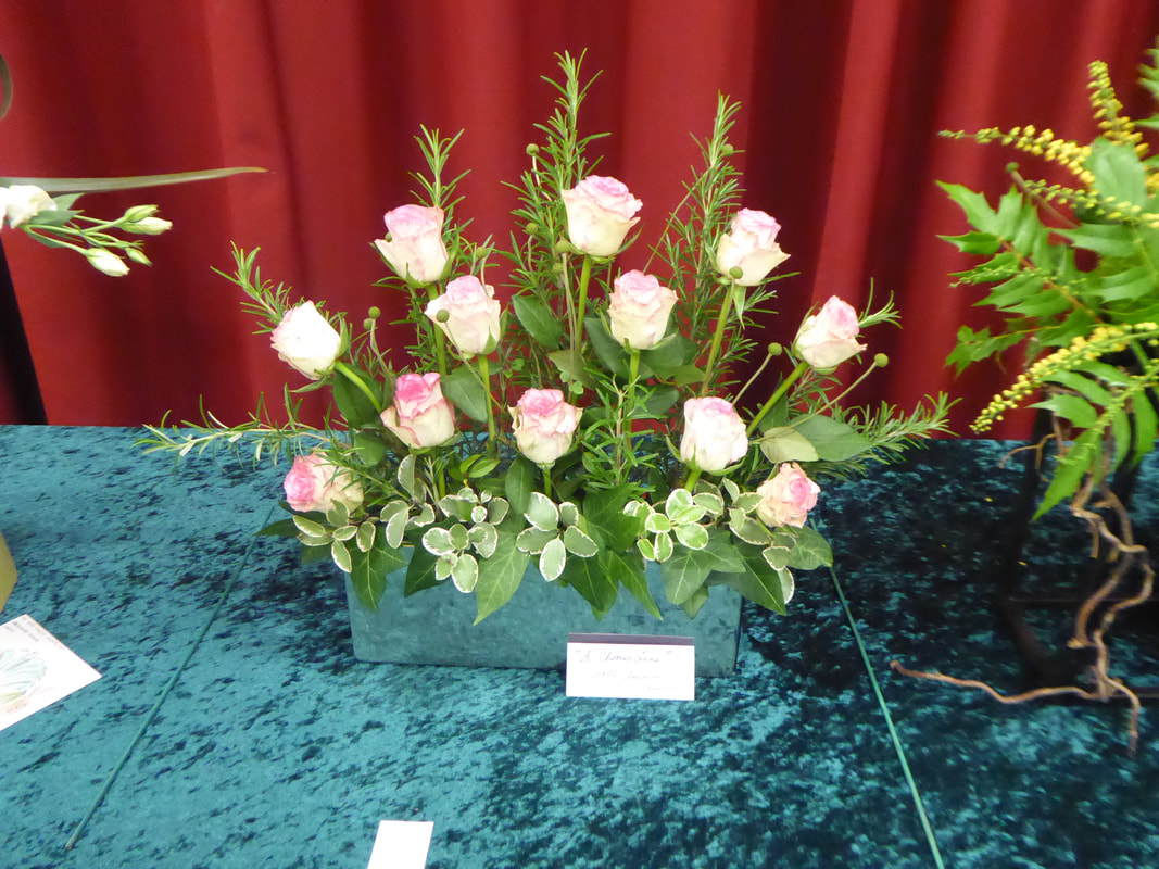
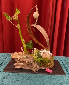
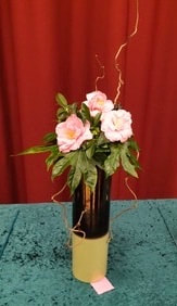
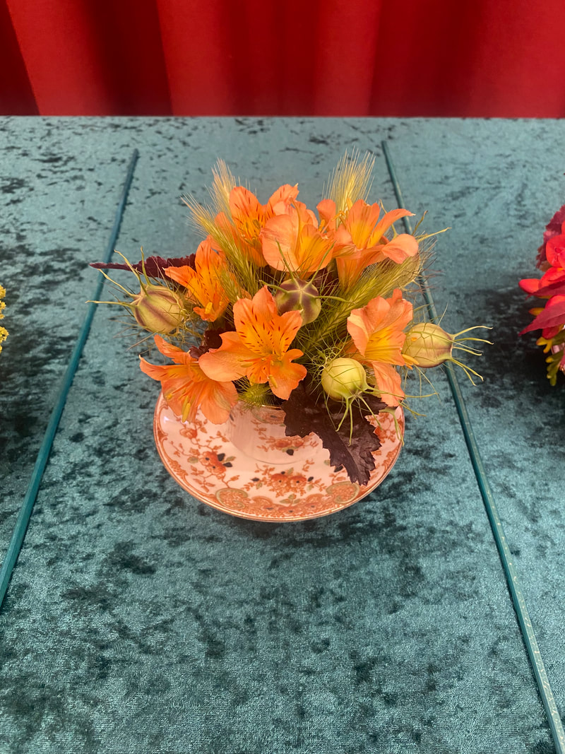
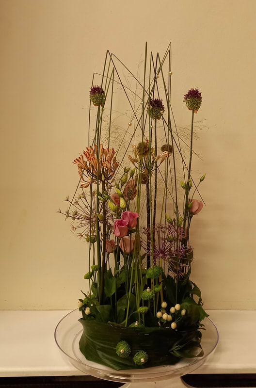
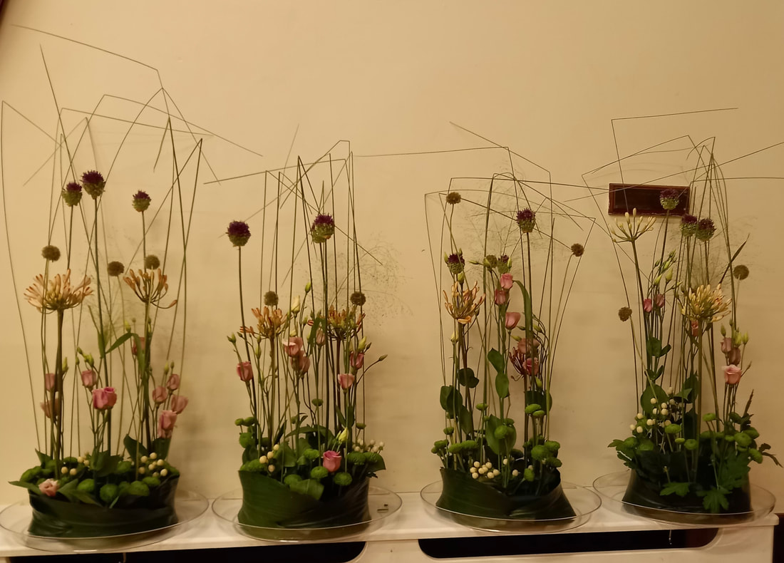
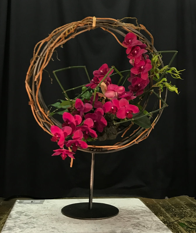
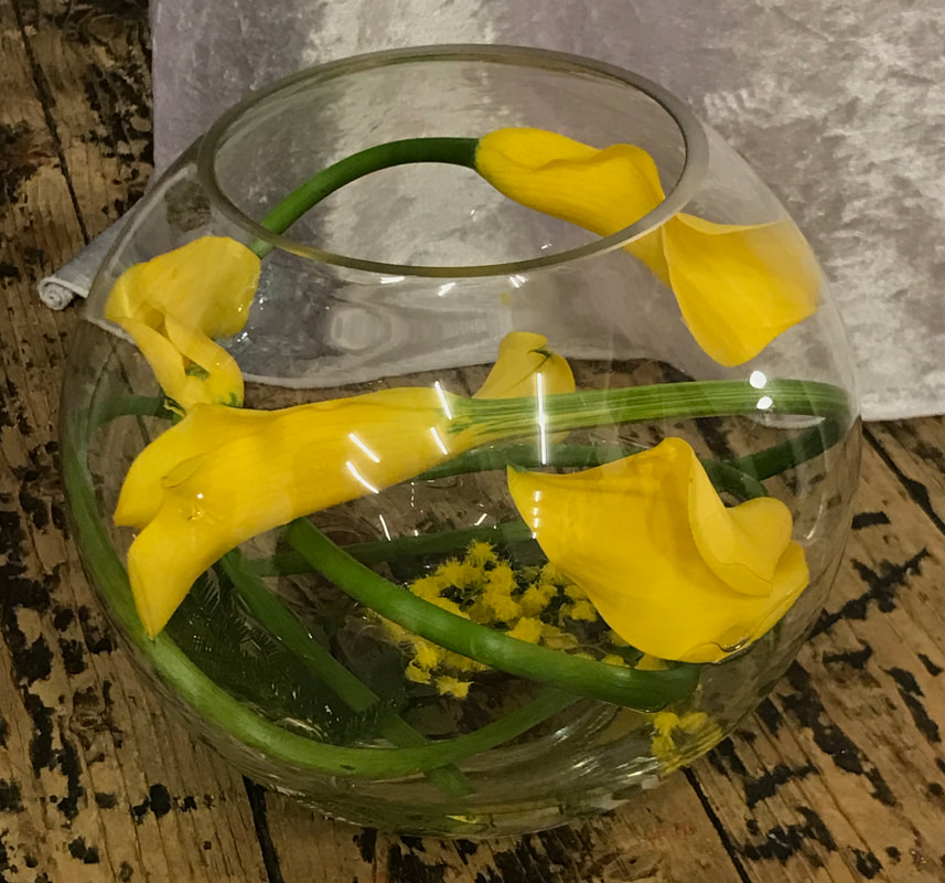
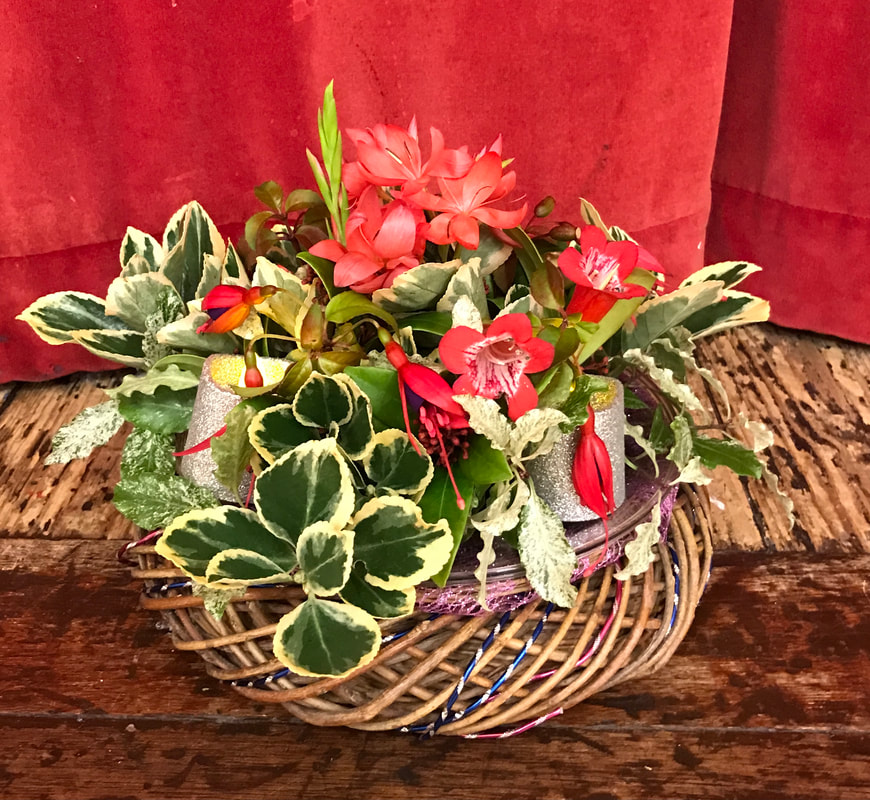
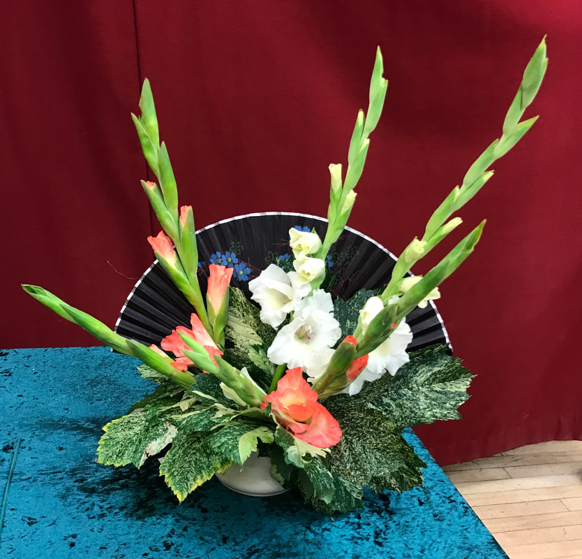
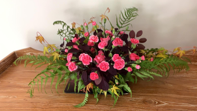
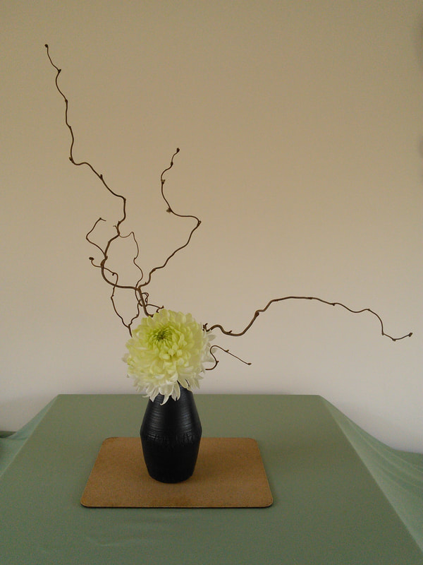
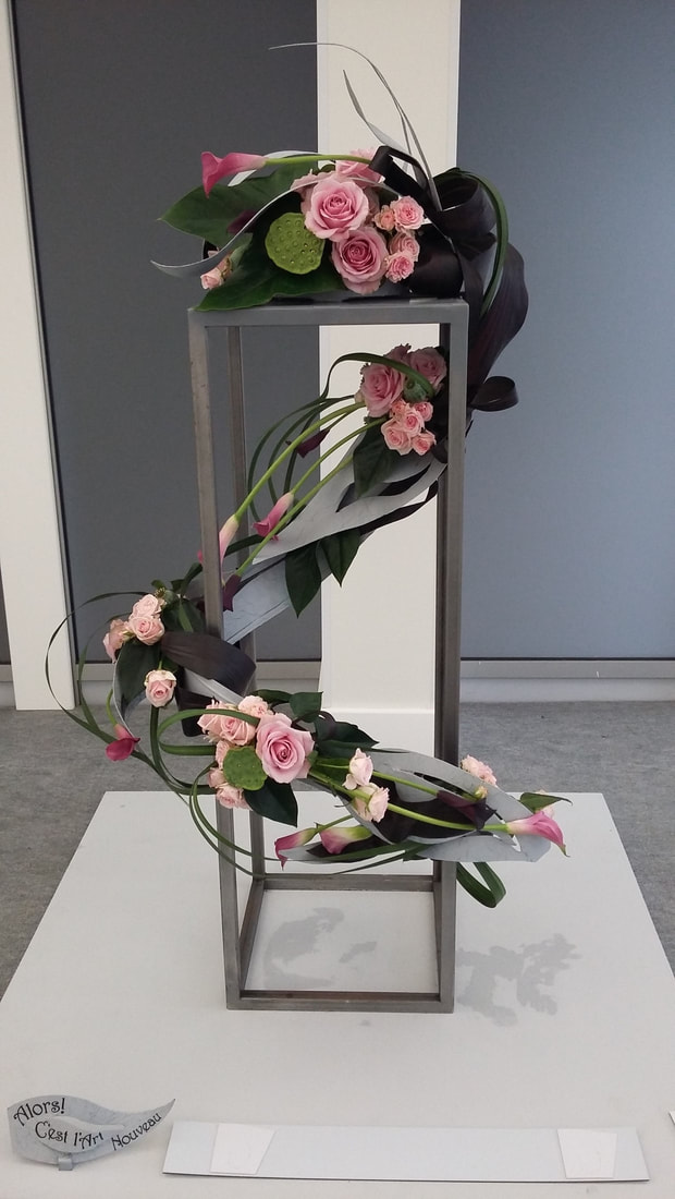
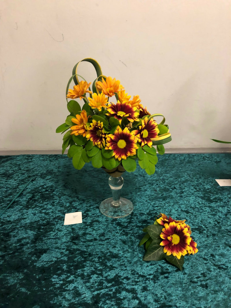
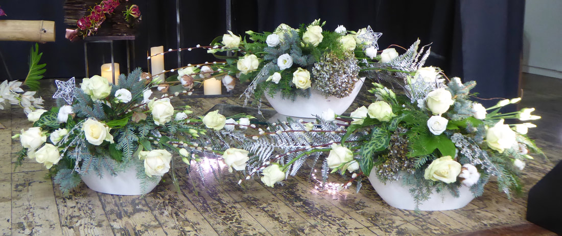
Title - "Twists and Turns"
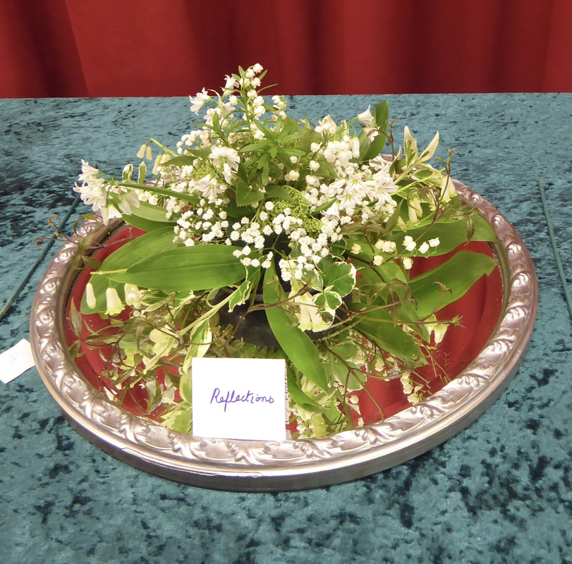
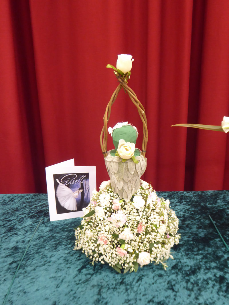
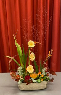
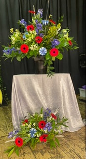
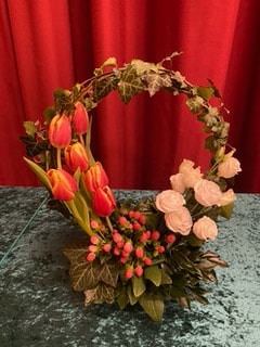
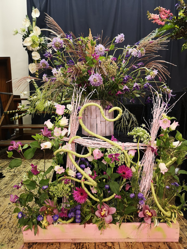
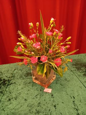
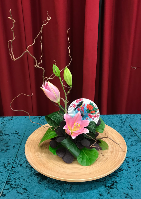
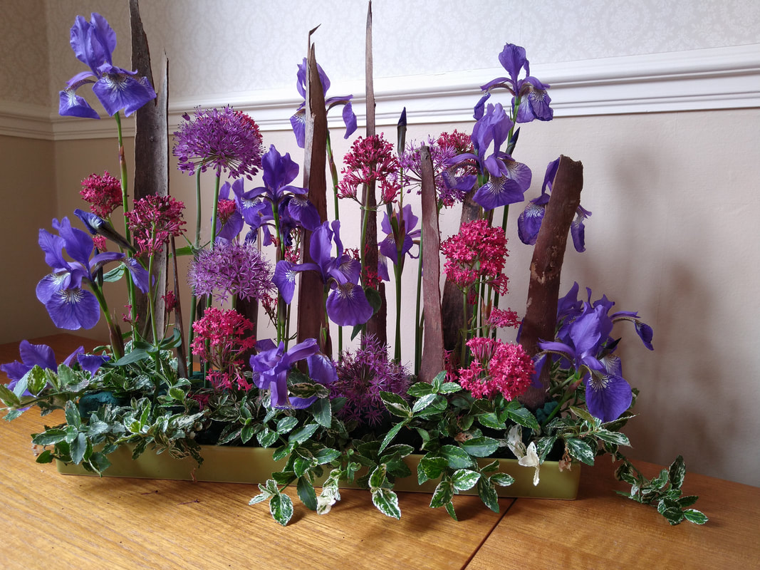
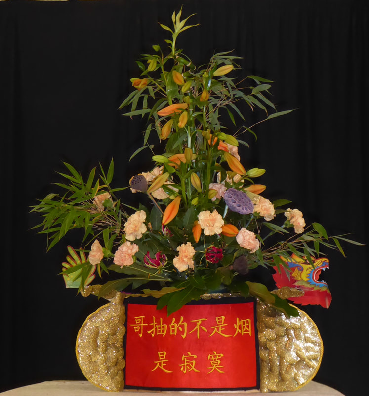
Judges Cup won by Barbara Tucker (Photo 1)


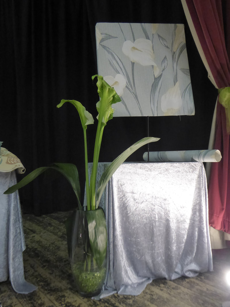
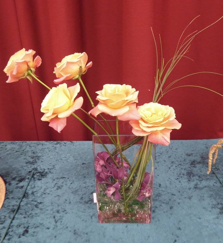
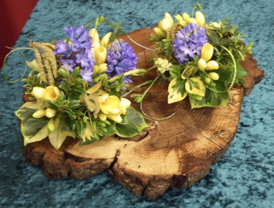
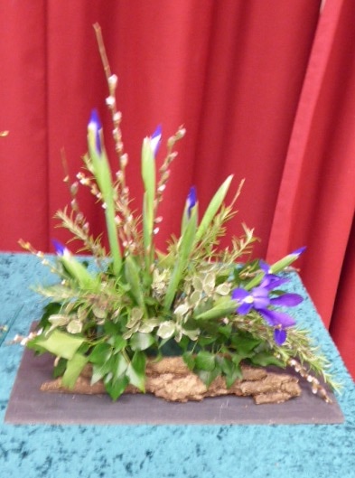
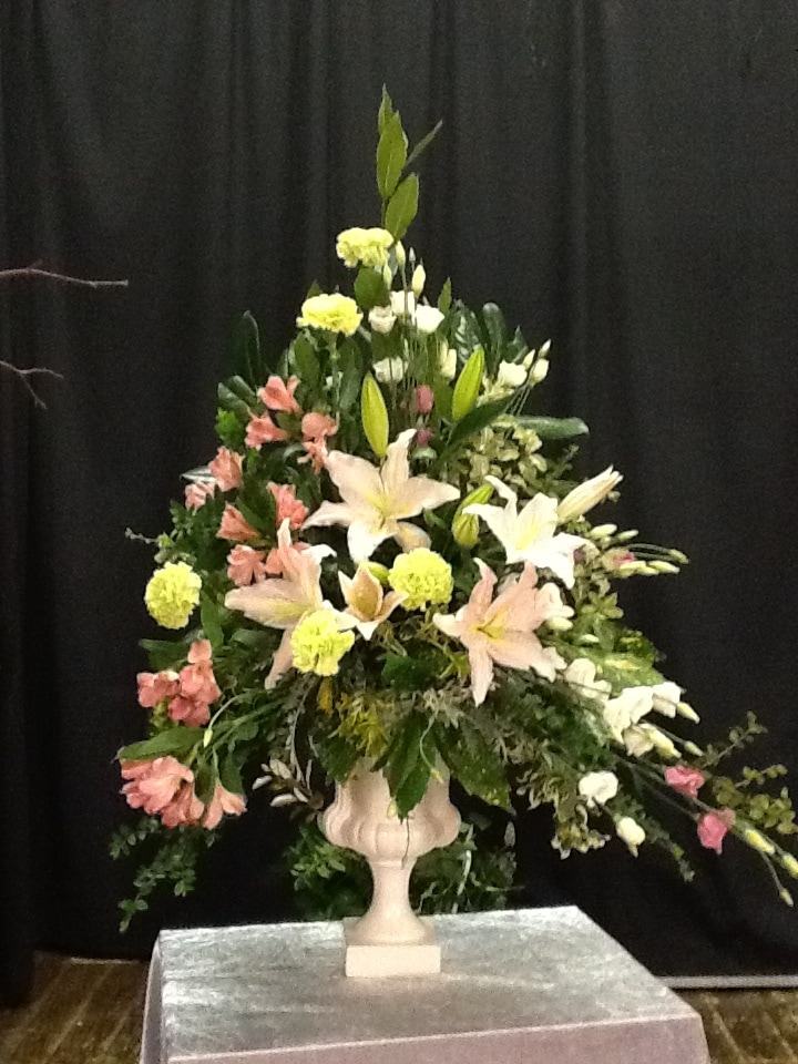
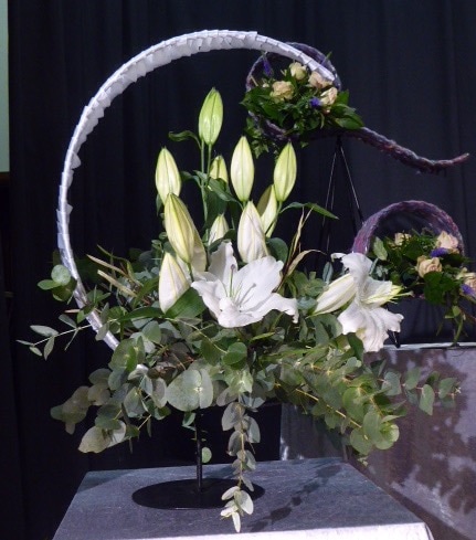
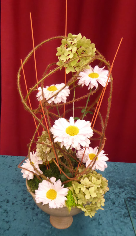
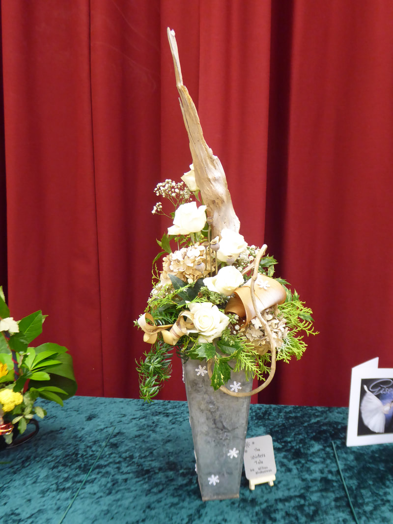
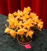
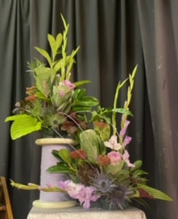
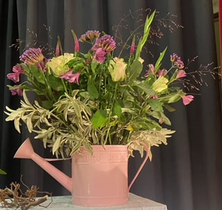
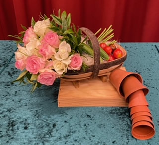
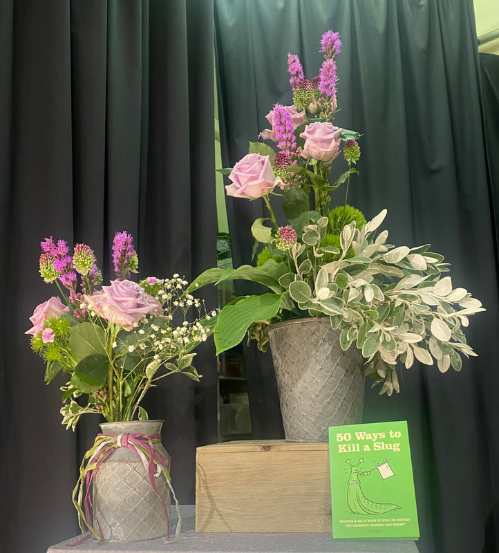
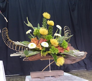
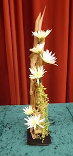
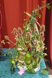
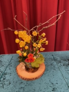
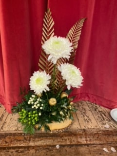
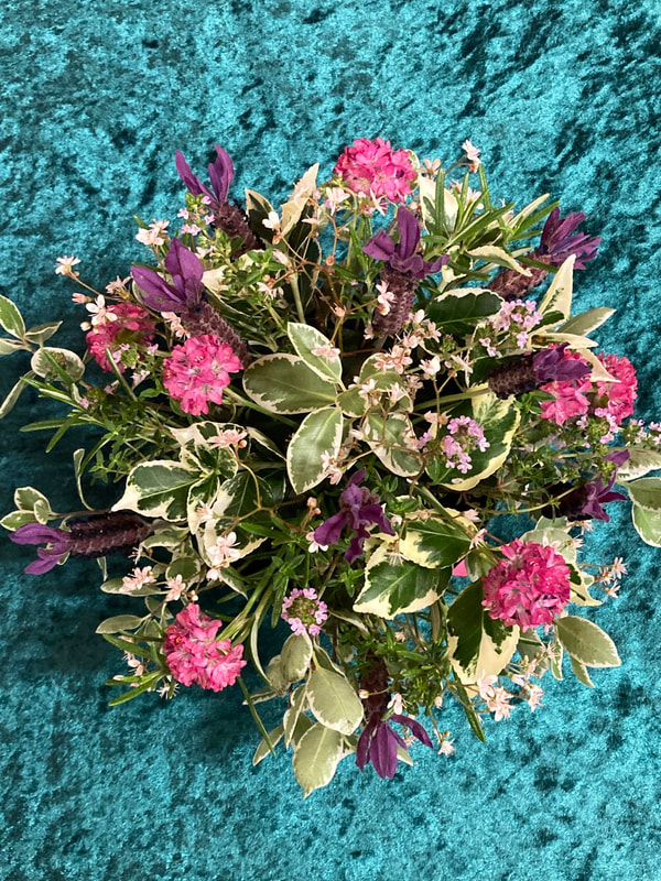
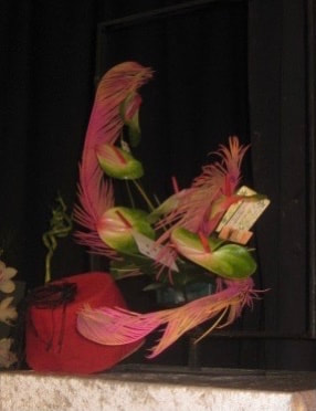
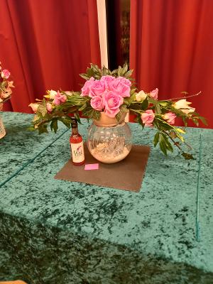
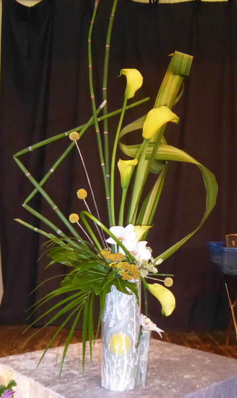
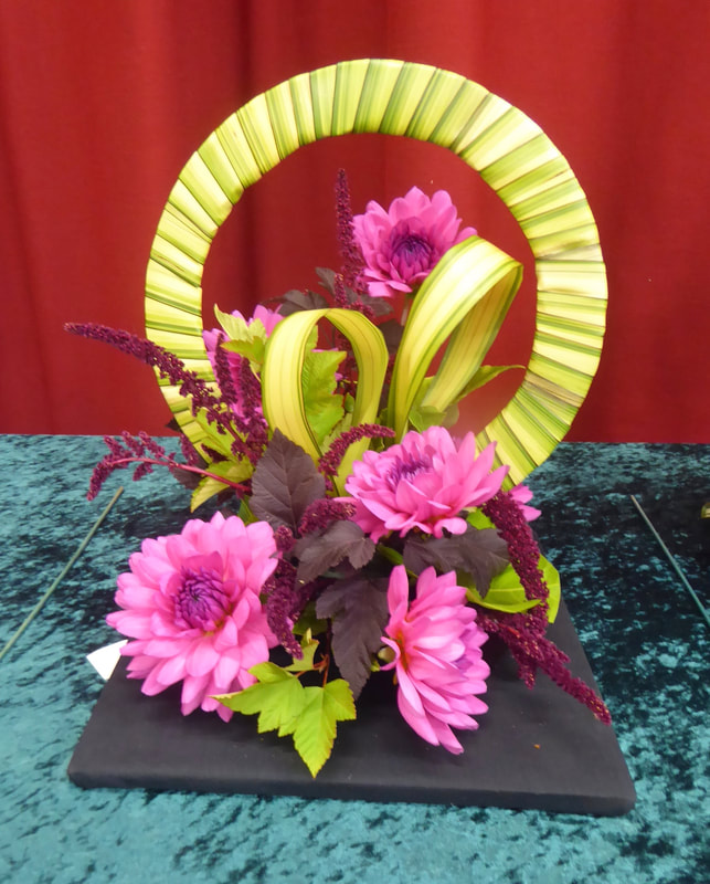
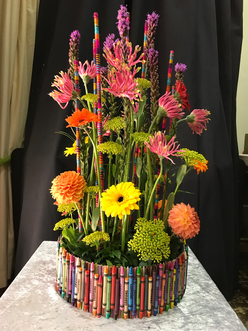
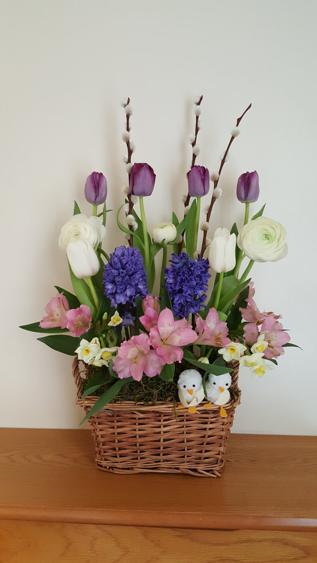
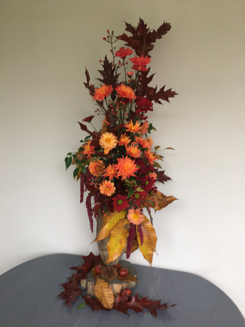
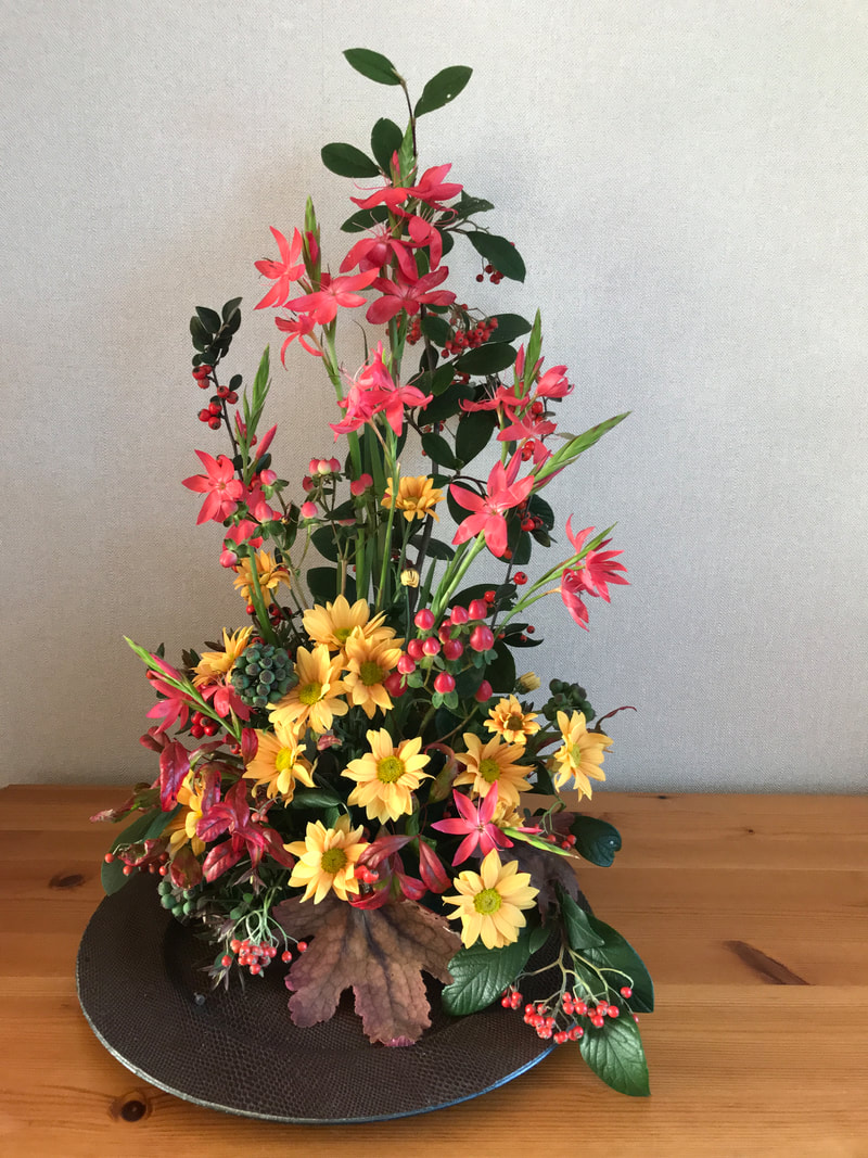
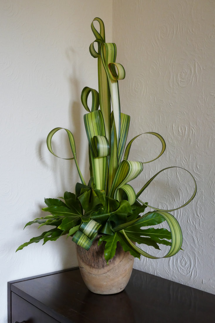
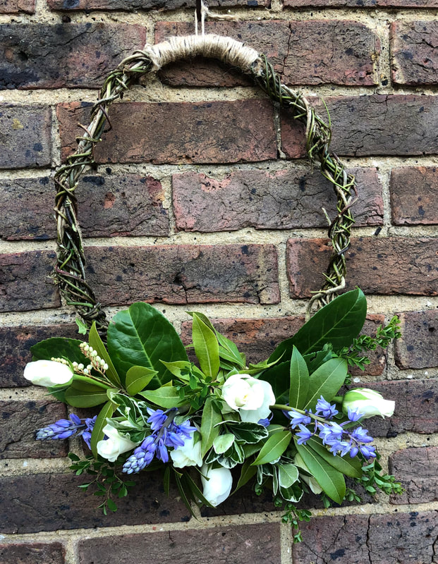
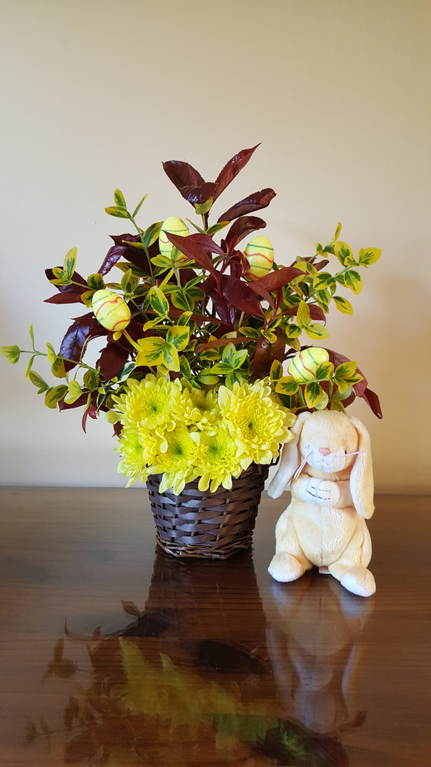
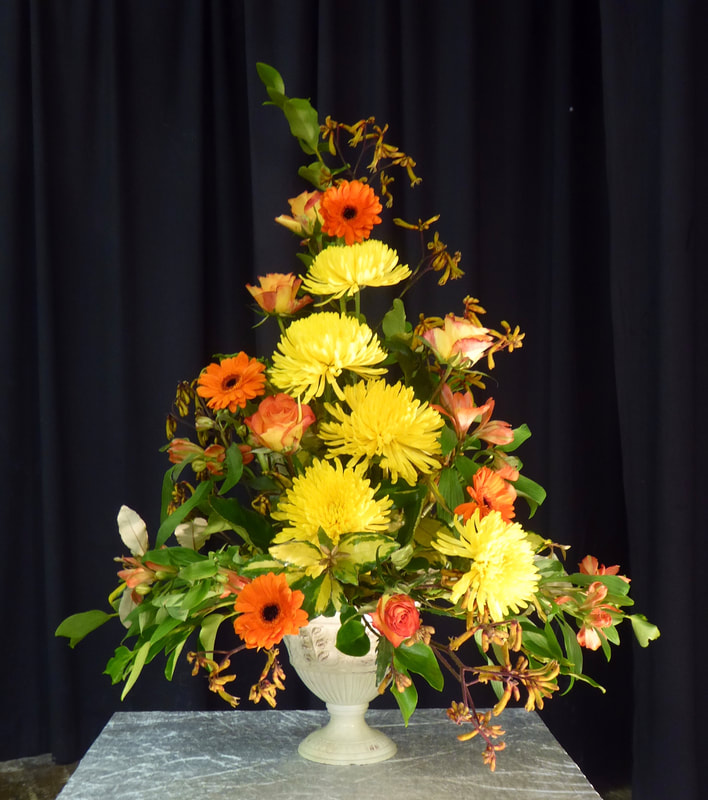
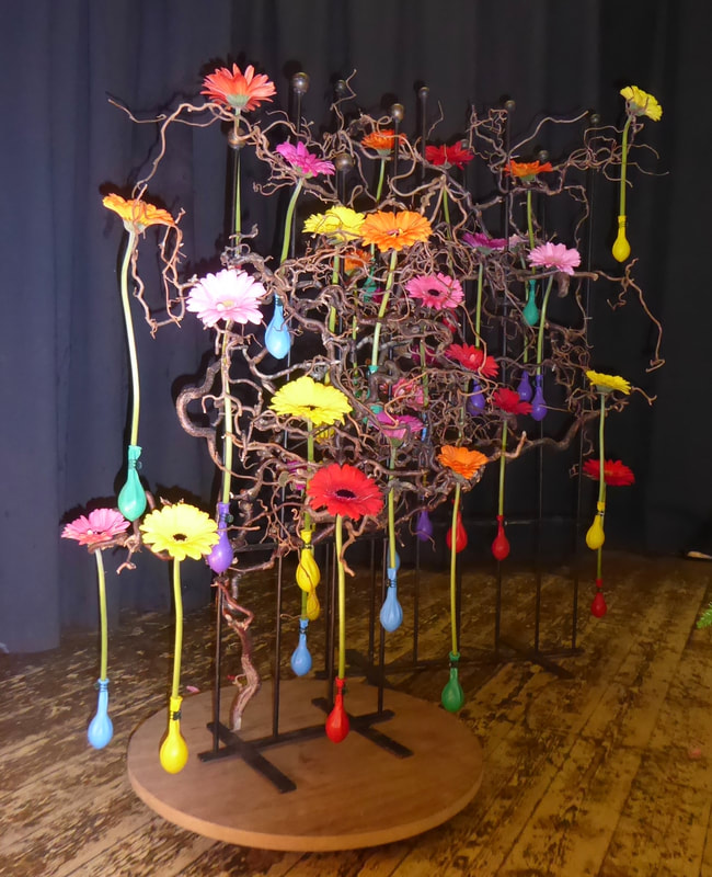
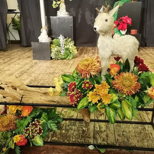
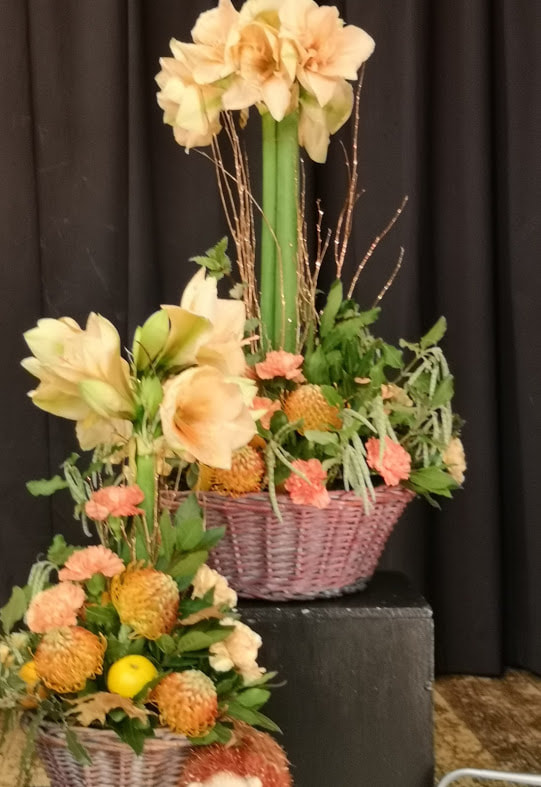
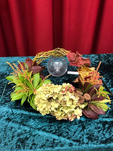
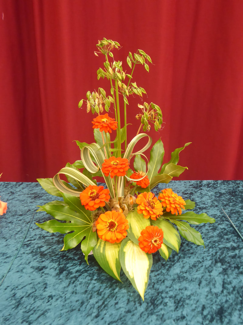
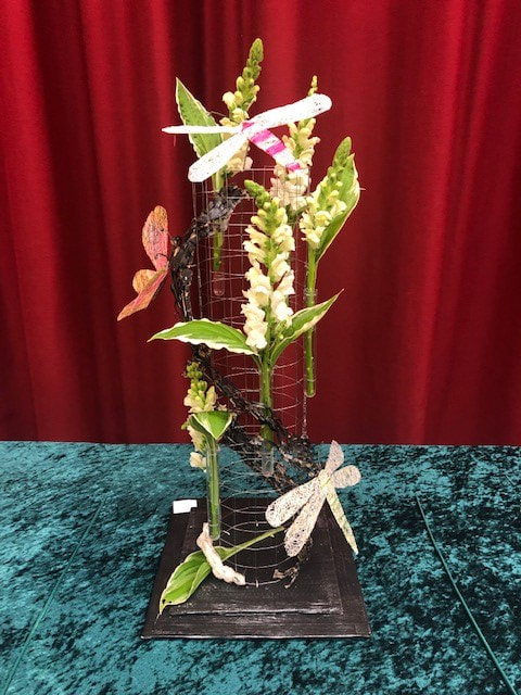
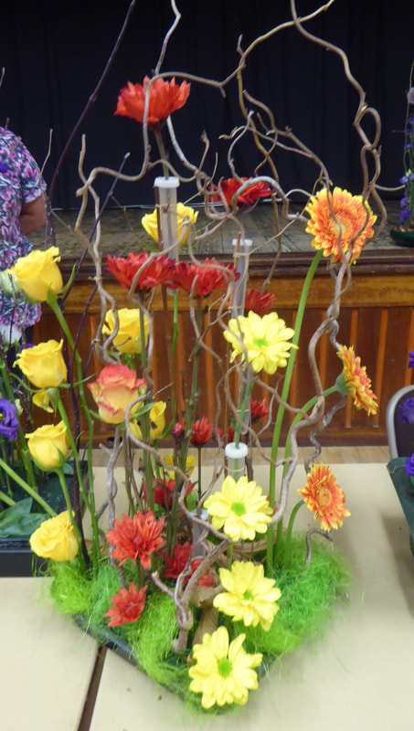
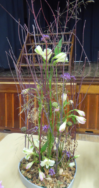
16th April 2024
Demonstrator - Nina Tucknott
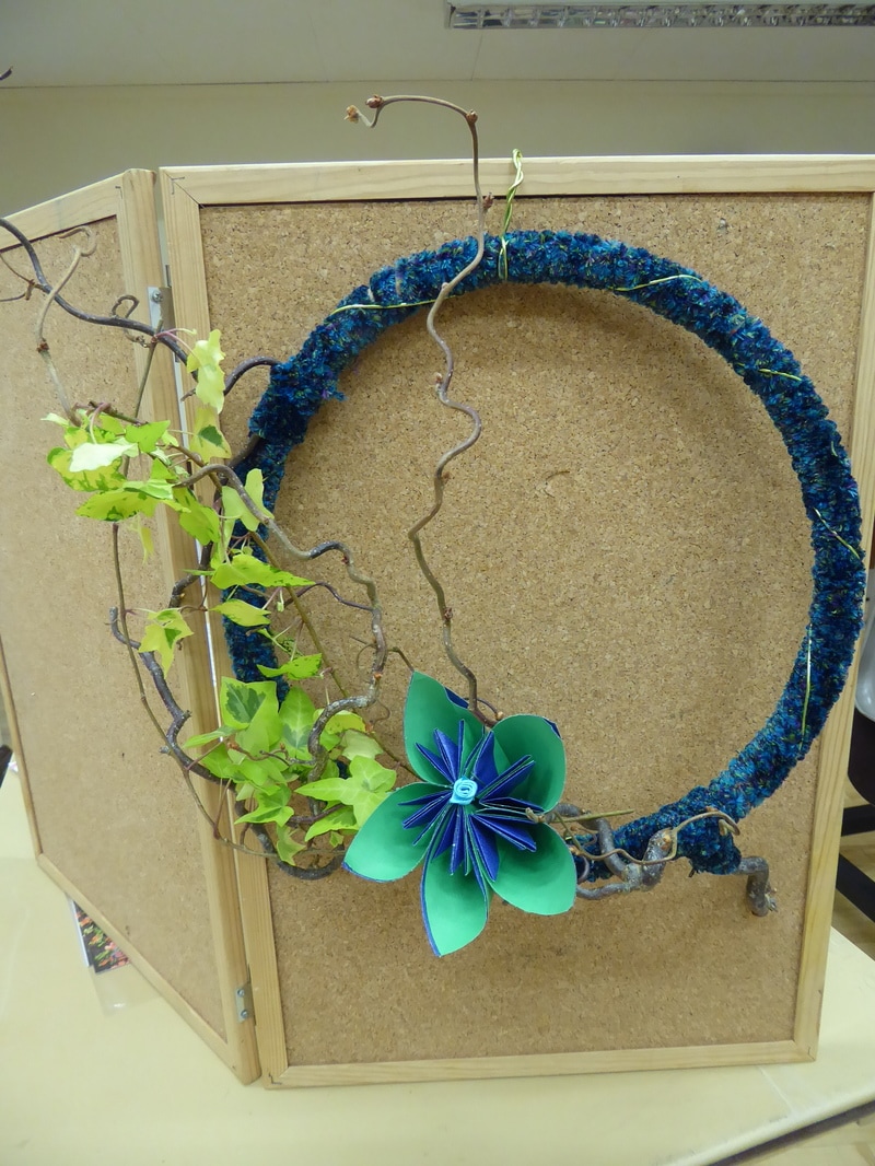
Title - "Green Inspiration"

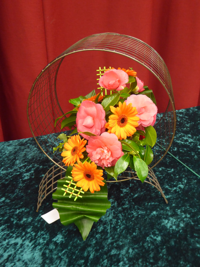
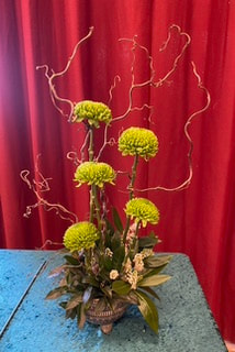
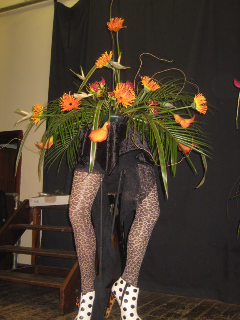
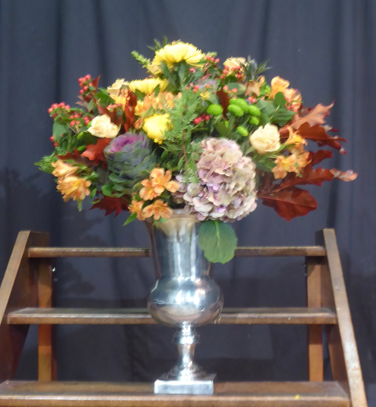
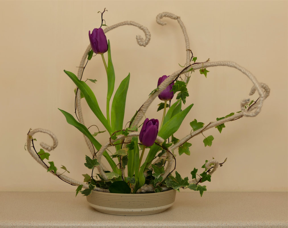
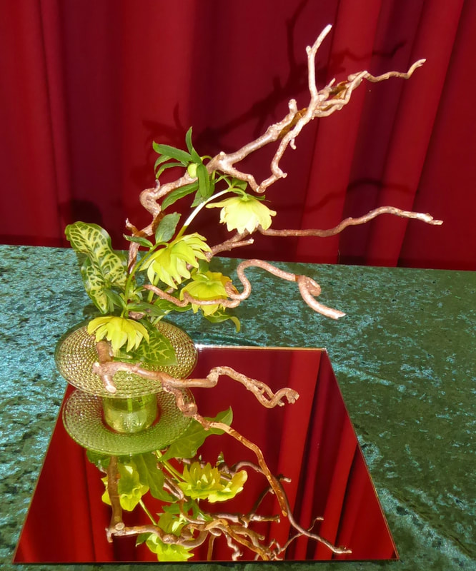
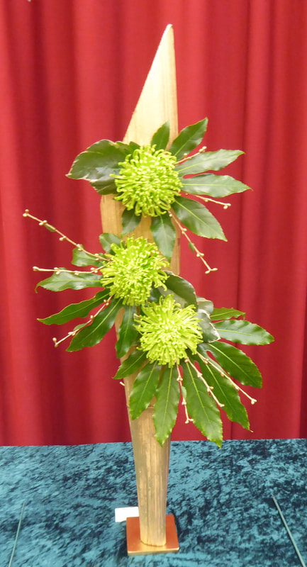
Club Competition
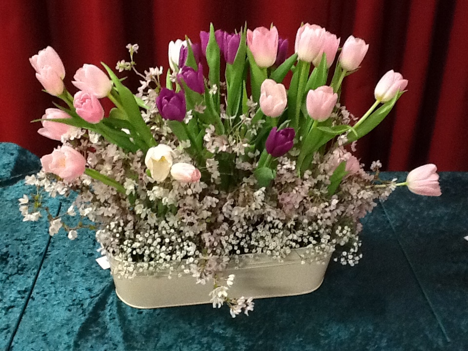
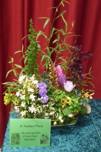
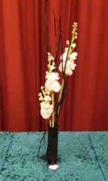
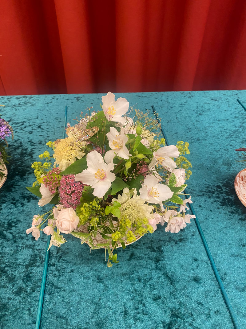
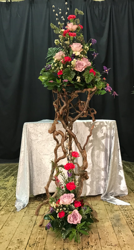
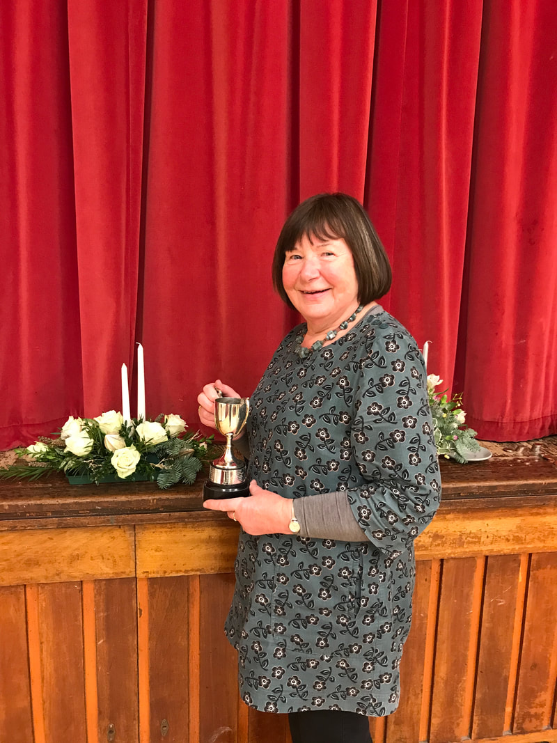
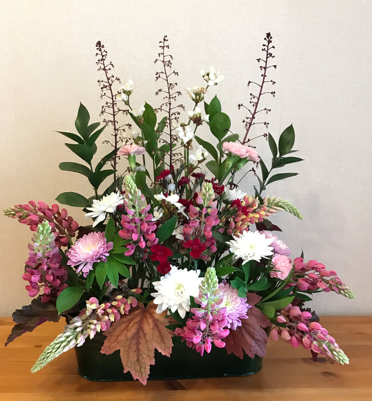
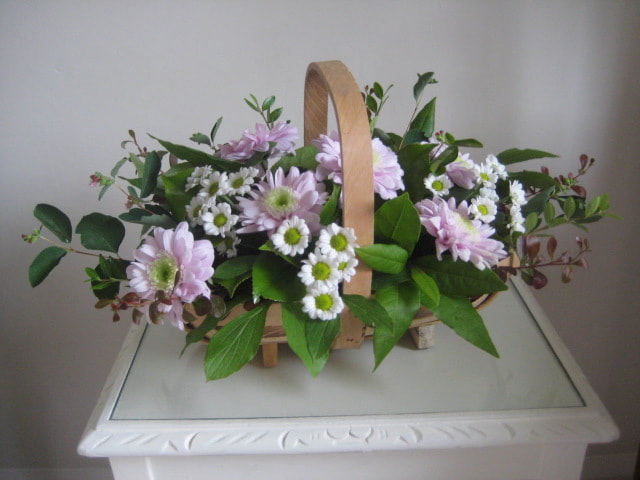
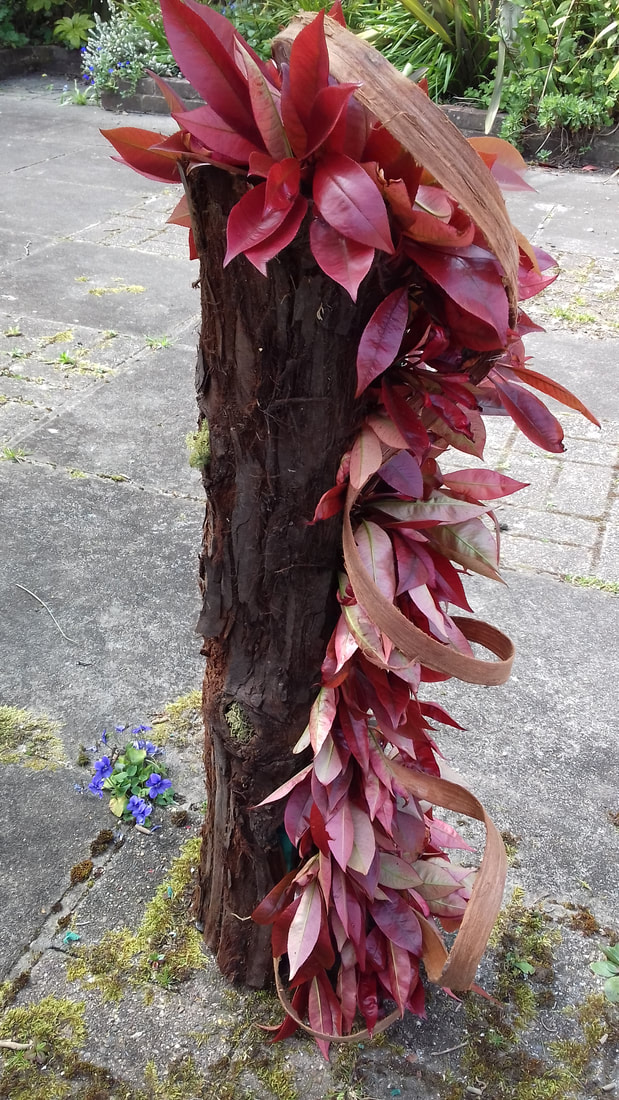
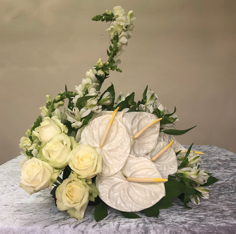
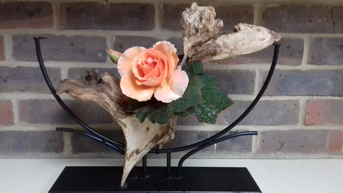
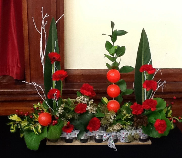
Title - "Fabulous Forms"
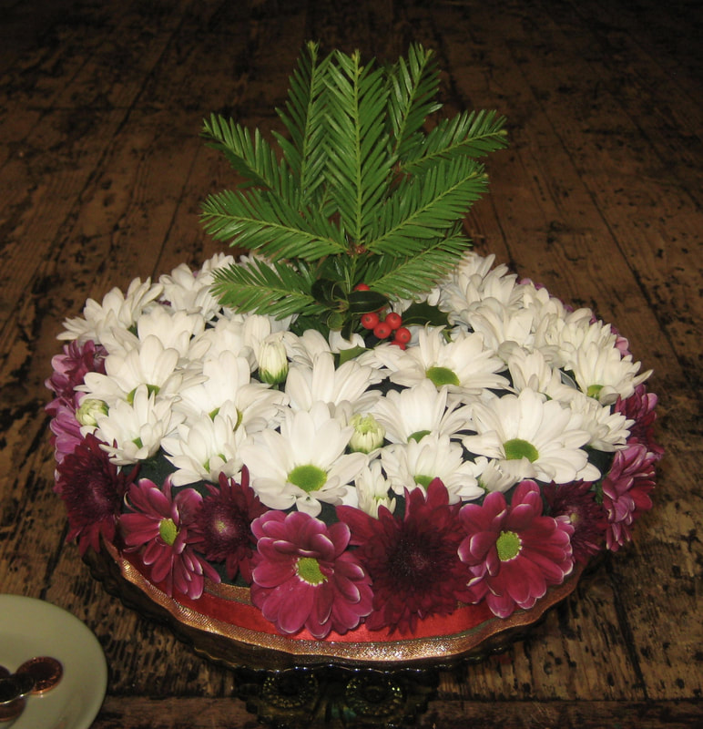
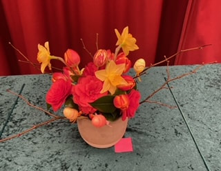
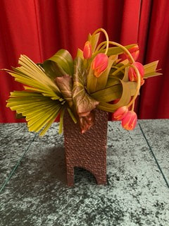
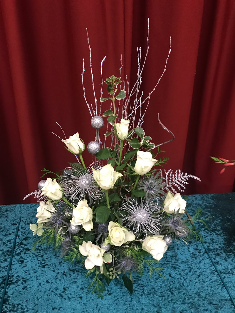
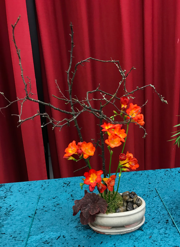
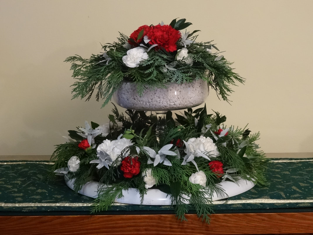
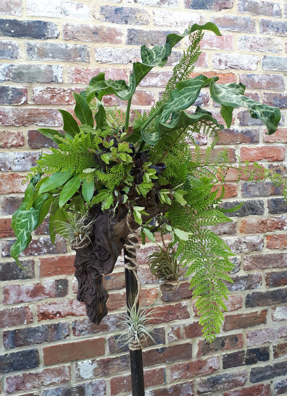
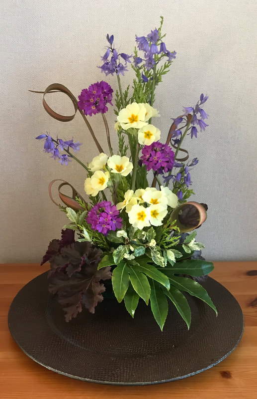
Judges Cup was won by Barbara Tucker (Photo 1)
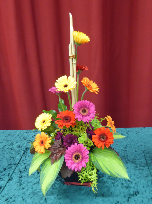
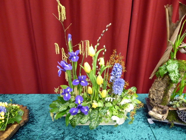
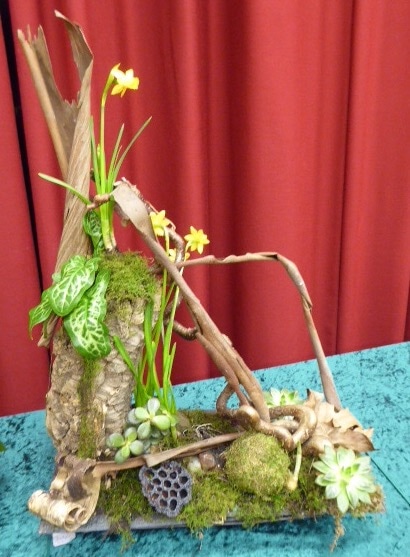
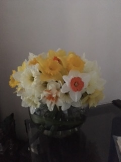
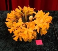
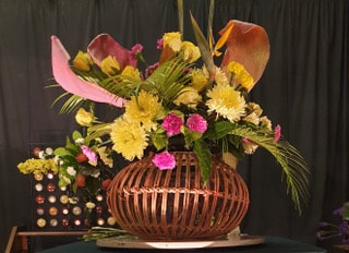
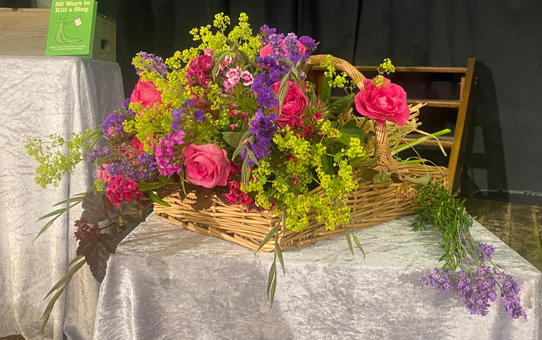
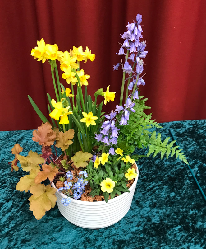
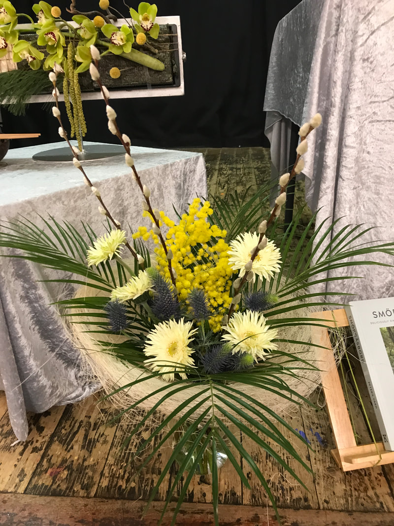
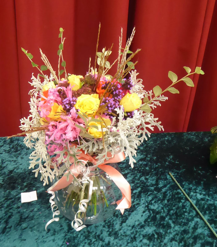
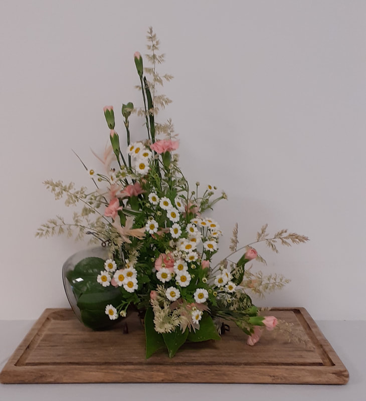
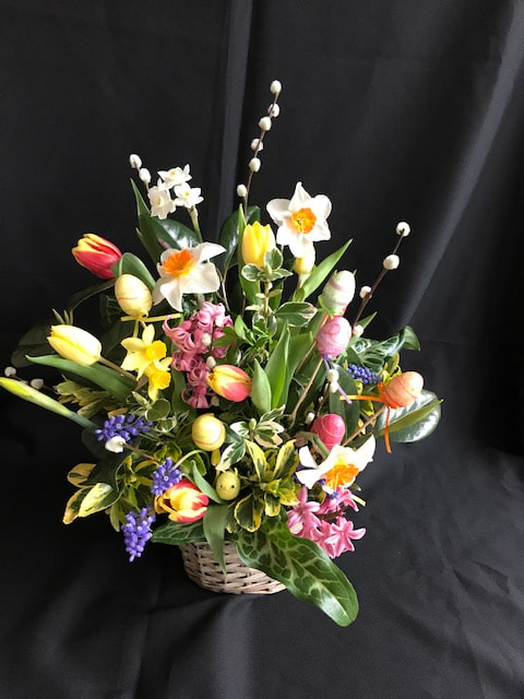
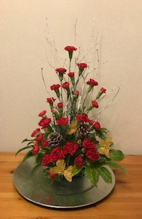
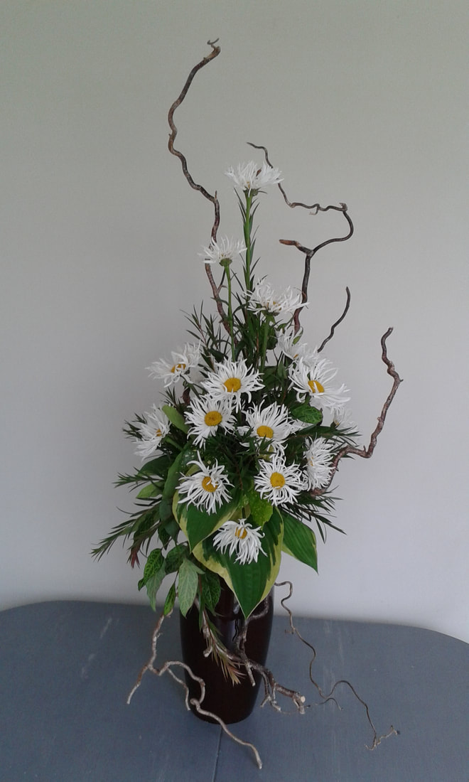
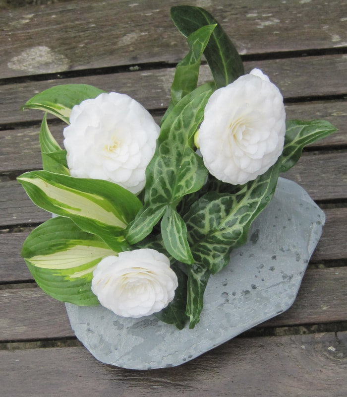
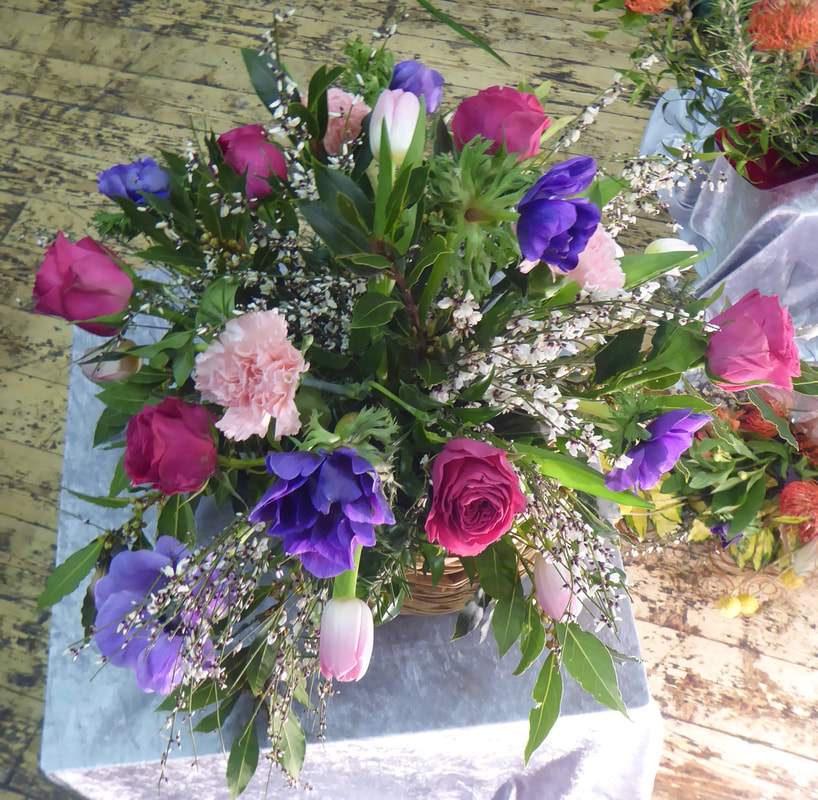
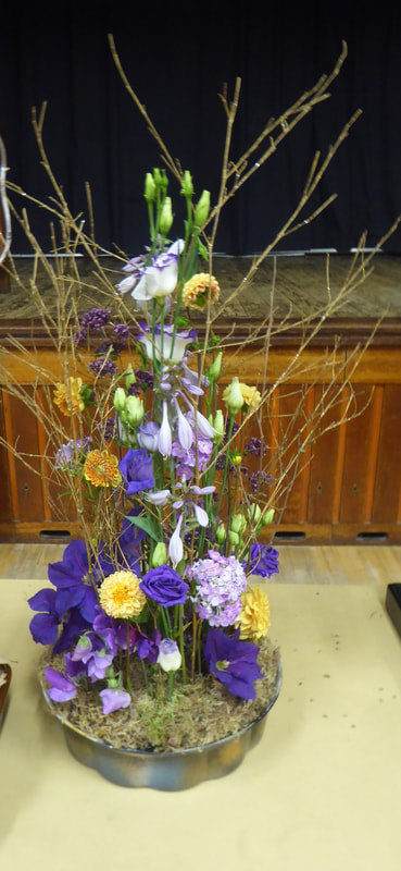
19th March 2024
Demonstrator - Gill Homer
Title - "Happy in my Work"
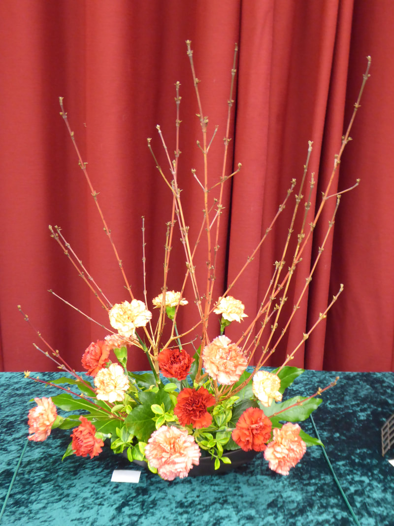
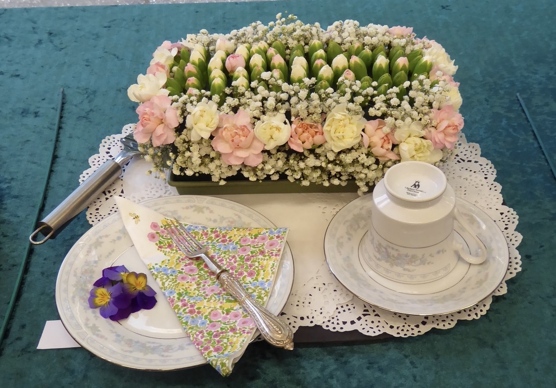
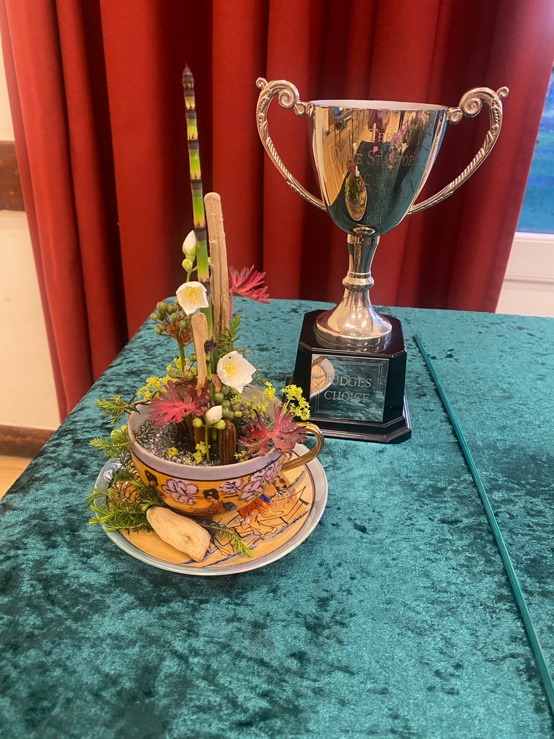
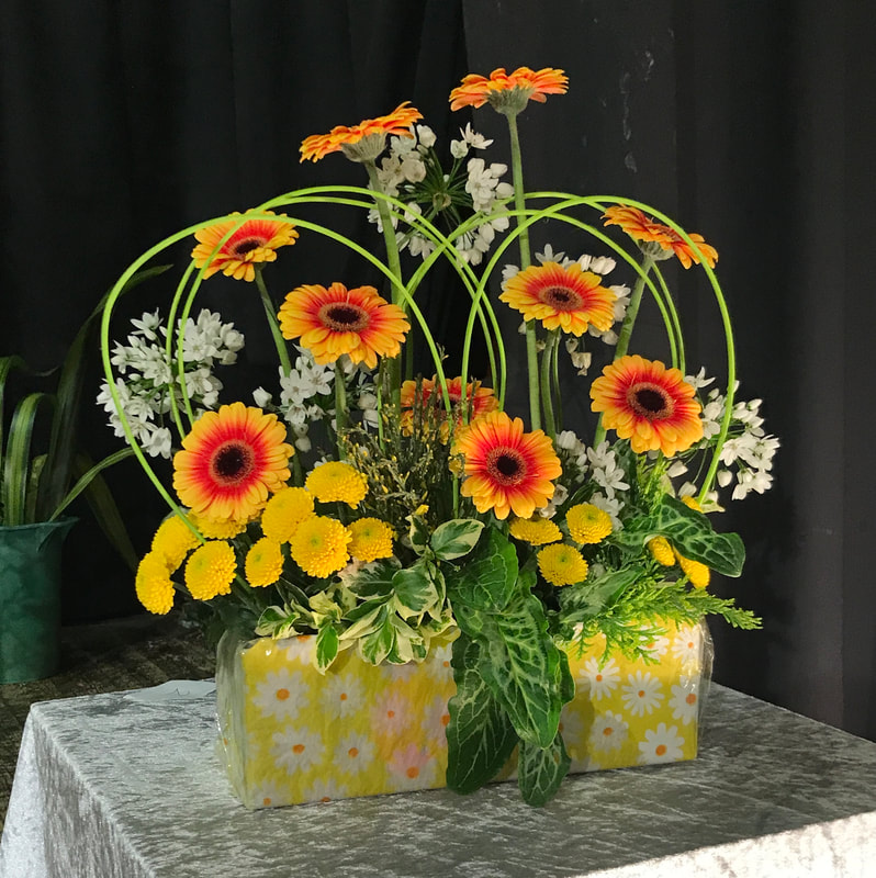
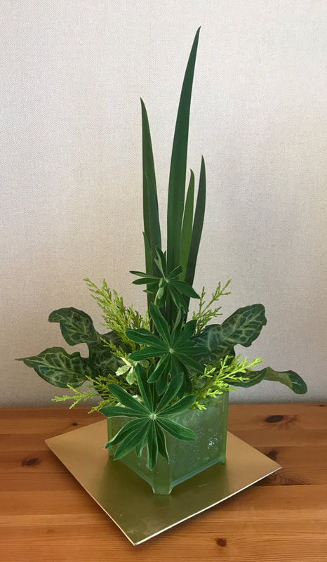
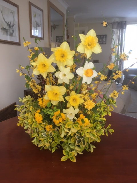
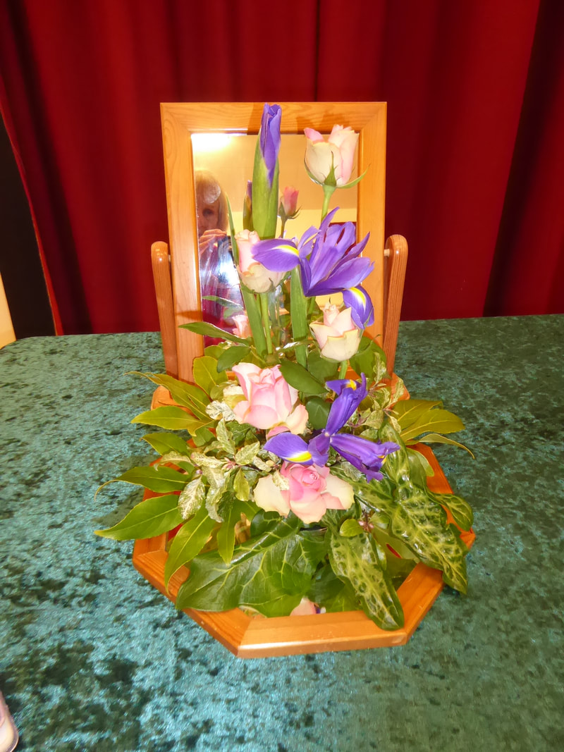
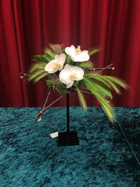
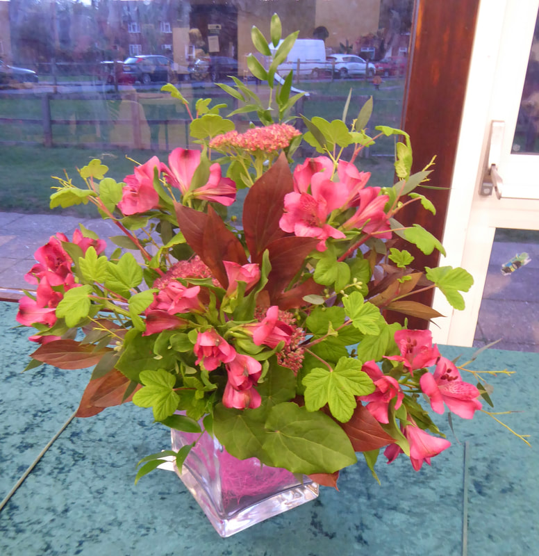
Club Competition
"Daffodil Day"
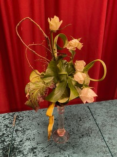
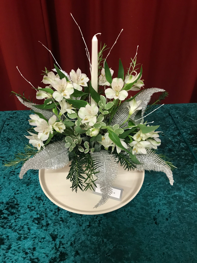
Judges Cup won by Janet Sharp, Photo No 1.
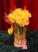
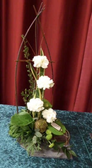
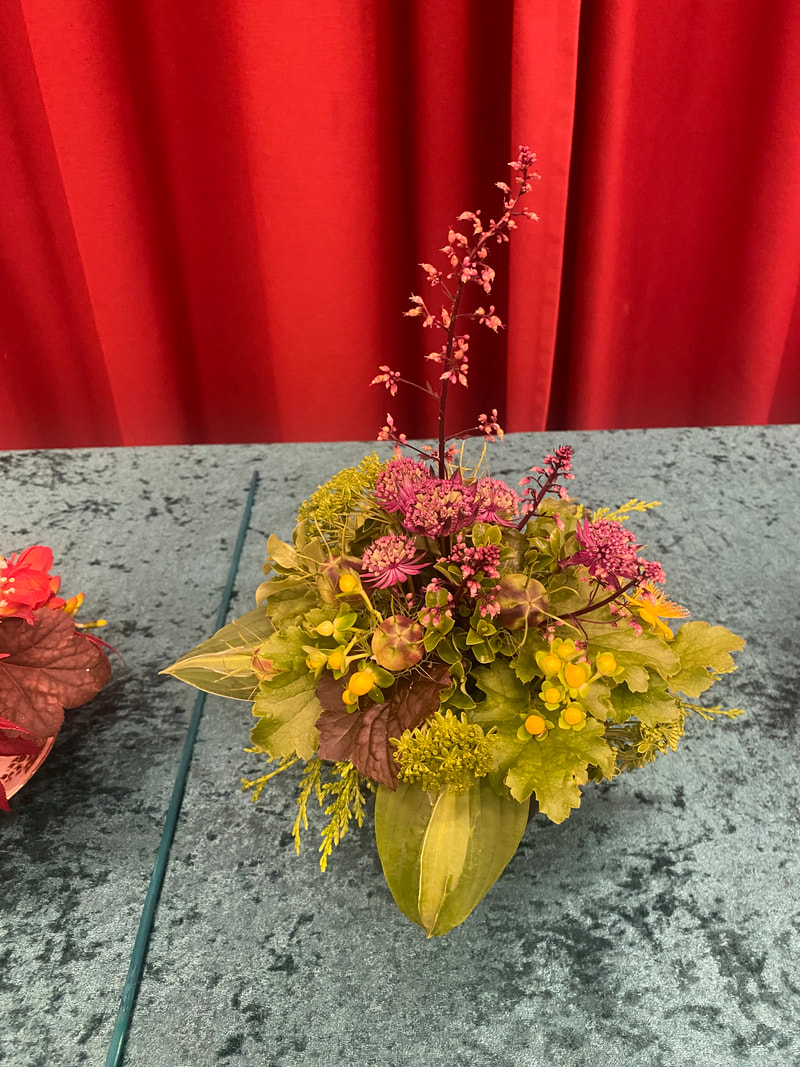
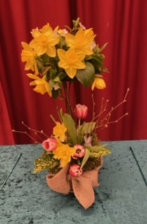
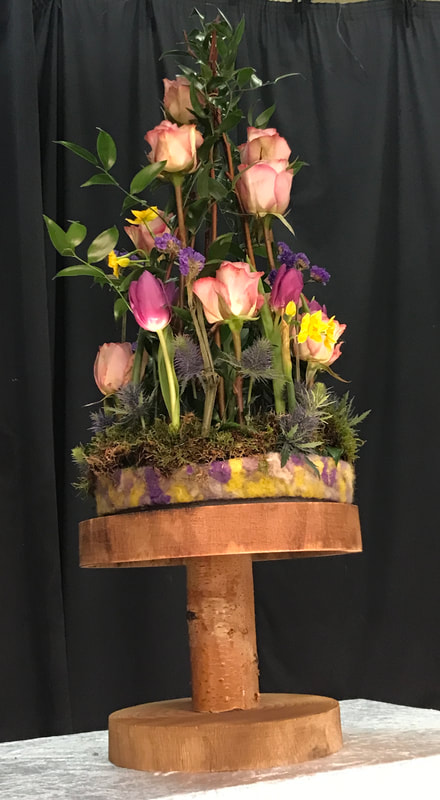
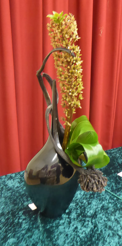
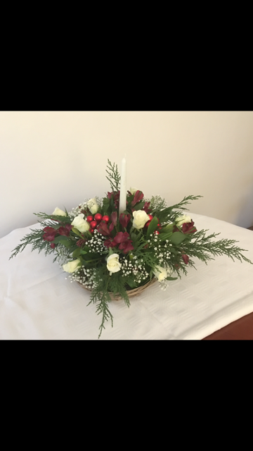
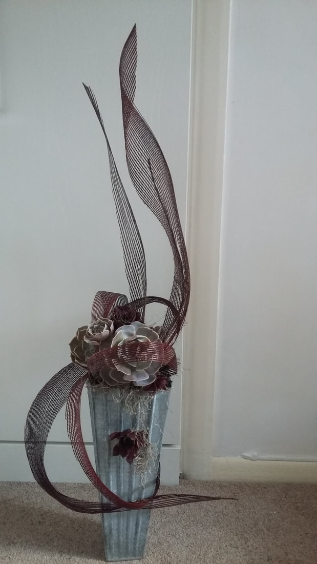
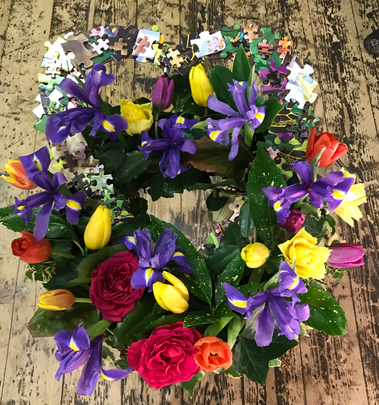
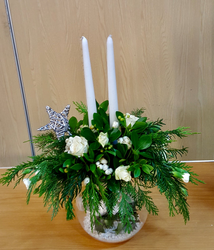
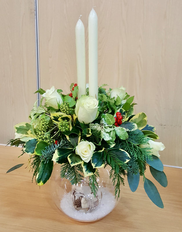
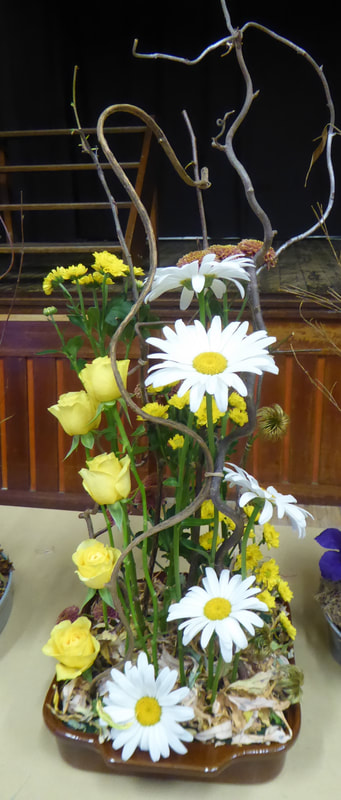
20th February 2024
Demonstrator - Stephen Mc Donnell-Daly
Title - "Just in the Moment"
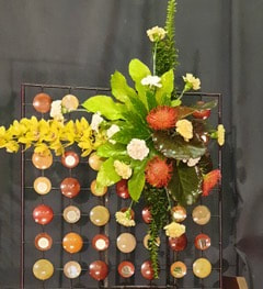
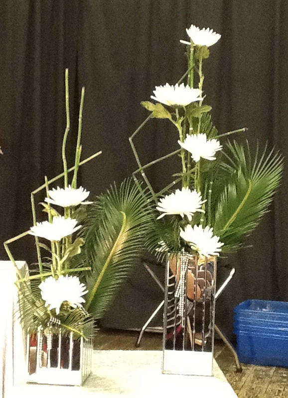
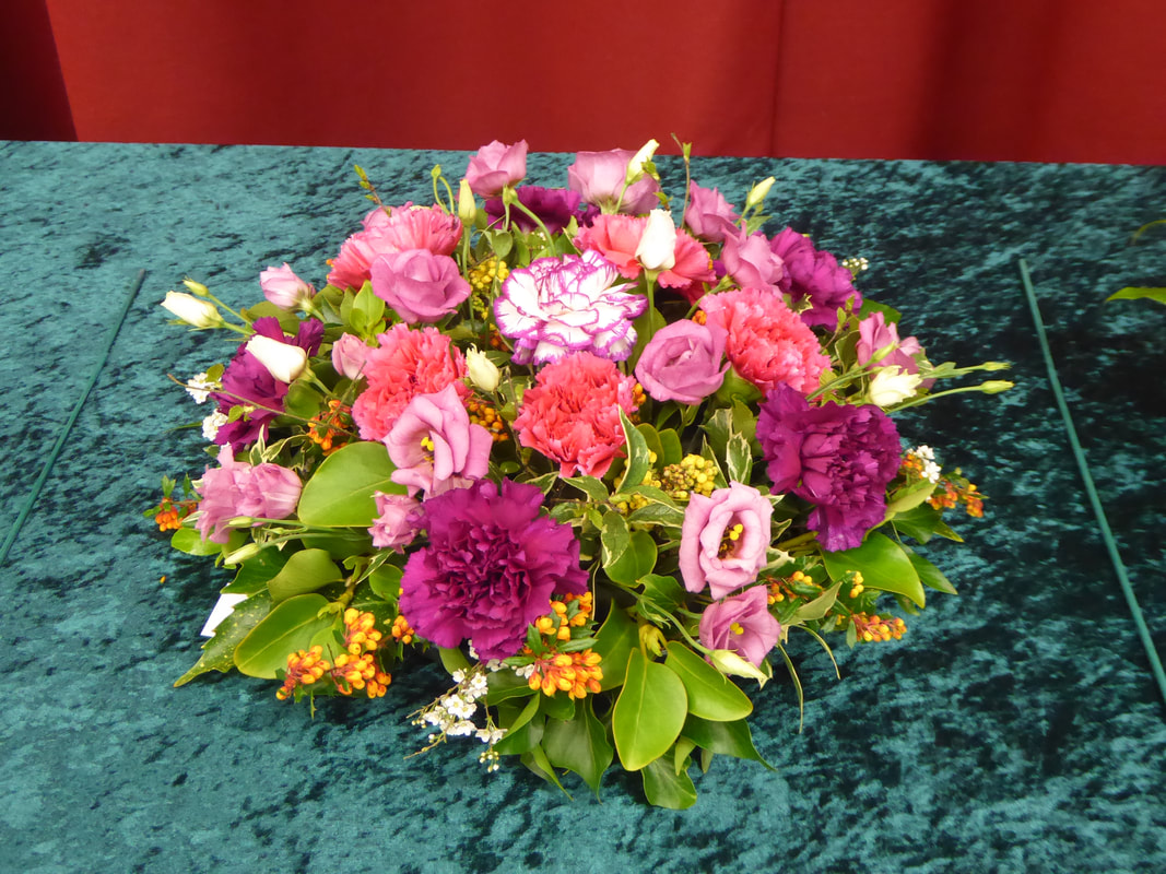
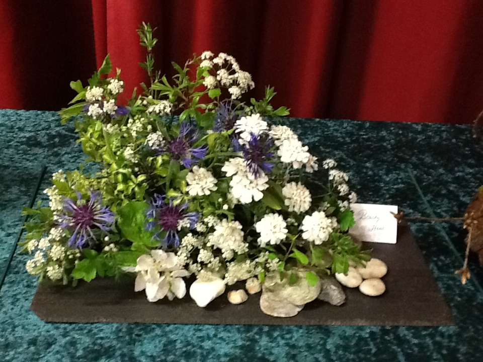
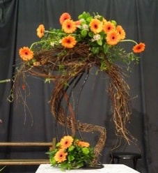
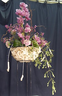
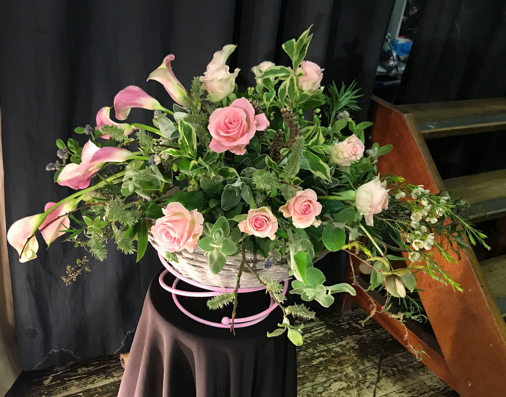
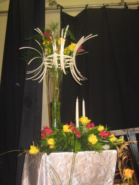
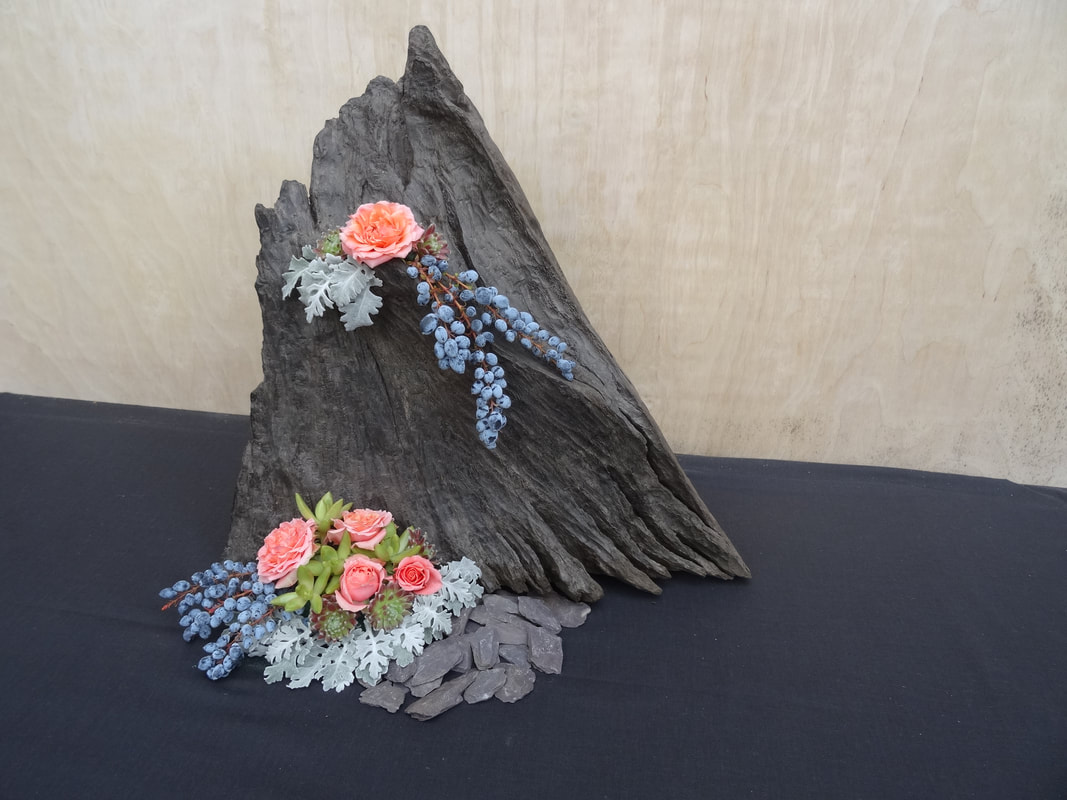
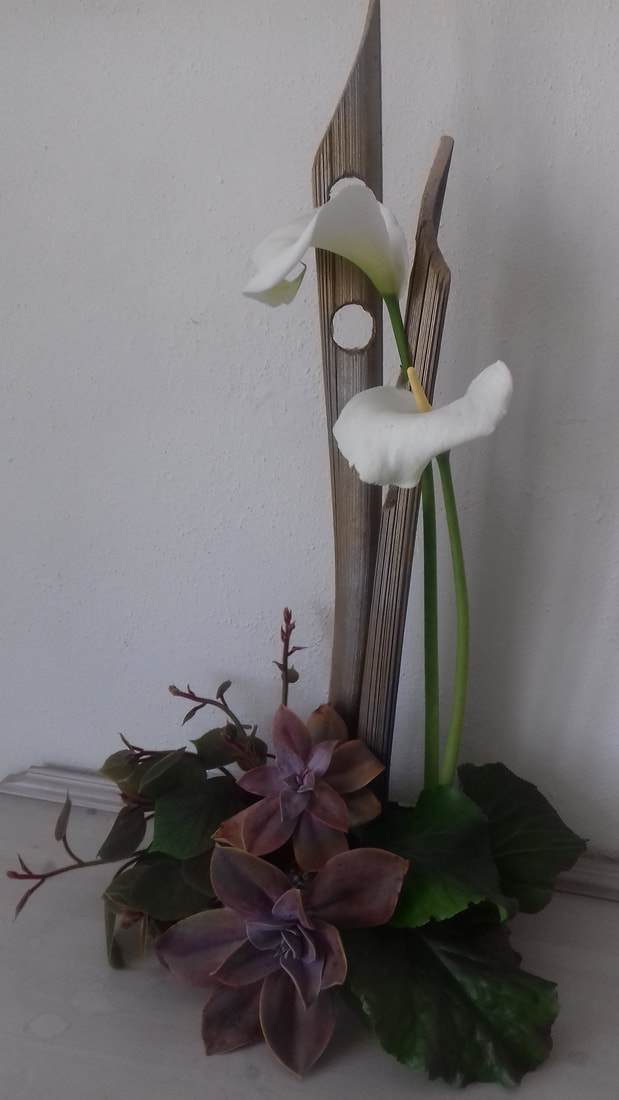
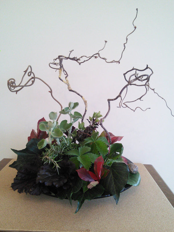
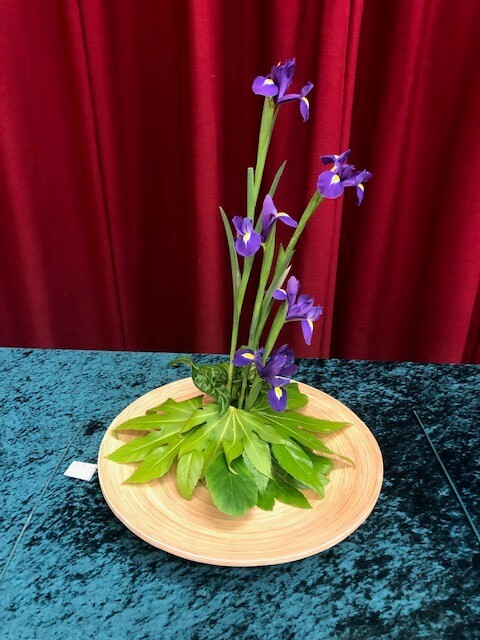
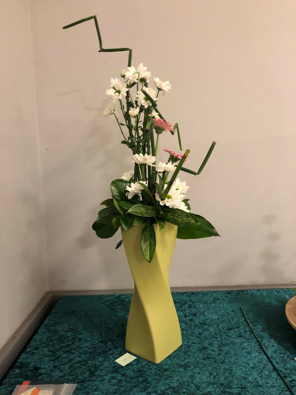
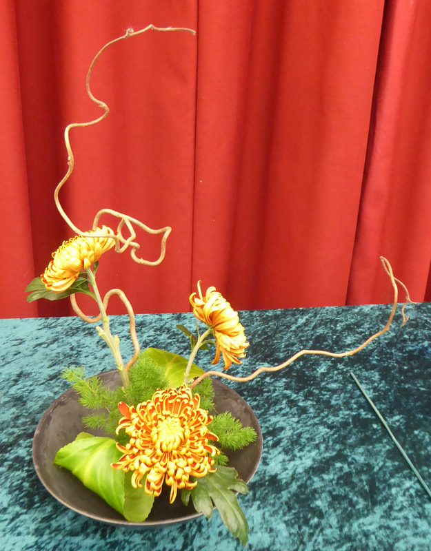
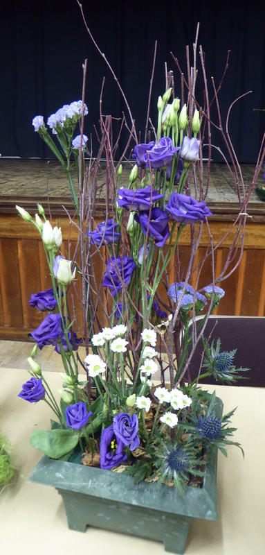
Club Competition
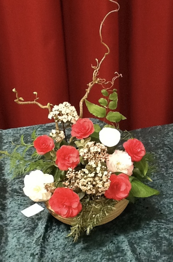
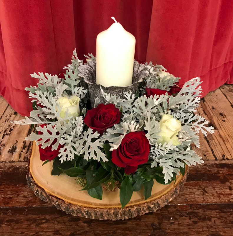
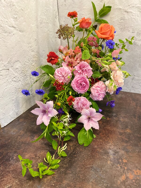
"Standing Tall"
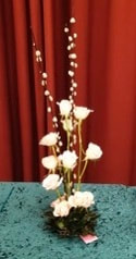
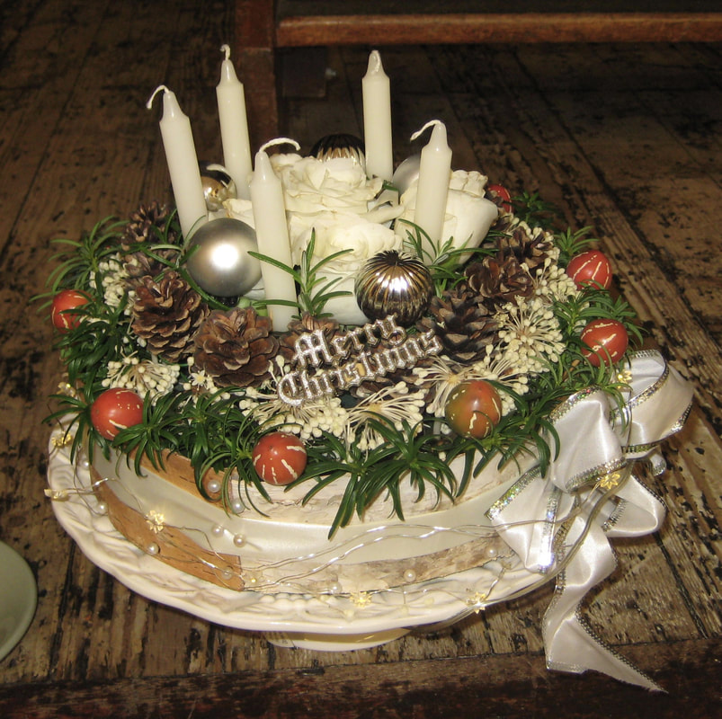
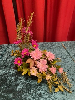
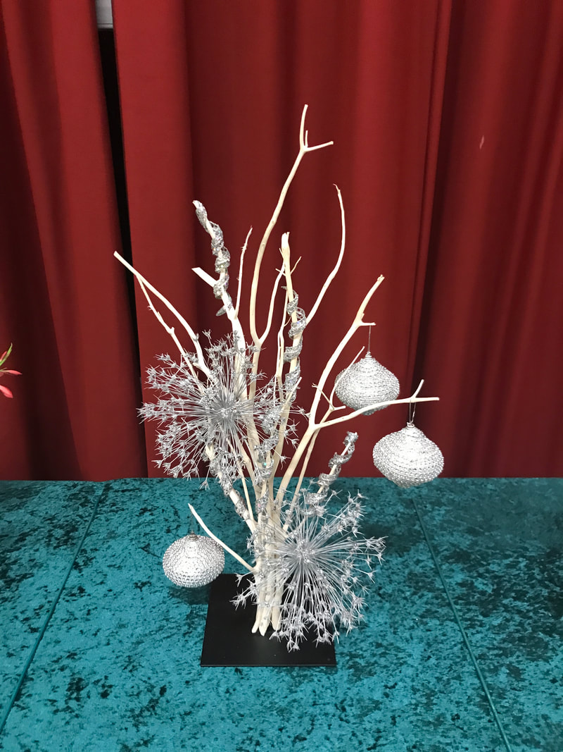
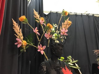
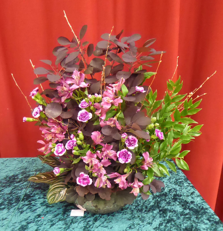
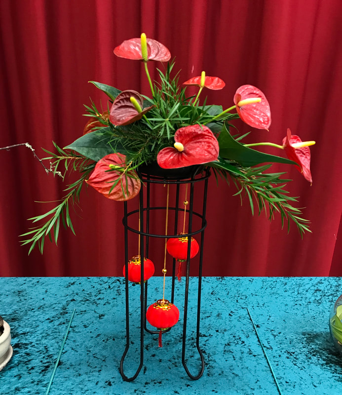
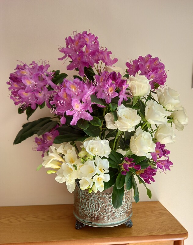
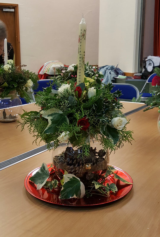
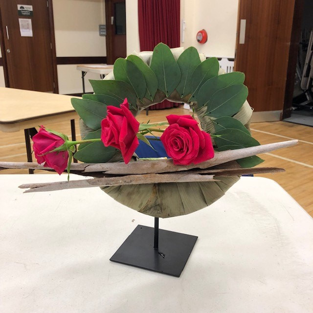
Judges Cup won by Barbara Tucker
Photo 1
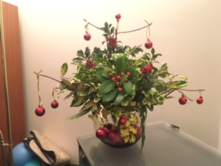
21st November 2023
Demonstrator - Robin White
Title - "Floral Festivities"
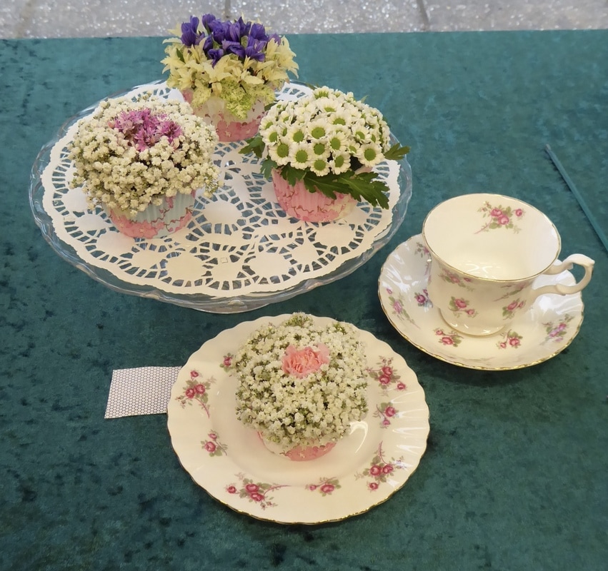
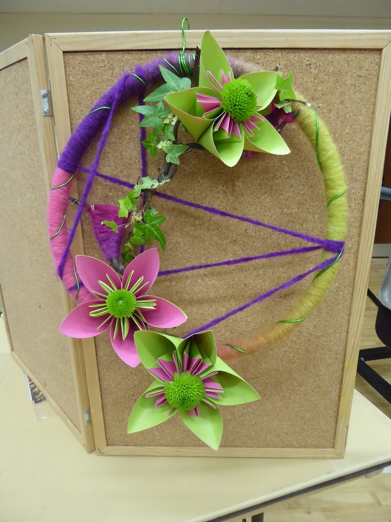
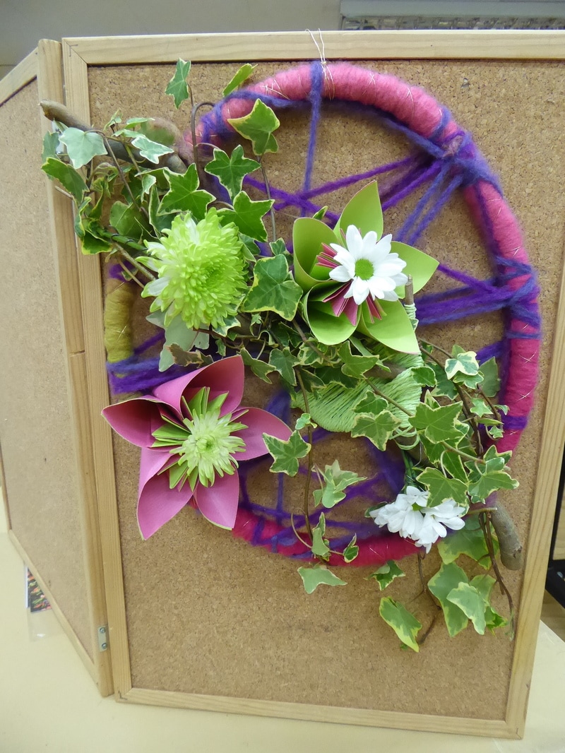
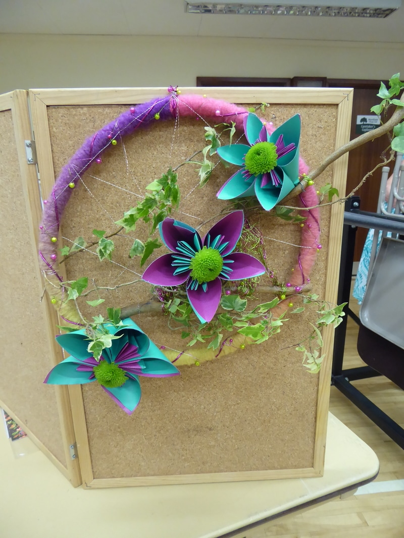
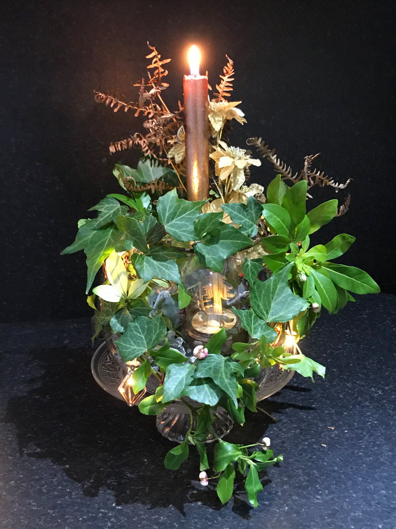
17th October 2023
Demonstrator - Alison Gillott
Title - "A Pocket Full of Posies"
Club Competition
|

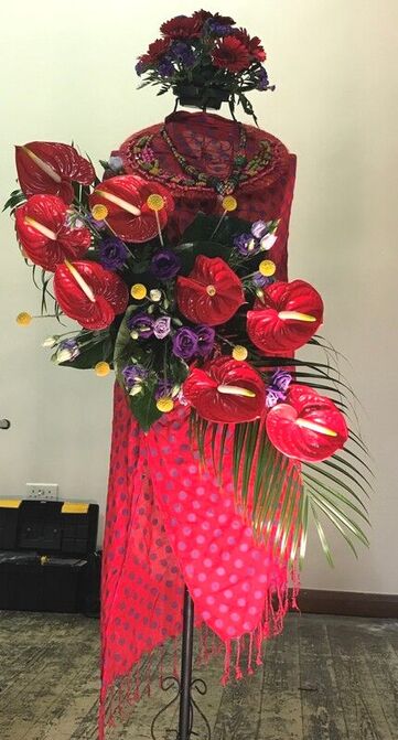
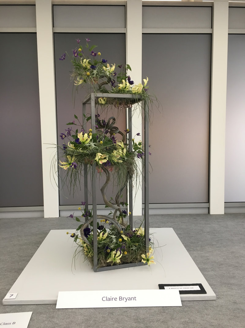
15th November 2022
Demonstrator - Claire Bryant
Title - " Bring on the Bling!"
Club Competition
Title - "All that Glitters"

18th October 2022
Demonstrator - Mark Entwistle
Title - "The Designers Mind"
Open Meeting
20th September 2022
Celebrating the 60th Anniversary of WEFC
Demonstrator - Stephen Mc Donnell
Title - "Sparkling Affair"
21st June 2022
Workshop with
Dennis Van Wonderen
17th May 2022
Demonstrator - Graham King
Title - "May Bugs and Blossom"
Club Competition 17th May 2022
"Its a Small World" - Petite

19th April 2022
Demonstrator Gill Homer
Title " Be Inspired"
Club Competition 19th March 2022
"Plants and Flowers"
15th March 2022
Demonstrator Gaenor Circus
Title " A Woman's Place"
Club Competition 15th March 2022
"Life in the Pink"
15th February 2022
Demonstrator Nina Tucknott
Title " A Floral Smorgasbord"
7th December 2021
AGM - 27 members attended
Club Competition - A Table Arrangement
The Molly Orford Cup
Lesley Etherton winner of The Molly Orford Cup
16th November 2021
Open Meeting
Demonstrator Stephen Mc Donnell
Title "Beneath a Shooting Star"
19th October 2021
Demonstrator Lucinda Knapman
Title "More Fabulous Flowers"
Club Competition
Title "Absolutely Fabulous"
21st September 2021
Demonstrator - Dennis van Wonderen
Title - "Autumn's Ablaze"
Club Competition - "Sunset Glow"
Hilda Gertrude Craven
Honorary Lifetime Vice President of Warnham Evening Flower Club
23rd July 1921 - 13th March 2020
Memorial Service 22nd July 2021 at St Margarets Church, Warnham
Flowers arranged by members of the flower club, in memory of Hilda in the church.
2021 Club Competitions
17th August 2021 Meeting
Two of the Designs by Helen Hare
August Club Competition
"Oriental Influence"
June Club Competition
"Bursting Out All Over"
Judged by Barbara Harris NAFAS National Judge
1st Joyce Skeet (3) 2nd Catherine Chandler (2) 3rd Michelle King (4)
Highly Commended Debbie Jackson (5) Commended Veronica Pooley (1)
(6) (7)
April Virtual Club Competition 1
"Easter Basket"
Judged by Barbara Harris NAFAS National Judge
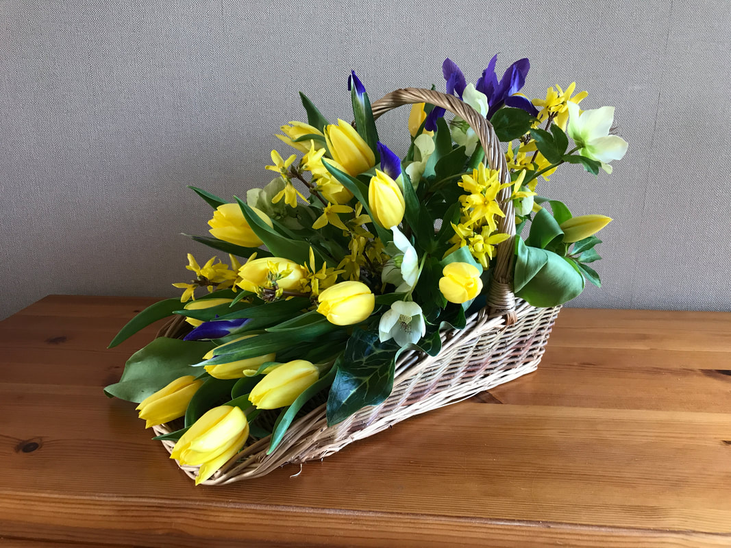
= 1st Joyce Skeet (3) = 1st Lesley Etherton (9)
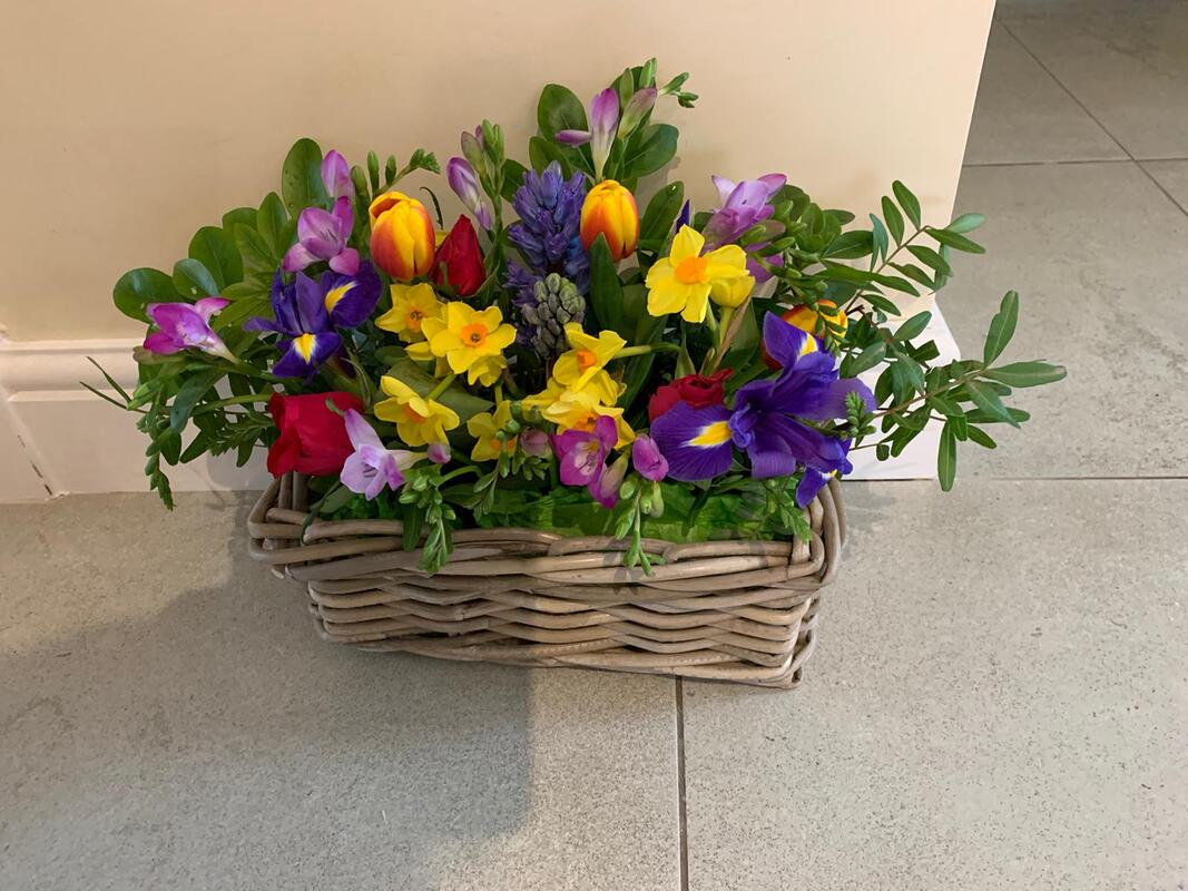
2nd Jackie Calway (2) 3rd Janet Sharp (1)

Marion Nedem Very Highly Commended (6) Veronica Pooley Commended (8)
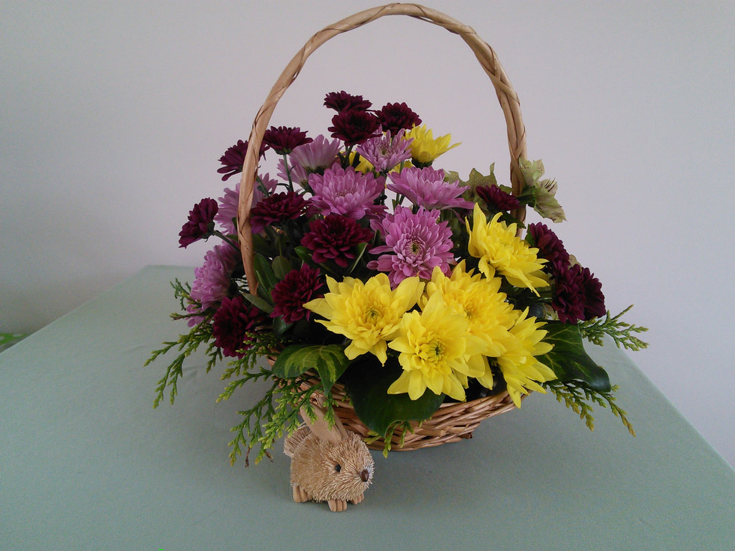
(4) (5) (7)
Barbara's Comments "Easter Basket"
1. A well arranged parallel style Easter basket with good use of colour linking between the accessories and white flowers
(tulips and ranunculus) (Third prize)
2. A colourful and beautiful selection of spring flowers which have been arranged well to give impact and a good interpretation of Easter (Second prize)
3. Congratulations - A very elegant asymmetrical basket design using stunning tulips with touches of blue iris and lovely white hellebores. Each piece of plant material is individually displayed to give maximum effect (= First prize)
4. A charming design with spring flowers and accessory. If some of the plant material were brought forward it would incorporate the figurine more fully into the whole design
5. An interesting display with pretty small-scale plant material in a small basket. However the branch is visually very heavy and rather overwhelms the effect of the basket
6. Such a delightful selection of spring flowers and foliage. Whilst it is important for the plant material to pre-dominate, in this case the basket container is just a bit too small to give the best overall proportions to the design (Very highly Commended)
7. An attractive basket design with appropriate accessory, however the chrysanthemum flowers are seasonally not really very interpretative of the class title of Easter Basket.
8. A pretty trug/basket of daffodils and other spring plant material with the catkins being well-placed to give a good interpretation of Easter. Some bolder foliage towards the centre of the design would have given greater contrast of form in this area. (Commended)
9. Congratulations on a beautiful and very atmospheric Easter basket design incorporating delightful and most appropriate accessories. There is such good use of the strong colour contrast and the seasonal foliage of the Arum Italicum leaves. (= First prize)
April Virtual Club Competition 2
"Spring Fever"
Judged by Barbara Harris NAFAS National Judge
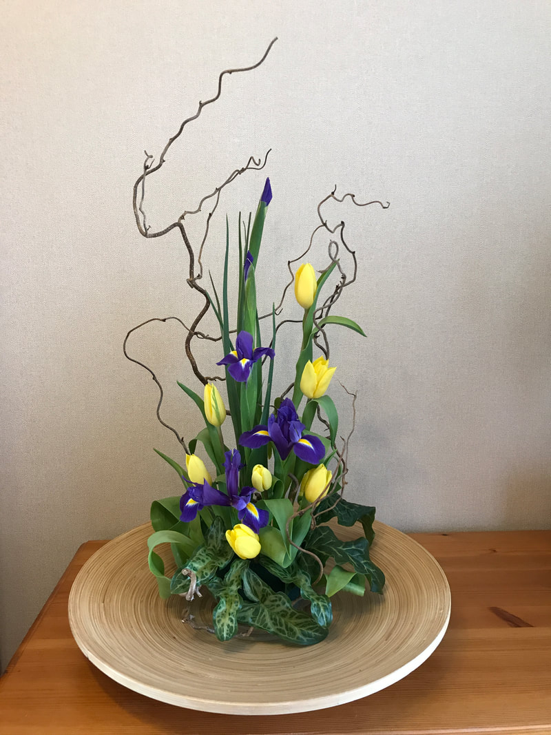
1st Joyce Skeet (7) 2nd Catherine Chandler (1) 3rd Lesley Etherton (5)

Debbie Jackson Very Highly Commended (4) Michelle King Commended (8)
(2) (3) (6)
Barbara's Comments "Spring Fever"
1. A delightful selection of pretty spring flowers which have been arranged well to display each individual flower. However the black and white base is not very compatible with the theme of the design (Second prize)
2. A very colourful design which has been well-staged against a background of the complementary blue colour. The arrangement is eye-catching but there are really too many non-spring flowers to give a good interpretation of the class title of Spring Fever.
3. A very neat parallel design with good use of space between the 3 vertical placements. However, the plant material does not really fully interpret the ‘Spring Fever’ theme with its emphasis on the impact of the roses.
4. A lovely Spring design using Forsythia blossom and beautiful Camellia flowers with a very appropriate yellow coloured container. The colour of the bronze foliage is however not very harmonious and tends to look a bit dull by comparison (Very Highly Commended)
5. A striking design full of rhythm with good emphasis on each piece of plant material. The ‘twirl’ (bark strip?) running vertically through is, however, rather dark and heavy and detracts from the natural beauty of the flowers, foliage, and willow. (Third prize)
6. An attractive design using lovely tulips and pussy willow to give an open Spring effect. Unfortunately, the grouped foliage and Pieris flowers at the base are really too dense and create a base-heavy effect
7. Congratulations – a very elegant and classic design with clever placing of the flowers and foliage to create space and impact to the design (First prize)
8. A most innovative and interesting design with the ivy and ‘twirls’ creating rhythm throughout. The whole effect is however, a little sparse with its use of plant material (Commended)
December Virtual Club Competition
'Tis The Season
Judged by Barbara Harris NAFAS National Judge

1st Lesley Etherton (2) 2nd Veronica Pooley (9) 3rd Pamela Woolterton (8)
Michelle King (1) Jean Plaskett (4) Janet Sharp (13) Joyce Skeet (6)
Very Highly Commended Commended Commended Commended

(5) (10) (11)
(3) (7) (12)
Barbara Harris's Judges Comments
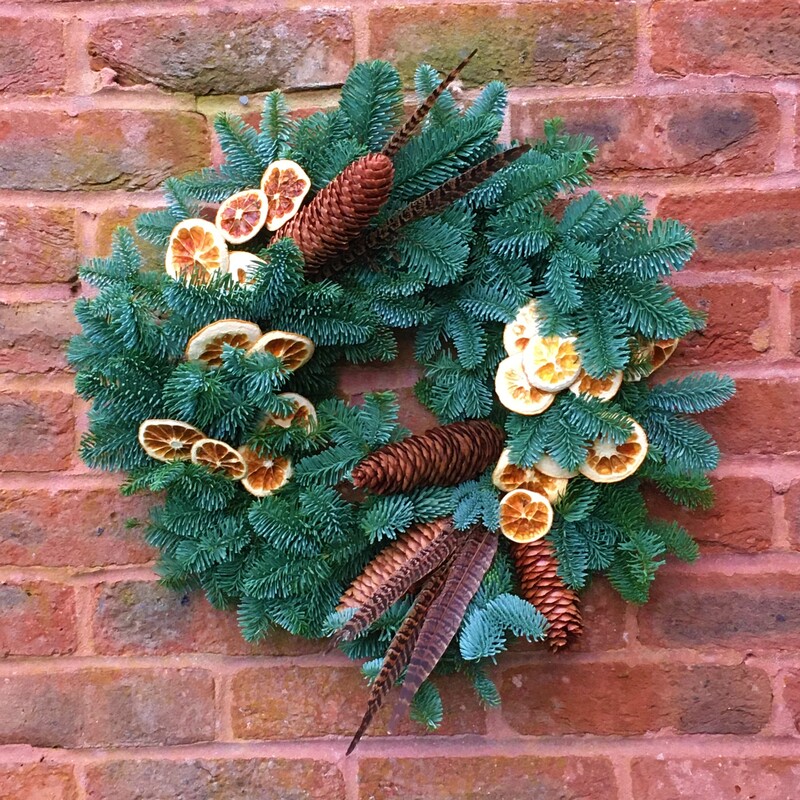
1. A most attractive and accomplished wreath ring with contrast of colour between the orange slices, beautiful cones and feathers, and the blue spruce – all well-staged against a brick wall which provides a warm-coloured and appropriate background.
2. A well-arranged parallel design with good repetition of materials throughout and with many delightful features. Good positioning of the components gives space and movement to the whole exhibit. The gold bow at the centre of the base is, however, slightly loose
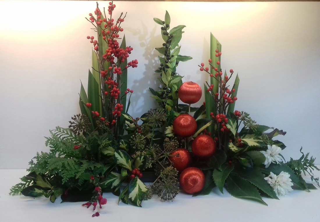
3. A pretty design including several varieties of attractive evergreen foliage. The red baubles add bright areas of colour throughout and provide a colour link with the red berries. However the support sticks of these baubles at right angles to the design detracts from the overall rhythm.
4. A bold and dramatic parallel design with excellent individual touches and clever positioning of different materials. However the base-work of ferns and large leaves is visually very heavy and creates a slightly base-heavy effect to the whole design,
5. A simple and elegant table-centre using fresh flowers and foliage with the gypsophila adding a suggestion of snowflakes (?) The long pieces of conifer tend to detract from the impact of the candle and central area of the design.
6. Beautiful ‘Christmassy’ colours have been used to create a very attractive festive arrangement with the inclusion of the gold butterflies, pine cones and white twigs. However the top of the design has a slightly thin and sparse appearance with so many obvious stems.
7. An attractive display of evergreen foliage with mellow colouring, all arranged with a candle to give impact (which I do hope for safety reasons is battery-operated and not a living flame!!) The positioning of the ivy leaves is a little random and gives a slightly confusing effect.
8. An impressive design, well-staged within the fireplace and with an attractive selection of seasonal plant material. A few bolder forms and contrast of colour at the centre would have added even more impact.
9. A most attractive triangular arrangement which has been well-staged Excellent colour harmony with the subtle shades of pink and mauve within the flowers and baubles. A little more height with the plant material would have given better counter-balance to the heavy glass cube container.
10. Bright cheerful colours and good use of the Garrya Elliptica catkins. However the large Poinsettias at either side of the design create a heavy effect in each of these areas detracting from the overall good balance.
11. These are 2 attractive placements with most suitable festive plant material. The 2 placements give impact to the whole design. Unfortunately the side surface of the top container is apparent and rather eye-catching
12. A really ‘Christmassy’ atmosphere to the arrangement with appropriate plant material, baubles and the glass pebbles to suggest ice. However the design is rather thin at the top creating a base-heavy impression of imbalance
13. A lovely festive arrangement with silver stars, foliage and beautiful roses which complement the colour of the berries. The design has been well-composed however the top centre is a little thin and this affects the overall balance of the composition
November Virtual Club Competition
"Autumn Glory"
Judged by Barbara Harris NAFAS National Judge
1st 2nd 3rd
Lesley Atherton (3) Joyce Skeet (4) Debbie Jackson (2)

(7) (1) (5) (6)
Highly Commended
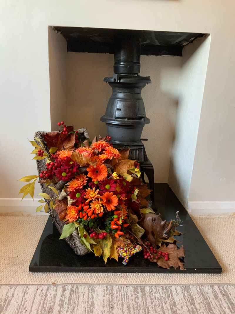
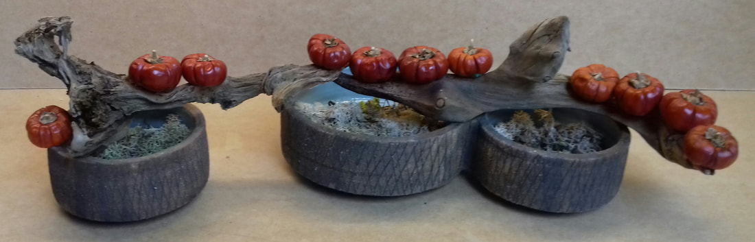
1.An attractive and very atmospheric exhibit. However the pumpkin is a little too dominant and causes conflict of scale with the other components.
2.A very colourful display of autumnal components in a trug with a good selection of plant material which is well-staged. Greater height at the left side would give a better counter-balance to the visual weight towards the base of the design.
3.An impressive and colourful autumn exhibit which shows a good interpretation of the class title “Autumn Glory” The top piece of foliage is a little fussy.
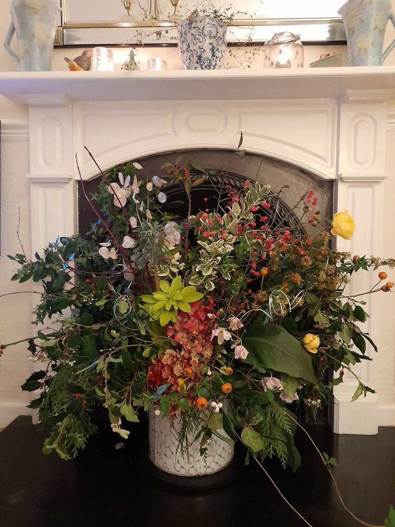
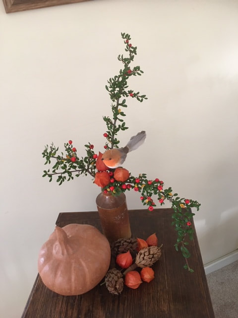
4.A very colourful exhibit which includes vibrant Kaffir Lilies (Latin name formerly Schizostylis, now Hesperantha) and highly coloured Hypericum berries. The exhibit is well-staged but is slightly ‘sparse’ in the centre top area 5.A very attractive and unusual design including most appropriate Physalis cases with fruit and the charming accessory of a little robin. The large gourd on the left side of the base is very heavy visually and is rather too large in relation to the other components.
6.A well-arranged basket of autumnal flowers and fruit with good interest throughout the design. However the colouring overall is rather subtle and subdued and lacks the impact to fully convey the ‘Glory’ of the class title.
7.An eye-catching and well-arranged exhibit. The grouping of different colours is interesting and gives impact. However the area of overlapping Fatsia leaves is visually very heavy, thus affecting the overall balance of the design.
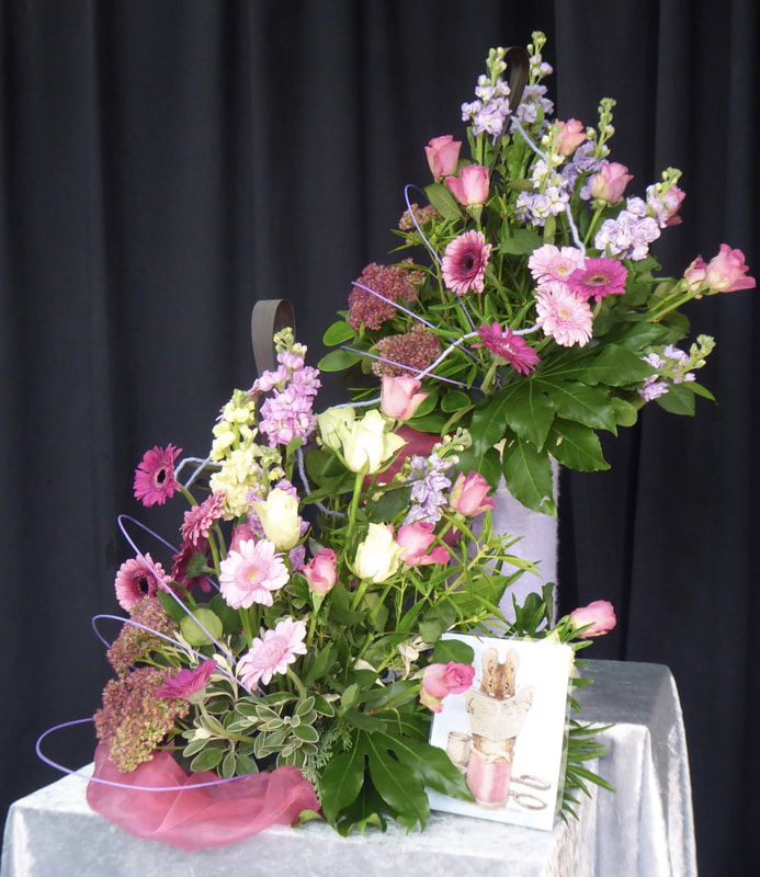
August Virtual Club Competition
"We'll Meet Again"
Judged by Barbara Harris NAFAS National Judge
1st 2nd 3rd
Debbie Jackson (3) Michelle King (6) Janet Sharp (5)
(1) (2) (4)
1. A pretty design using lovely flowers and in a delightful setting. However there is really not enough of a colour link between the 2 placements to give a unified effect
2. A well-shaped overall design with good linking of line and colour between the 2 placements. The gorgeous gladioli flowers are, however, visually very heavy and create a rather top-heavy effect to the overall design.
3. The whole design is very rhythmic and full of movement . The positioning of the 2 placements under the clock cleverly suggests the class title whilst the curved lines of the designs take the eye up to visually include it.
4. A very dramatic design with good linking between the 3 placements. Although there is repetition the design is very static and heavy with the containers being rather too dominant.
5. An attractive, harmonious grouping of flowers and foliage in very suitable containers. The movement throughout the design would have been improved with more curved plant material linking the placements.
6. A very charming and interpretative exhibit staged in containers which are most appropriate for the chosen theme. The 2 displays of flowers and foliage are well arranged but perhaps the photograph is rather large in proportion to the whole design particularly when placed in such a central position.
June Virtual Club Competition
"Wooden it be Lovely"
Judged by Barbara Harris NAFAS National Judge

1st (3) 2nd (11) 3rd (4)

VHC (9) HC (10) C (12)
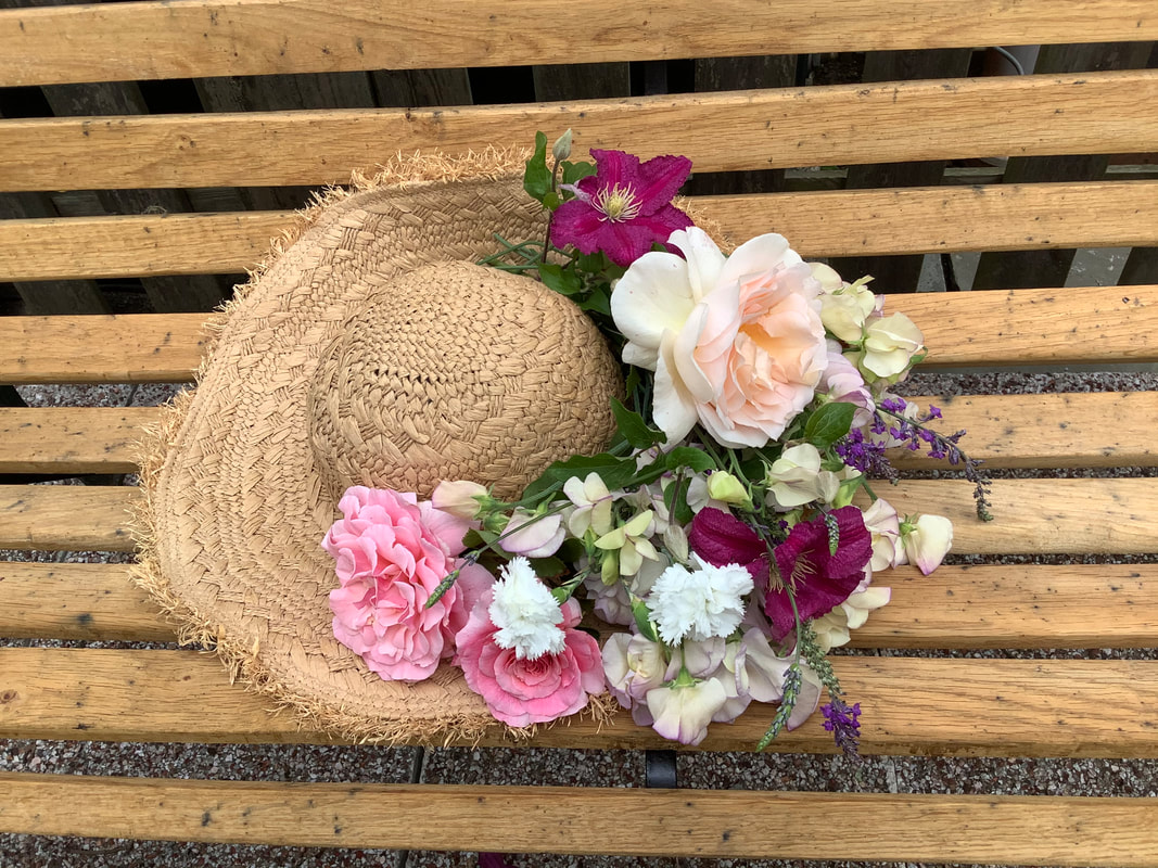


(1) (2) (5)
(6) (7) (8)
(13) (14)
1 A delightful informal design adorning a straw hat. However the only wooden element here is the slatted wooden base. The gorgeous peach rose is rather large in proportion to the other flowers.
2. A charming basket of flowers which has been well-staged on a white plinth. The large single pink Chrysanthemum on the left-hand side is rather heavy and detracts from the delicate balance of the whole arrangement.
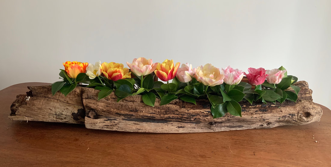
3. Congratulations – This is a stunning and stylised design which has been expertly staged and with excellent use of space throughout. An interesting diagonal line has been achieved with the placing of the piece of driftwood.
4. An eye-catching exhibit with very good rhythmic line throughout the design which has been created by the excellent placing of twisted branches of wood. The shaggy effect of the flowers is repeated in the texture of the foliage (rosemary ??) and in turn this contrasts with the form and texture of the Hosta leaves.
5. A colourful display of lovely garden Alstroemeri a flowers. However the two parts of the design are rather separate with the foliage grouped at the base. More integration of this foliage through the design would have given more movement. The driftwood is almost completely concealed.
6. This is a very classic and well-arranged selection of flowers and foliage giving a very pleasing effect. The use of wood is not very apparent, (is it the piece at the top right hand side ?) – it really needs to be more obvious when it is such an important part of the title.
7. A brightly coloured arrangement of flowers with great impact. However, the dark container/accessory (?) is very dominant. Greater use of the foliage though the design would have given a more unified effect.
8. A well-staged and attractive exhibit with good individual placements. However the piece of driftwood is very dark and heavy and dominates over the whole design.
9. An unusual and well-staged exhibit. The flowers and foliage have been cleverly used to complement the line of the distinctive wooden container. The addition of some foliage to decorate the container adds a further interest to the design.
10. A most attractive and clever display of foliage with the looped Phormium leaves creating much rhythm through the design. The use of an element of wood is not apparent – is it a wooden container ?
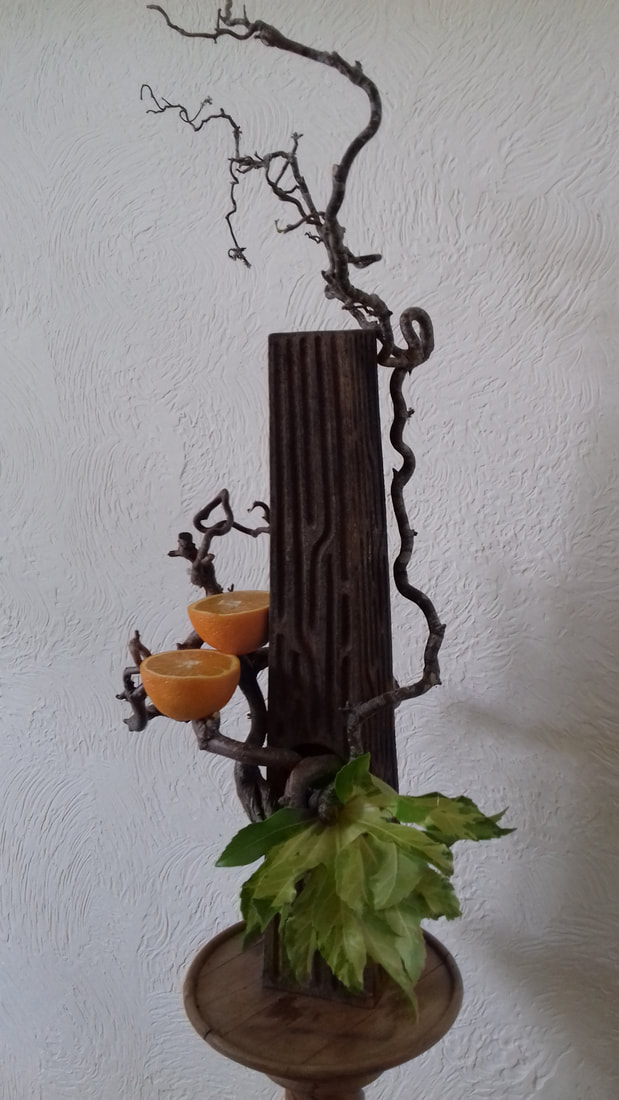
11. A very stylised and dramatic design with the twisted branches and orange halves perfectly displayed against the vertical lines of the wood. However the grouping of foliage at the base is cluttered and distracts from the otherwise outstanding positioning of the components.
12. An eye-catching and attractive exhibit with a good line of flowers and foliage running diagonally through the design Good colour harmony. The piece of wood whilst having a very rhythmic line is rather heavy and large in scale when placed with the smaller scaled plant material
13. Good use of a suitable piece of driftwood arranged with the roses to give a vibrant exhibit. The foliage of the ferns is however a little weak when used in conjunction with the strong forms of the other components.
14. Clever use of colour with the rich violet of the clematis and the grey shades of the wood (particularly on the wooden slatted base). The piece of driftwood at the lower right side is however rather heavy and gives a slightly unbalanced effect in this area.
May Virtual Club Competition
"As I Like It"
Judged by Barbara Harris NAFAS National Judge

1st (13) 2nd (1) 3rd (5)


Very Highly Commended (8) Highly Commended (9) Commended (11)


(2) (3) (4) (6) (7) (10) (12) (14) (15) (16) (17)
April Virtual Club Competition
"A Bit of Fun"
Judged by Barbara Harris NAFAS National Judge
Foliage Competition
1st (1) 2nd (6) 3rd (3) Commended (5)

(4) (2)
Flower Competition
"A Bit of Fun"
Judged by Barbara Harris NAFAS National Judge
1st (1) 2nd (5) 3rd (Hand Tied)(16)

Very Highly Commended (8) Highly Commended (13) Commended (18)
(17) Both Commended (10)
Other 10 Entries in Floral Competition


(2) (3) (4) (6) (7)
(9) (12) (14) (15) (11)
17th March 2020 "Moving Through Time"
Barbara Caldecourt
Club Competition "Reflection"

18th February "As We Like It"
Jean Plaskett, Angie Hyde, Jilly Griffin, Gaenor Circus and Michelle King


18th February Club Competition "Exotic"

2019 Designs, Club Competitions & News
Workshop at Horsham Flower Club 10th December 2019
A Christmas Table Arrangement
3rd December 2019 AGM
Competition- Molly Orford Cup: Title-"A Christmas Present"
Winner- Joyce Skeet
3rd December 2019 AGM Trophy Winners:
The Wilson Cup= Member who has gained most points in the club competitions for the year
Awarded to: Joyce Skeet
The Festival Cup= The member who made the most entries in the club competitions for the year
Awarded to: Joyce Skeet
9th November 2019 Demonstrator
Margaret Rumens- OPEN
"Christmas is coming!"
15th October 2019 Demonstrator
Jenny Nye
"Memorable Moments"
Club Competition 15th October 2019
Title- "Forever Autumn"
17th September 2019 Demonstrator
Eleanor Bracken
"Holiday Tales"
17th September Club Competition
Title- "Tropical Twist"


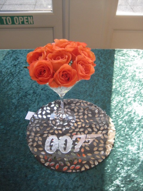
16th July 2019 Demonstrator
Maggie Hayes
"Any time, Any place, Anywhere"
Club Competition 16th July 2019
Title- "Shaken not Stirred"
18th June 2019 Demonstration Workshop
Sachiko Pearce
"Contrast & Contemporary"
Images of our club member's designs from Sachiko Pearce's 'Contrast & Contemporary' Workshop;


Congratulations to Gaenor Circus for winning Gold and to Claire Bryant for winning Silver-Gilt at Chelsea.
What an achievement! Left photo- design by Claire Bryant. Right photo- design by Gaenor Circus.
21st May 2019 Demonstrator
Kathryn Austin
"Wings"
Club Competition 21st May 2019
Title- "Something in the air"
To celebrate National Flower Arranging Day two members from Warnham Flower Club arranged a couple of exhibits in the foyer of The Capitol, Horsham. This was linked in to Horsham’s Year of Culture as well. The event is generously supported and sponsored by John Nicholson’s Fine Art Auctioneers and Valuers of Fernhurst. John Nicholson’s are one of the leading auction houses in southern England.
The arrangements were created by two well known Sussex Area demonstrators, Gaenor Circus, and Jean Plaskett our Sussex Area President. Gaenor has won both Silver and Silver Gilt Medals at the Chelsea Flower Show, and Jean has been a Gold Medal winner at the World Association of Flower Arrangers in Japan.


16th April 2019 Demonstrator
Graham King
"Floral Madness"
Club Competition 16th April 2019
Title- "Crazy Daisy"
19th March 2019 Demonstrator
Gaenor Circus
"Through the Ages"
Club Competition 19th March 2019
Title- "Nostalgia"

19th February 2019 Demonstrator
Michelle King
"Tutti Frutti"
Club Competition 19th February 2019
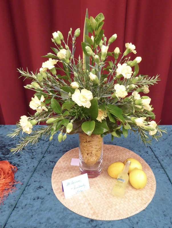
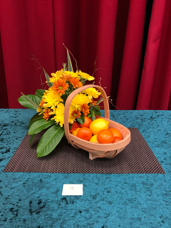
Title- "Oranges & Lemons"
2018 Designs & Club Competitions
Molly Orford Cup 4th December 2018
Title - A Pantomime
Winning design by Lorna Hourigan - Snow White


Designs by Jean Plaskett, Angie Hyde and Clair Bryant 20th November 2018
"Wee Three"

Club Competition 20th November 2018
"Trio"

Design by Christina Payne 16th October 2018
"All the time in the world"
Club competition 16th October 2018
"Back in time / Looking back"
Design by Jennifer Thompson 18th September 2018
"A Floral Workout"
Club Competition 18th September 2018 "In the Pink"

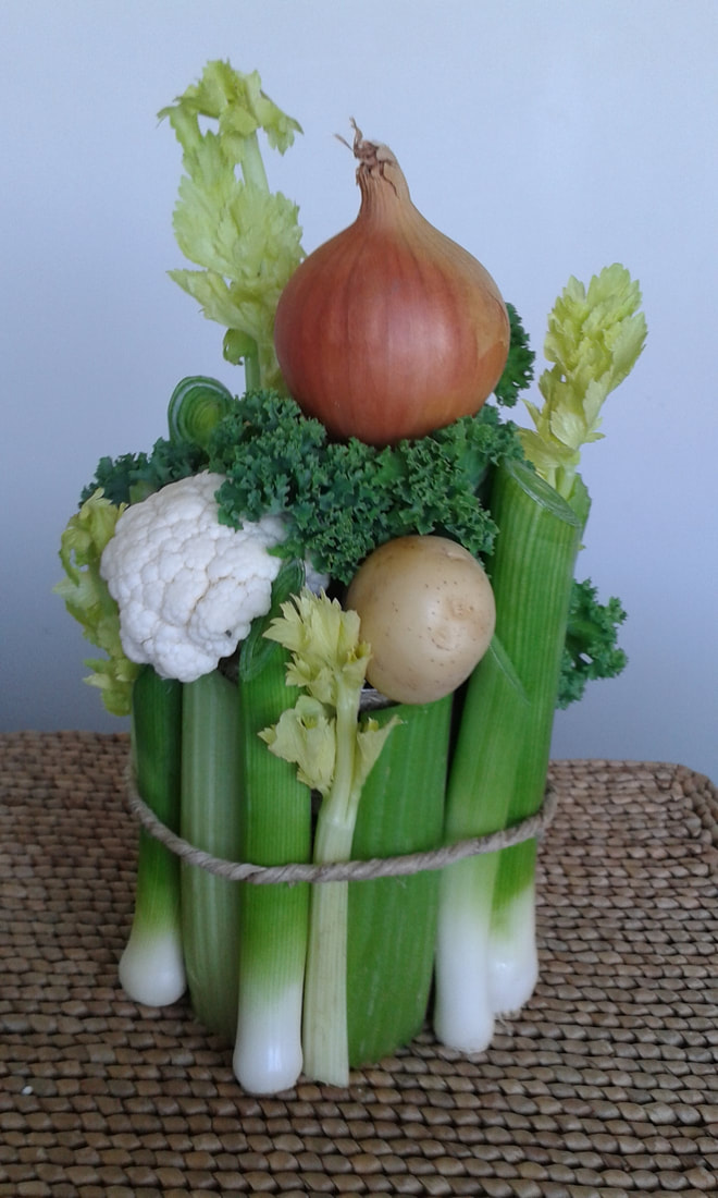
Workshop by Margaret Trepant 17th July 2018
"A Vegetative Parallel Design"


Designs By Robin White 19th June 2018
Open Meeting - "Wooden it be Lovely"!